The monogram logo is one of the most beautiful and exquisite types of logos. But what is it? There are but a few who can tell monogram logos from other types. That’s why we begin with some basic descriptions. The monogram logo is a complicated sign, endowed with some quaint letters interlacing.
The idea belongs to that medieval or even ancient blazonry. They used to depict initials in an enigmatic manner. Many companies are enjoying that designing move nowadays. It is not necessary to make a monogram extremely ornate or rich in details, adding tons of ringlets. It’s better to be apt, rather than having lots of useless details. Today, we’ll tell you how to make a trendy monogram logo.
Create your own logo with Turbologo logo maker. It takes less than 5 minutes and no design skills needed.
Go to Logo MakerTable of Contents
Why to choose a Monogram Logo
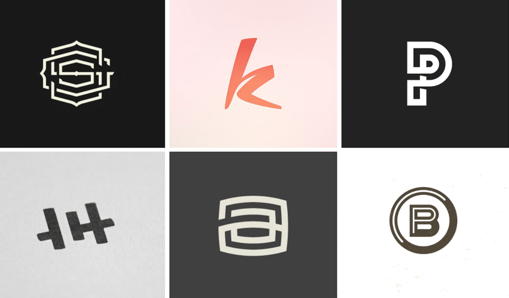
When designing a logo for your business you should keep your audience in mind. It should be visually appealing and reflect the values of your business. This is because the people you are trying to attract will also like it.
Monograms are easily remembered and have a classy, clean look. Use a monogram logo:
1. If you are in the luxury industry
Your customers should feel luxurious or service-branded. A logo that is personal makes them feel special.
Monogrammed towels, personalized pillows, and initialed fountain pen pens are all associated with high-end clients. People will associate your monogram logo with that feeling they get when their initials are emblazoned on anything. It’s like you care about them.
The logo of Louis Vuitton is an excellent example of this. It carries history and poise and has been around since the beginning. The luxury fashion brand is family-owned, and the monogram reflects that tradition while adding a personal touch.
2. Your business name is too long
Monogram logos usually only have 2 or 3 letters. This may work for you if your company name is long or difficult to pronounce. A long business name can be intimidating. Your initials will create intrigue and encourage your audience to ask more about your company.
It’s also important that business owners have a simple logo. Your audience won’t spend a lot of time looking at it and won’t be able to remember who you’re. Long business names can negate the ability to glance at your logo quickly and grasp what you do.
Bang and Olufsen is a long name. However, the Danish electronic company has a monogram logo that’s simple to remember. The ‘B&O” mark is more snackable than a wordmark for the entire business name.
3. Your business works on global markets
A logo that appeals to multilingual audiences can be challenging to design. There are many obstacles to overcome, from language barriers to cultural differences. When in doubt, less is more.
Your initials will make your logo more versatile. They’ll allow people to recognize your company from anywhere in the world without having to associate it with any particular language or country. H&M is an example of how this works. The international clothing retailer uses a bright, clear monogram to communicate with a wider audience rather than alienating a portion of their customers by using a “clever” monogram. Potentially misunderstood logo.
4. You don’t like a pictorial or abstract symbol
This logo style is a good option if you don’t want to use any symbol in your logo but still want your company name to be prominent. Combining initials with something unique can create a visually appealing logo.
You’re trying to build your brand and increase awareness when you first start your business. This is why you should choose a variant of the monogram that has the business name underneath or beside it.
The monogram can be used by itself in smaller spaces like website favicons or social media profile pictures.
5. You don’t have to be restricted
Monograms can seem counterintuitive as they remove the pictorial element from your logo, limiting you to only letters. Images can help your audience think about an object.
This can work in a brand’s favor if they want to highlight a particular product, but it can also limit brands that are looking for a wider reach.
If you are starting a business that specializes only in real estate consulting, but want to expand your services to other types down the road, then a monogram logo could be a good idea.
Creating a monogram logo
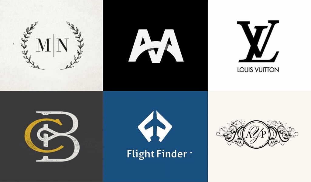
A good monogram is actually a masterpiece in its own rights. That’s why monogram designing is an arduous task to complete. If feel it’s not your cup of tea, you’d better use a free online monogram creator. The result will cause joy to you and your customers. A well-crafted depiction makes your image unique, as it reflects your values.
And it’s the first thing to focus on. CNN logo is a fine example here. It is both simple and elegant, which surely matches the company’s spirit. And it’s easy to read too!
Keep in mind that you are not obliged to design a monogram. Do it only if it’s appropriate. Just when are you supposed to create a monogram? Well, just when you need to stress the name of the company by making it part of a logo. They often use a shortened version of a name due to a lack of space in a logo. That means that you should make up a shorter name. It takes three letters at most to make a worthy monogram. Should you take more; the design is doomed.
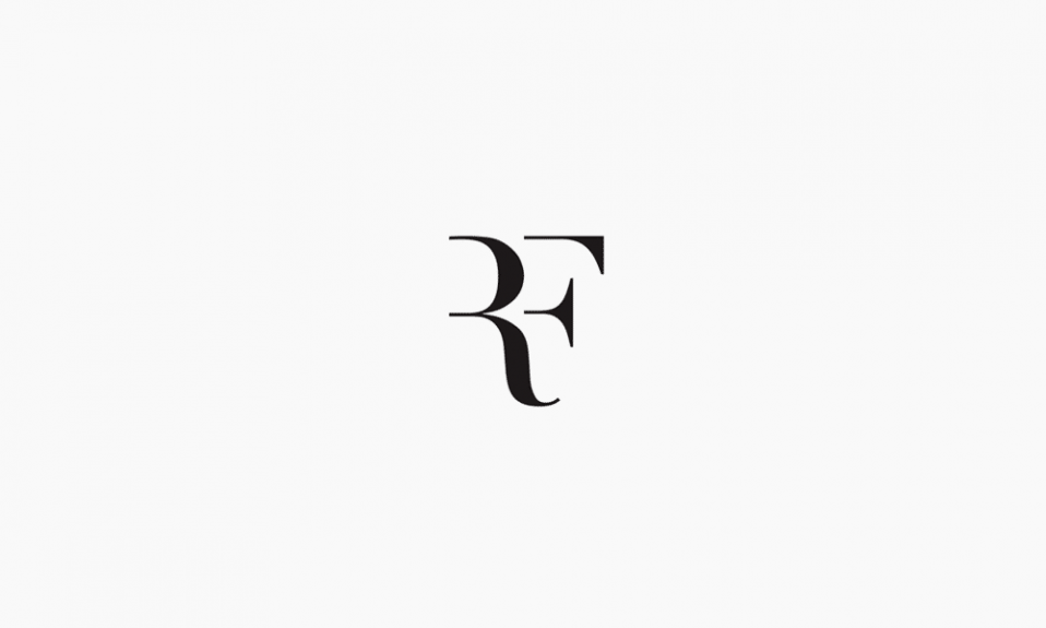
Use some brand new and extraordinary types. Make letters more abstract, shorten or elongate them. All of the above leads to a unique monographic design. You can simply erase part of a letter, following Roger Federer’s example. He has placed his initials in a logo, and then simply erased part of both letters. However, the meaning is still clear. The point is to know when to stop. Don’t turn your logo into a line medley.
Tip on how to create a monogram logo
The first rule of an effective monogram is simplicity. So, get over yourself and design an abbreviation. And be ready to think again if it gets too long. It would be hard for your customers to memorize a name comprised of 5 words, so feel free to abbreviate and shorten longer names. Here are the four tips:
1. Find perfect typefaces
The heart and soul of a monogram logo is in its typeface. So search for the right one that best represents what your brand stands for.
A serif font (fonts with fewer feet at the ends of letters) can give your brand a traditional, timeless feel. If your brand message centers around innovation, creativity, or modernism, then a sans serif font will be the best choice.
The New York Yankees have a unique font that layers the letters of “NY” on top of one another. They use a unique font that emphasizes their New York claim and isn’t to be misunderstood.
If your logo letters face in different directions, this could be a good strategy. However, you need to take care not to “collide” letters into each other making your logo hard to read.
The Michael Schumacher logo, on the other hand, is an excellent example of how to add a personal touch to a monogram. This is done primarily by mimicking a signature style. Try experimenting with different script fonts if you want to convey a message such as this with your logo. Most cursive fonts can mimic a handwritten signature and portray an elegant and sophisticated brand.
2. Experiment with layouts and shapes
Monogram logos are mainly composed of letters, but their overall design is influenced by the shape of the letters.
The most common layout is one that has overlapping letters and falls into a rectangle shape. Luxury fashion brand Yves Saint Laurent opted for a vertical layout, with the initials “YSL”, arranged in an overlapped vertical orientation.
There are many layout options available:
- Interconnected. This style is very popular because it can be used in all industries. This layout needs at least two letters.
- Lettered seal. A letter seal monogram is more formal and works well for brands with a more traditional history.
- Mirrored or flipped. This layout works best when it is done with just two letters. It’s eye-catching and makes people do a double-take.
- Stacked. You might consider a different approach. A stacked monogram is an option. This unusual layout is great for two to four letters, and will grab attention. You should stick to a simple serif or sansserif typeface. Otherwise, it can look messy with script typefaces.
- Informal. An informal monogram, which is more quirky than usual, can be a great way for your brand to show off its personality. This logo is typically handwritten. A casual blog or clothing brand might want a more informal monogram.
3. Choose the color
Your logo’s message will be communicated through the colors you choose for a monogram logo. You can mix and match colors to make your audience feel something about your brand. Different colors have different meanings.
The CNN logo is a combination of bright red and white. This tells viewers that CNN is a bold and passionate network. While the white gives the channel a soft, innocent touch, it also reflects truthfulness and innocence.
You can also go bolder and use a multicolored palette, such as the PlayStation logo. Palettes like these appeal to younger audiences, giving off a youthful, energetic and playful vibe. You run the risk that your logo’s message will be misunderstood and your design becomes cluttered if you use too many colors.
When choosing logo colors, think about the three main emotions you want your audience to experience. Blue is a symbol of reliability, trustworthiness, stability, and health; green represents wealth, health, and nature; and so on. Focus on the 1-3 colors that best convey your main message.
Your logo will clash with many backgrounds. It is important to have an idea of where and how you intend to use it. Before you commit to a monogram logo using 4+ colors, think about whether your brand will benefit from it.
4. Include a hidden meaning
Many monogram logos have hidden meanings. Before you begin creating your logo, you should think about whether this would be something you could add to it. The LG logo, for example, is technically a monogram, but they use spacing and letter sizing to make a human face. Have you noticed that FedEx has an arrow in the middle of the letters ‘e’ & ‘x’? This symbolizes motion and informs their customers that they will receive their packages quickly.
To determine if your brand’s story is being told, look at the font, color, layout, and layout. You can reorder the letters to create space for new meanings or symbolism if there is a missing message in your logo.
Monogram logo inspiration
90% of success rests with a felicitous font. And minimalism is harmful here actually. GAP had done that mistake recently, trading an elegant font for a simplified one. Simplification doesn’t mean dulling!
A proper font defines most designing moves in your logo. For example, notches and ringlets in a font suggest a vintage or retro style. And that move can stress the origins of your company. You can even make people think that your company is rather old and reliable.
To clarify the details we suggest recalling some medieval emblems, family crests or armorial bearings. Those are what led to the new trend inspiration. Kings and emperors used to adorn medals and other awards with monographic symbols. A good example here is The Most Excellent Order of the British Empire order of chivalry. VRI letters were interlaced in there, standing for “Victoria Regina Imperatrix”.
That designer move is getting common in the fashion industry. And it’s quite consistent, as most of such companies are named after their founders. Their initials suit monograms best. The most famous examples are Chanel, Gucci, Roberto Cavalli, Louis Vuitton and Alexander McQueen. The latter’s logo is probably the best example of how to make a monogram. You can’t just confuse this elegant, beautiful and clear sign with something else, can you?
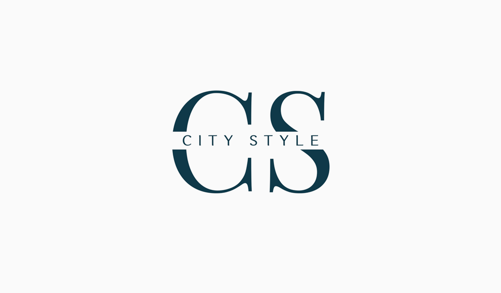
Other examples look much more utility or even ordinary. Such companies as Procter & Gamble, Hewlett Packard and H&M possess those. As you can see, sometimes, aptness is just dull. Such logos are well-known only because of the goods they are placed on. And it’s not anti-marketing, it’s just outdated design. How can a monogram be improved? Take a look at GAP, IBM or Warner Brothers. But minor changes have improved the overall design, and it is really easy to adopt. Aptness is awesome, but it can lead to meaningless simplifications.
Ready to start?
It’s hard to design a plausible monogram logo, possessing no designing skills and experience. That’s why it is more convenient to create a monogram using our logo creator. That surely would result in something worthy.
I’m a product and graphic designer with 10-years background. Writing about branding, logo creation and business.

