What is connection between impressive Burdz Khalifa skyscraper, conquest of Everest and rice noodles? It seems there is none, but actually that’s not quite right. Ultrasuccessful company Samsung is that connection, that’s why we’ll tell you about one of the world most famous brands and delve into Samsung logo history.
Create your own logo with Turbologo logo maker. It takes less than 5 minutes and no design skills needed.
Go to Logo MakerTable of Contents
Samsung Logo history
In current world we know Samsung company as one of the major electronics producer, however, initially, in 1983 the company had a vector towards food industry development. The company supplied dried fish, rice and noodles into neighboring China and Manchuria, and since 1939 it has widened the range of goods with wine and rice vodka.
So, the first Samsung logo was depicted on noodle packages, the history of the emblem begins in 1958.
How did Samsung logo look like back then? It was a well-detailed black-and-white sign, resembling a post stamp. Framed by white hieroglyphs there was a circle on a black shield, where three stars were shining, as the word itself (Samsung) is translated as “three stars”. So, what sense do these stars convey? What is the meaning of Samsung logo?
Logo Meaning
The meaning of the emblem is hidden in the title itself. In translation from Korean language Sam means “three” (or “greatness” and “multiplicity”) and Sung – “stars” (another meanings are “success”, “diversity”).
Perhaps, owner of the company meant his three sons, who were destined to drive the company to a vast market, or maybe a success that was supposed to follow them. Whatever the case was, the idea turned out to be lucky and prophetic.
Samsung logo font
Samsung logo use the font DDT Cond SemiBold font, the font was designed by Ray Larabie.
Logo evolution – From noodles and fish to electronics and change

As time passed by, and previously its label crowned just noodles packs, the company begins to think about development by the middle of 20th century. The first step of development became insurance and real estate business, and then an interesting twist broke out. Second World War didn’t go light on southern Korea, and its government made a certain decision. 30 best Korean companies were endowed with lowered taxation and industry development funding. All the economics branches were split into 30 currents and each company received its own. As we know today, Samsung was responsible for electronics and government’s money didn’t go to waste.
And what’s about that simple noodles Samsung logo? The changes came for it too, as this symbol was supposed to enrich high-tech good of that time. What is more, it was necessary to ship not only to neighboring countries, but also to the whole world. That is why Samsung logo evolution takes place. From now on, the company’s name is written in English, and three starred circle moves to the left. As a whole, the logo looks reservedly and quite relevant for those days, so the rebranding could be considered a success. The logo remains black-and-white.
A symbolic alteration
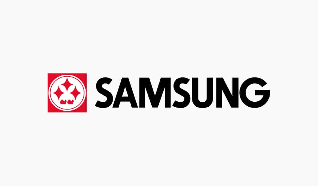
The next change of a Samsung logo occurs rather symbolic, as black-and-white TVs are outdated and go out of fashion. In 80s the whole world wants to watch color TV at home, and Samsung is ready to give the world just that. That’s why the logo can’t stay colorless, it must become full of vivid colors. It was decided that the logo is to be left to American investors, making it more modern.
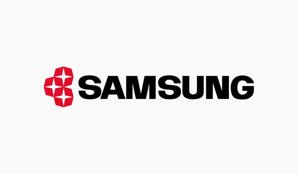
Three star continue to shine on the logo and lasts for quite a time. Only in 1993 changes come again. As the world changes extremely fast, there is no more place for old ideas. In order to remain as successful on market as before, Samsung must become open and relevant global company. Major values at the beginning of 90s are technological boom and modern innovations. The world expands its borders. Korean Samsung workers are detached in masses to West, and West comes to East. The time comes to change logo dramatically.
The logo as we know it
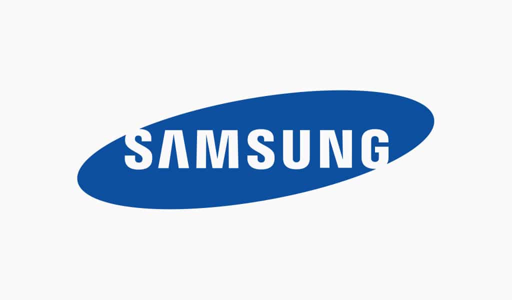
It is this variation of Samsung logo which is known worldwide. The blue oval with white letters appears. What is the meaning of new Samsung logo?
The three stars have disappeared, but connection with space still remains, as the oval symbolizes shape of our universe. Please notice, that top of letter “S” is designed as if it is spilling to the outer space, and the same holds true for bottom part of “G”. Designers deliberately took that step, for this symbolizes Samsung as something open to the whole world, to everything new, to development and perfection. Serene, reliable and confident blue color is a color of ocean and sky. According to Samsung guidebook, a letter space isn’t necessary to be filled with white, it can be left transparent against any bright background.
In the beginning the oval was accompanied by a blue “electronics” sign at the bottom, but as overall logo simplification course was taken it didn’t last long. Even the oval itself disappears sometimes, as inscription is so well-known that it will do without it.
Successfulness of the logo is proved by the fact that many small businessmen follow the idea of oval and inscribe it with their own names, hoping to repeat the success of Samsung, but we know that logo is not to be plagiarized, for this is hard labor, which requires attentiveness and talent.
As for the topic we have touched upon in the beginning of this article, now you know, that rice noodles was the first Samsung logo bearer! And Everest, in turn, has helped the company to demonstrate its production quality. A British alpinist took Galaxy S II with him, and proved that a smartphone is capable of picking up signals in extreme conditions. It was a huge success, as the smartphone functioned normally at the height of 8850 meters above the sea level! As for the most famous skyscraper in Dubai, construction of the building was entrusted with south Korean company “Samsung Engineering and Construction”. Thus, the company proves its motto once again – Samsung is always ready to push it beyond the limit and accomplish something brand new!
Blog editor and content marketing specialist at Turbologo. Writing about Marketing and design. Victoria’s articles contain useful tips on how to build a brand and promote it online.

