Taco Bell is one of the biggest players on fast-food market. The company activity scale is hard to evaluate at first, as their diners may be not the brightest. However, the company employs 20.000 staff members a year. Just how do they manage to keep the growth? What lies behind that ordinary Taco Bell logo? Let’s find out!
Table of Contents
The Rise of the Taco Bell Logo
The question is, why have they chosen a poorly related to food name? And what has Taco Bell logo history begun with? To get the answers we are bound to go to the past. Everything changed after World War II. Many people were drafted and then dismissed. As a result, they were completely detained from their previous occupations. Many factories were forced to redirect their development vectors into more peaceful aims. People had to search for peaceful ways of making their living. Glen Bell, a marine, also faced the same fate. As you might have already guessed, he founded the company. And that explains the bell in the logo. And his surname still features Taco Bell logo.
50s food market could list many of those who are now fast food giants nowadays. McDonald’s is probably the best example here. That’s why another burger shop was sure to fail. Glenn used to stroll up and down a city in search of some brand new idea. And finally, he was lucky to notice long queues at Mexico restaurants doors. That kind of food was a rare sight those days and restaurants were getting a good price for it.
The first Taco Bell logo history
Glen started to build a Mexican style diner as soon as he realized that nachos and burritos will make him rich. Old Taco Bell logo was comprised of Mexico flag colors. The logo was created in 60s – its history begins in 1962, yet the color combination is still delicious. All the colors are most suitable for fast food restaurants. Why is that so? Well, it’s a common knowledge, really. Yellow stands for hot oil, and green is for fresh greens and spicy pepper. And red symbolizes an appetizing meat with hot paprika. It has surely made your mouth water, hasn’t it?
Want to craft a signature logo for your restaurant that stands out in the fast-food market? Delve into our gallery of restaurant logo design inspirations to spark your creativity.
Perhaps, Taco Bell became famous due to lack of rivals, but the logo surely has something to do with that as well. The depiction looks dull nowadays, but it used to attract thousands of customers.
Taco Bell Logo font
And the old Taco Bell logo font looks much like Macbeth. Overall identics proved to be well balanced too. As for a new Taco Bell logo font, they have chosen Helvetica.
Taco Bell logo meaning
The Taco Bell logo color sceme combines next bright colors – blue, pink and yellow, tha main aim of this mix is to appeal young customers. Blue color stands for grace, excellence, strength, the pink depicts youthfulness, yellow – happiness and optimism.
New Taco Bell logo evolution and rebranding
They realized that 90s are place for up-to-date things and it’s time to create something new. They also decided to keep Taco Bell logo meaning. It still stood for the founder’s surname. However, colors and font were altered. A new depiction is far better that the old one. In particular, it has become more dynamic, the bell is almost sounding as it attracts new customers. Nevertheless, colors alteration wasn’t the most plausible one. The company decided to adopt acid-pink fuchsia, violet and yellow colors in order to differ from rivals. And it’s not the best solution here.
Looking for a logo that captures the essence of food branding? Discover innovative food logo design ideas in our curated gallery.
And even the new logo was slightly altered in 2016. However, customers haven’t quite liked it. The font has been altered to Akzidenz-Grotesk and clearly resembles Helvetica. Strangely enough, but they removed all dynamics. Yet the big problem is the colors. Dirty violet is a major color now. It’s hard to imagine even less appetizing color. It seems that all the cold colors are taboo for food industry. The shades are better be used for chemical goods store, as they remind of cold aggression.
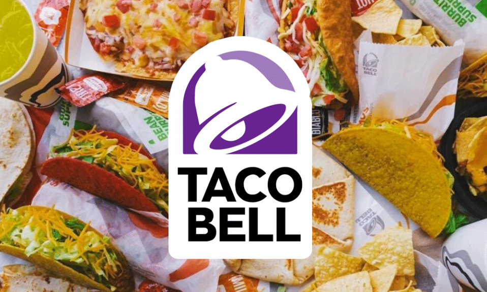
Taco Bell presented a new minimalistic logo on November 14, 2016 and it was created in collaboration with the New York agency Lippincott and Taco Bell’s internal design group. There is a purple shape logo with a white bell on it, and under the shape there are the words Taco and Bell in black text. The flexibility of the new design allows owners to customize it to their preferences. The relevant rebranding strategy gave a second wind to business development of the Taco Bell.
The company grew in popularity so fast that within five years they already had 100 restaurants and in eight years after they started, they had 325 public restaurants. The fact that they introduced the value menu where they had a wide variety of 0.59, 0.79 and 0.99 cents items influenced for the better. The availability and an affordable price of the appetizing Mexican food were the key factors to success. All that was needed is to give a customer what they wanted and nothing more. The tasty food like pizza, nachos, soft-shell tacos that is fast and cheap led the company to historic profits.
The bell shape was targeted specifically since it indicates the surname of the company founder and is named after Glen Bell. Among other things, the festive sound of the bell symbolizes the holiday time and also attracts a flow of new customers. It is also believed that the space inside the bell, in particular the clipper is similar to the shape of a taco. The company is famous for tacos and tortillas, therefore the choice directly reflects the elements of the main dish.
As Taco Bell seeks to maintain its modern appeal and market presence, aligning with contemporary design trends is essential. The vibrant palette of dark and light purple, black, and white conveys originality and a distinctive style. The redesigned logo is now more unique, streamlined, and minimalist, aligning with modern design aesthetics. By simplifying the logo, Taco Bell has established a more versatile brand identity. The combination of pink, yellow, and purple previously posed challenges for logo placement on dark or colored backgrounds. However, the purple hue is now perceived as symbolizing luxury, adding a touch of sophistication to the brand’s image.

SEO specialist, link builder, and blog editor at Turbologo. Writing insightful content about marketing, design, and branding. Sharing practical tips on building and promoting brands online.