E-mail marketing fails to keep its ground these days. And it is spammers who are responsible for that, as they really have crossed the line, promoting their goods in a harmful and ineffective way. Biggest e-mail services are shielding their users from spam. E-mails are still relevant especially when it comes to business correspondence. Many top business executives are using e-mails to run their companies. Despite the fact that beautiful ad pagination is no more, e-mails themselves are still being used. Today we’ll tell you how to add your logo to e-mail signature.
Designing Effective Email Signatures for Brand and Sales Enhancement

It seems that there is nothing difficult or useful about this task. However, you must never neglect it, as signature is a free way of increasing your sales. Just like a good logo attracts more customers, your e-mail signature helps to promote your image. People tend to lose information and contacts with it. Sometimes it’s hard to find relevant data, and Google would provide outdated info too. However, if your letter contains all the necessary phone numbers and e-mails you are far more likely to be taken into consideration. All you need to do is to add social media icons to e-mail signature.
Another important reason is an alluring image. They often make judgments based on the first glance, and your image is affected by an abundance of smaller details. Delays and broken promises destroy the trust of your customers. But a neat and clear signature defines you as a successful and effective partner. The idea is that your e-mail logo conveys a sense of reliability and prosperity. A signature generator for email can help you create a professional and consistent email signature to strengthen your brand image.
Moreover, a clear and simple signature is like a final chord in a symphony. The best signature in e-mail always calls to action. And it’s effective way to affect a receiver. They say last lines are remembered better than everything what comes before them. It is crucial to ponder it and come up with a rational combination of logo and text in your e-mail logo. It is most likely will make an addressee to have another conversation or e-mail with you or your employee and order something else.
How to Enhance Your Email Signature

The creation of signature templates doesn’t take any advanced programming or designing skills. In fact, it takes just a little patience, attention and accuracy. And your logo would be required too. It is best to use a small-sized logo with high resolution. Obviously, the misshaped logo will repel any customers. If you still not ready to take the risk, it is best to use an online logo maker.
So, you need to provide most general information. Your name and surname must be most noticeable, and only then comes your position and company name. If you specialize in design or your project is personality centered brand you should add a photo too. However, it’s best to add a photo when some personal contact is going to happen. Neat staff members always cater for customers’ trust. In other cases like selling some kind of pipes or crude oil, it’s advised to use company logo alone.
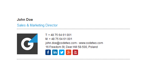
You should state contacts next. Aptness is your best friend when it comes to e-mail signature. Your physical address should be added only a customer could need it. However, if you are running some online business that information is irrelevant. Your employer can always get your address on your site after all. The same principle goes for social media icons in e-mail signature. Adding a dozen of social networks which you suddenly decided to check during another office party is also a bad idea. Stick with a couple of actively led ones.
Most Common Mistakes When Designing an Email Signature
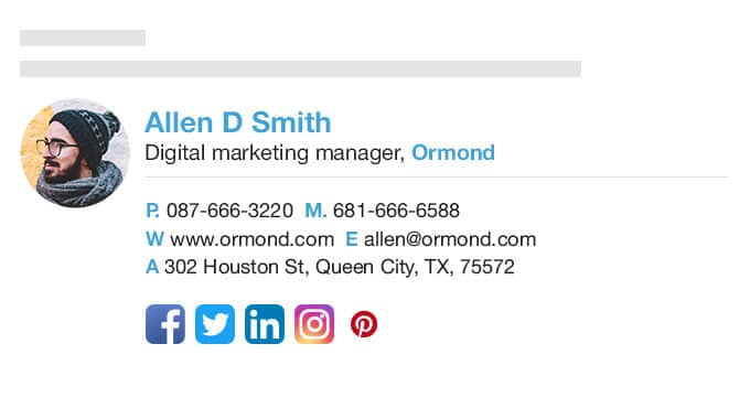
The first and most common mistake is excessive amount of information. Unnecessary links, slogans, abundance of pictures make a text hard to read and they just scroll it down and forget about it. Good e-mail signature doesn’t contain useless elements or information.
The second mistake is too pretentious design. Leave all those font alterations, color abundance, boldness and underlining for some signature carnival. Having more than two colors in a signature always looks too mannered as only professionals can make it plausible. Keep in mind that your first color is the color of your font. And the second one is likely to be the background.

The third common mistake is not structured e-mail. Do we really need a rigid hierarchy of elements to put a signature in e-mail? Actually, we do. Think of it, there is so much information to deliver. The more info you provide the more complicated e-mail structure gets. Keep in mind that your slogan mustn’t be as noticeable as name and contacts. Let a customer get the info without slogan at all rather than don’t get the info at all!
I’m a product and graphic designer with 10-years background. Writing about branding, logo creation and business.

