Are there any video games lovers who won’t recognize the Roblox logo design? Probably not. This unique online-based platform is a great (if not the greatest) supplier of opportunities to create entertaining virtual worlds. And not only that. It also allows the exploring of those designed by other users. In such a way, a developer can gain profit from his/her activity.
The praising of the company’s success as a whole may be way too long-lasting. So, today we are going to dive into the story of only one of its moving forces – the branding symbol.
Conducting research on prosperous emblems will surely help you get inspired to conquer new business heights. The text below covers Roblox logo evolution, meaning, history, font and colors. Take your time to get to know more about it!
Table of Contents
Roblox logo meaning
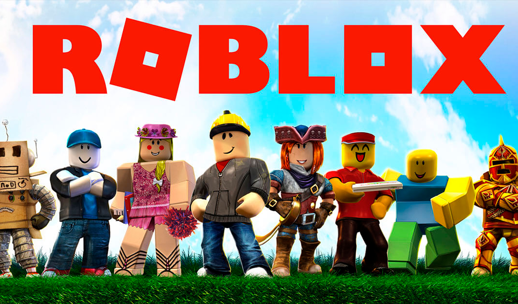
Since the platform was intended to develop video games, the Roblox logo should have coded some meaning connected with it. And so it did. ‘Robot’ stands for personages operated by the player, ‘blocks’ – for parts of which the game is formed. A little alteration and ta-dah, we have what we have.
Roblox logo history
Roblox history happens to be an extremely rapid one. The logo was transformed 10 times. That is quite a number. Nevertheless, the changes were not always huge, they still were. However, none of them remained for a long period. The biggest term lasted no more than 5 years. The average life duration is 1-2 years.
Roblox logo evolution
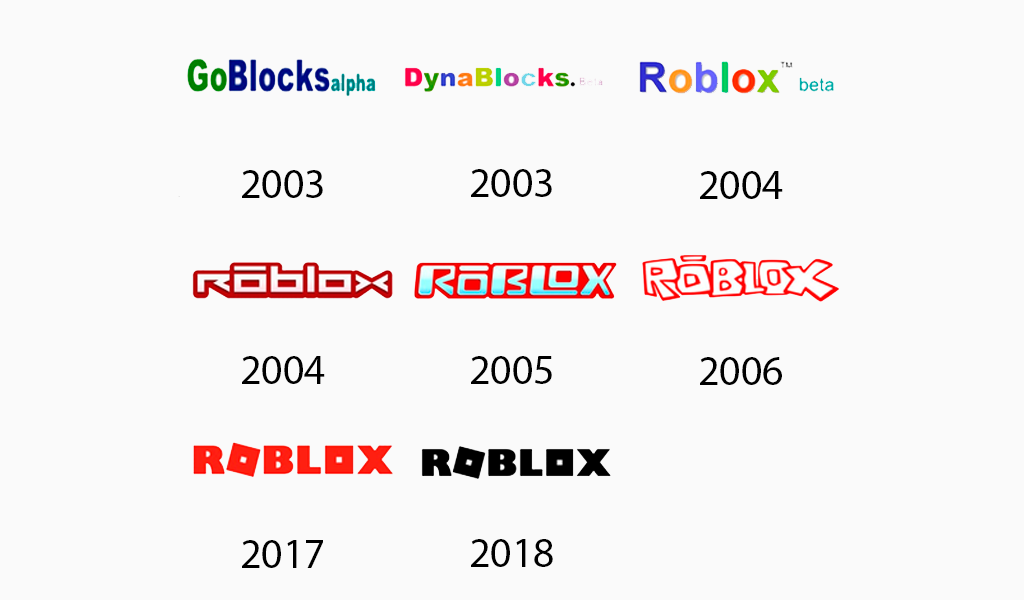
2002-2003
The very first emblem was the ‘GoBlocksalpha’ inscription. Its characters used to differ in size and tone. Green, dark blue, and light blue hues were accordingly spread between ‘Go’, ‘Blocks’, and ‘alpha’. Wherein, the last one was visibly smaller than the others.

2003-2004
In 2003 the program was renamed ‘DynaBlocks. Beta’. Each letter of the logo was colored differently. The last word yields in size to the key one.
2004
The first truly Roblox text came into existence in 2004. Here again ‘beta’ plays the role only of a little additional icon; the multi-colored palette remains untouched.
2004-2005
From now on Roblox logos will be painted white with red frames for more than a decade. ‘Alpha’ or ‘beta’ elements are not part of the scene anymore. The simple regular typeface is replaced by an ultra-modern, futuristic style. The first ‘o’ letter acquires a hyphen above.
2005-2006
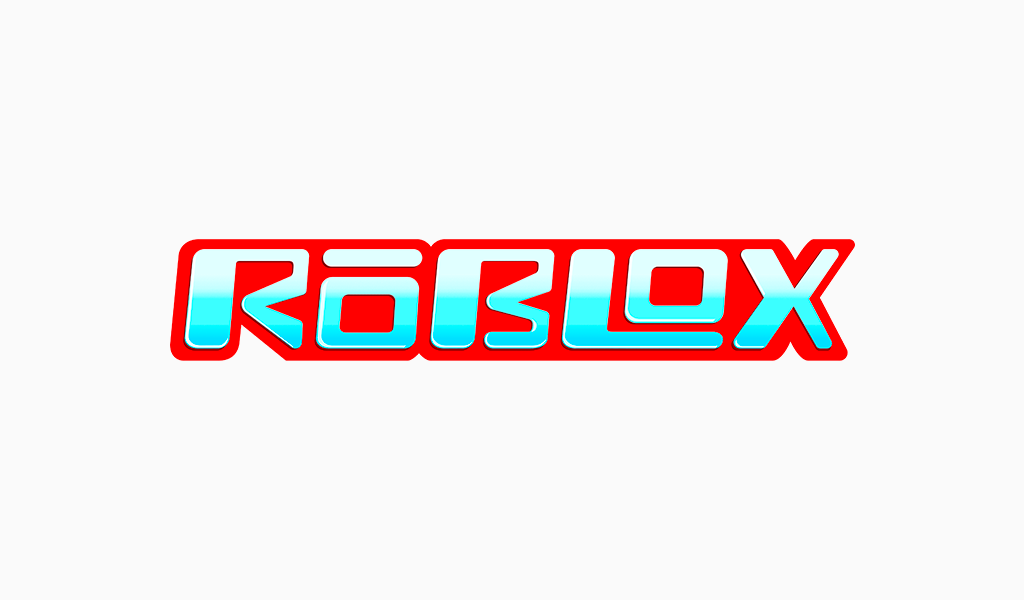
This modification of the old Roblox font contains some interesting design decisions. For example, all of the icon’s edges are situated on the same level. ‘R’, ‘B’, ‘L’, and ‘X’ symbols are capitalized, whereas, ‘O-s’ are not. The lower line of ‘L’ is placed under the last ‘o’. Previously blank space inside became gradient from white to light blue.
2006-2017
Although, usually this period of time is divided into three – 2006-2009, 2010-2015, 2015-2017 – they can be fairly united. In 2006 the company established the layered doodle-like logo Roblox. It was a laconic and super-actual design. Until 2017, it has been slightly changed two times. The difference consists solely in the shade of red and thickness of the outline.
2017-2018
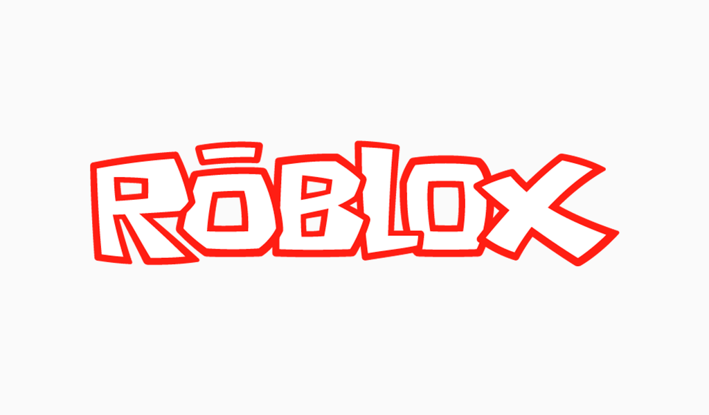
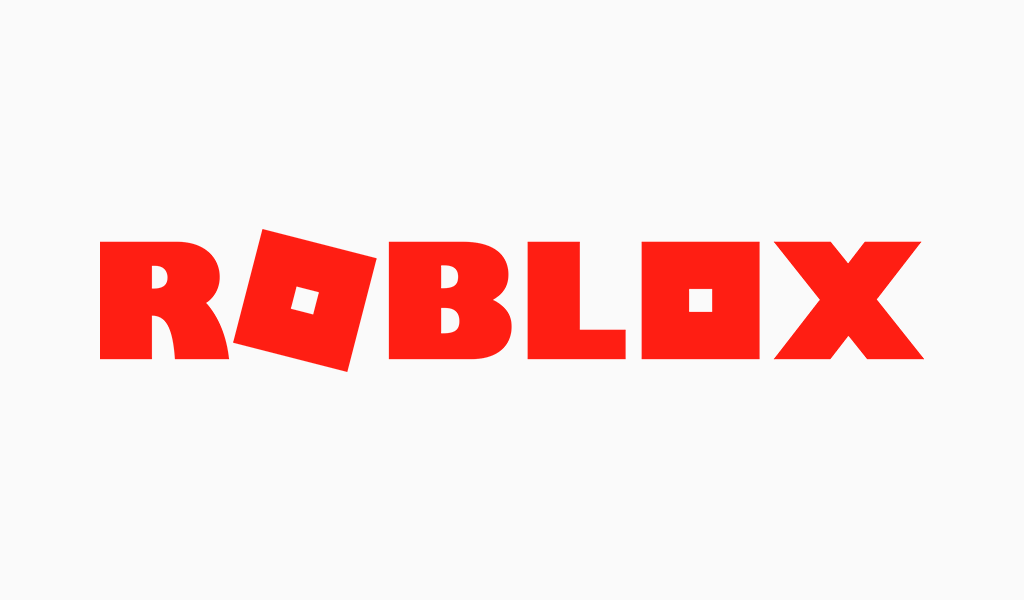
In 2017 a new Roblox logo variant takes place. Each letter here is somewhat squared, more or less. The ‘o’ following ‘r’ is falling, so it stands diagonally. Also, white elements took final leave.
2018-Present
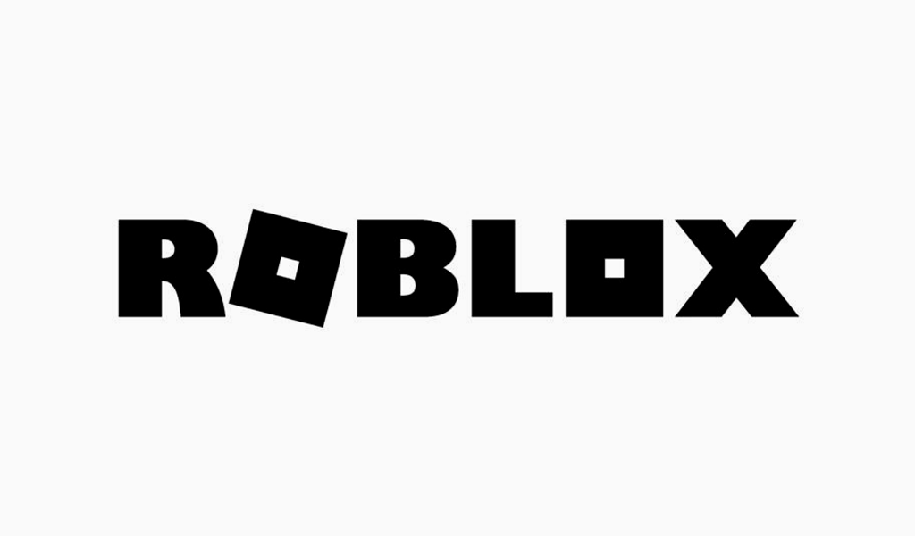
Present-day showcases preceding the mark word of before, but in monochrome: black letters, neutral background.
Roblox logo font
The current typeface is a bold, monospaced, sans-serif display. It was created uniquely for Roblox.
Roblox logo colors
As was already figured out, the Roblox symbol experienced almost all existing color palettes. Once it was rainbow-colored, once – red, presently – black.
I’m a product and graphic designer with 10-years background. Writing about branding, logo creation and business.

