Right logo colors – quick access to the hearts of the audience. Every brand aims to establish an emotional connection with its consumers, but a slogan or a storefront in logo design is not enough to achieve this. Color is a powerful psychological tool that helps our subconscious mind distinguish a company from many others and remember it.
Create your own logo with Turbologo logo maker. It takes less than 5 minutes and no design skills needed.
Go to Logo MakerTable of Contents
Why is brand colors‘ role essential?
Corporate identity is a set of elements that reflect to clients the essence of the company and its attitude towards consumers. One of its main components is the logo.
Today you can find a large number of companies competing with others for clients. However, consumers only remember those companies that were able to create a unified style. The logo color creates clear associations, creating a recognition effect. Think about the brands you come across often.
For example, Lacoste. Most people will immediately say green. What color is the social network Facebook? Blue and white. And Yahoo? Purple. This is a little memory exercise that shows how corporate colors influence the subconscious, giving us a result when associated with a shade.
The correctly chosen logo color is of great importance for the company, as it helps the brand to be remembered. The shades are the face of your brand in your logo and other visual advertising materials.
Faber Birren, one of the most renowned specialists in color theory, wrote at length about the relationship between them and human emotions. While the words “love” and “gas station” provoke a variety of emotions, the color red also evokes different reactions in people.
What is most curious is that the same shades cause the same reaction in different people. The color yellow has the same effect on all people, whether in Paris or New York. Neither a cold-blooded businessman nor a convinced skeptic denies the psychophysiological impact of color in a logo design.
The importance of color meanings

Therefore, it is important to approach the choice of shade responsibly: together with words and actions, they form the image of the enterprise. They are important not only for customers and employees, but also give a perception of their workspace. A change in the balance of power in the market is possible due to the color of the brand identity.
This is one of the main means of fighting for supremacy on earth. For example, Pepsi changed its corporate color to blue and increased its brand recognition by almost 10%. This happened due to the detuning from the main competitor – Coca-Cola.
Brand personality and logo colors influence the client’s decision. At one time, Procter & Gamble experimented: consumers were given the same laundry detergent, but in different packaging. Housewives were dissatisfied with the powder in yellow packaging. They called it too caustic and the blue packaging was a weak powder.
As a result, the product in the yellow box with a blueprint was placed first. This powder perfectly removed stubborn dirt. However, the product differed only in packaging. Tobacco manufacturers often resort to this trick. Subconsciously, people associate harmlessness with the color white, which is why white cigarettes are so popular.
Logo design tips for choosing colors

The main thing is that the logo style and colors used evoke associations with the company and the products it produces. For example, green is suitable for fruits and vegetables. A dance studio for girls looks better in pink. Black hints at the sale of motor oil.
The color of the corporate identity should be extraordinary. Companies involved in growing plants prefer green shades; producers of dairy products or water prefer white. Brown logos are suitable for selling naturally brown products like coffee and chocolate sweets.
There are many different factors: shape, space occupied, color combinations with other shades, too similar color palettes. Color is perceived precisely thanks to all this. It makes sense to take into account the specifics of the niche that is associated with this solution. According to this opinion, insurance and financial companies should have a style in soothing colors, green or blue. This can be easily selected in Turbologo’s logo maker.
The perception of logo color depends on shape and size. Many shade mixes are harmonious and pleasing to the eye, while others create a negative impression. It must be built by the meaning and concept of the company’s image. A competent selection can be made only by analyzing the capabilities of different tones. For example, what emotional impact do they have on people?
It is not recommended to use a wide color palette in logo design if it is not of particular importance to the company. As a rule, a couple of colors are used in the design of the style. There are many reasons for this:
- Excessive multiple colors not only spoils the beauty, but also distracts.
- Shades look different in different conditions.
- The more diverse the brand palette on paper, the more expensive the production of advertising, such as packaging and souvenirs.
For a logo image, you need to choose colors that can be reproduced on different surfaces and look the same. Difficulties may also arise in an advertising campaign through newspapers. Unmixed dyes used to produce color shades do not match natural colors.
Color psychology in logo design

First, you need to decide what target group (age, female, male, etc.) your company’s products are intended for, what impression the corporate style will make on people, and what to encourage them to do. The next step is to select combinations of shades that will dominate the logo design.
There are several popular primary colors. It is worth remembering that people are less likely to remember complex shades. The choice of corporate colors directly depends on customer preferences, but the main ones from the range work the same way.
Color as an element of corporate identity:
Red
Food and beverage brands may use red. This color of the restaurant stimulates the appetite of customers. It is important to remember that if vegetarian food is offered, it will irritate customers.
This color is quite suitable for brands aimed at youth. Red is preferred by active people, as it stimulates at a deep level and can increase activity. It personifies fire, struggle, extremes, and causes strong emotional excitement. Such famous brands like Huawei or Kit-Kat have red logos.
Blue and light blue
These logo colors meanings are suitable for use in large amounts. They relieve stress and relax. The shade Blue color is used in the logos of travel agencies, airlines and shipping companies. The light blue color is in tune with the sea wave and the sky, because it reminds us of the pleasure of vacation, cruises, and flying. Light blue color paired with darker shades can form youthful, placating logo color combinations.
Green

Green logo is immediately associated with nature. It has a relaxing effect, instills hope and comfort. Managers who respect nature and promote environmental responsibility should choose green logos.
Pharmaceutical brands can also be designed in this color. It is also used to design hospitals, clinics and health camps for children. Green is also the color of veganism and organic products.
Animal Planet’s logo represents its activities. For variety, the letters use different shades of green. Another logo of this tone is from AirWick – the company produces air fresheners, so the chosen logo color helps create the impression of purity and naturalness.
Orange
The color of summer, hope and citrus. Orange tones are used on the packaging of citrus-flavored products. This color makes you feel hungry. Orange logos are also used by companies targeting children due to its cheerful, optimistic image.
Pink

Probably the least utilized logo color is a symbol of sensuality and beauty. Pink logos appear in the brand personality for beauty salons, fashion clothing, perfume stores and other women’s products. Victoria’s Secret often uses the unusual practice of writing its name on a pinkish background.
Purple
Historically purple dye was thought to be majestic and mysterious. Purple logos are often associated with luxury, wealth and nobility. Sometimes used as the main color in the interiors of elite restaurants. It is also sought-after by psychologists and beauty studios. Purple makes a person more confident and improves self-esteem.
The logo color combinations of purple with hot pink and brown secondary colors are relevant for confectionery companies. These colors are associated with holiday dishes. A striking example is the logo designs of Milka company.
Yellow

The color of summer sun, joy and warmth. It promotes communication and improves mood. If you want your company to be perceived as open and fun, you should consider using yellow to create a style statement.
It’s quite rare for a brand color scheme to consist entirely of bright yellow. Icons are usually outlined in a darker version mixed, because light yellow may not look very good on a white logos background. Yellow is a common color wheel pairing and sometimes combined with green, red, black or blue accents.
Color combinations selection
Now that you have a better understanding of color theory and psychology, you can create the right color palette for your logo design. Decide on a primary color: This can be the main color of your brand or one that reflects the mood and character of your project.
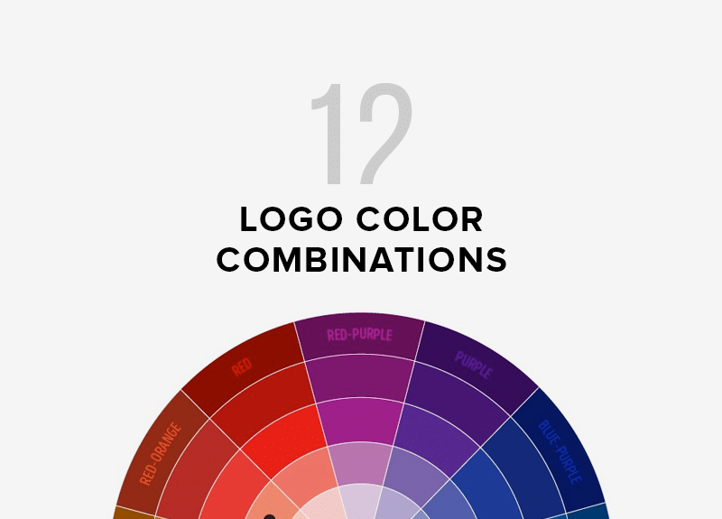
Use online tools like Adobe Color Wheel or Paletton color palette generator to craft harmonic color combinations and use color models to create balance and contrast in your design. Here are some of the most common types of color wheel pairing techniques:
- Analogous: Colors are located close to each other on the color wheel.
- Monochromatic: shades of the same color are used.
- Triadic: consists of three colors evenly distributed across the color wheel.
Universal options in color combinations
White, gray, black can be used in the logo colors of any company. They do not imply much atmosphere in logo color scheme, especially in small quantities, and perfectly fit as complementary colors.
The white color in the brand personality traits represents stability and innocence. It harmonizes perfectly with various shades and does not cause denial. It should be used in logos and company designs, as its light tinted hues makes the style more recognizable.
Conclusion
There is a lot to consider when picking a color. It’s easy to say: I want a red logo design! Cool, but red has other shades and earth tones. You need to choose a logo color that will look not only on the screen but also on printed media. You may not be planning on printing business cards right now, but when the time comes, you may find that the logo colors on the paper aren’t as vibrant as they are on the computer.
The differences can be strong. Or, conversely, if you choose a tone that is too light, you may find that it is hard to see when printing. As you can see, to combine colors effectively you need to execute a labor-intensive process. You have to experiment a lot to choose the right accent color. But the result is worth it.
I’m a product and graphic designer with 10-years background. Writing about branding, logo creation and business.

