What can be a business without a logotype? And what can be the second without stimulating an inspirational flow for its creation? That is the exact reason, we suggest you conduct some pieces of research on the world’s well-known, prosperous symbols.
It has passed more than a century of humanity admiring Chevrolet vehicles. The company’s product is one of the most favorites and demanded on the international market. Its constant satellite – the Chevy logo design – accompanies this long-lasting journey of great achievements. The history is worth being aware of!
Its meaning is placed in an entourage of a number of opposite versions provided by the closest to founder people. The evolution of it sets thinking. Below, we present all necessary information on the matter, plus, the font and colors utilized. Enjoy your reading!
Table of Contents
Chevy logo meaning
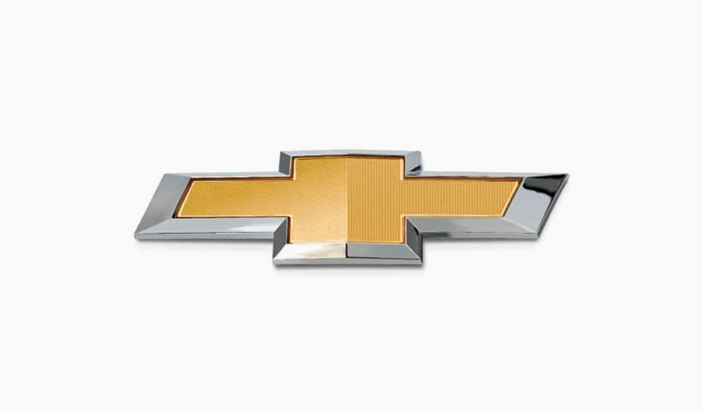
The Chevrolet bowtie logo has been the outcome of William Durant’s adventures in France. Or maybe not, since there exist three theories of its possible origin, the last two of which were introduced by his daughter and widow accordingly:
- Paris theory;
- Mr. Durant’s own idea theory;
- and the newspaper theory.
The opinion of the Chevrolet symbol being inspired by the ornamental wallpaper of the Paris hotel room has no evidence. The daughter of the company’s co-founder, Ethel Durant, in her book claims her father sketched the outline on the tissue during family dinner. On the contrary, Ariel Durant, the wife, recalls her husband’s statement of discovering something wonderful for Chevrolet in the newspaper, yet she did not remember what it was precisely.
The last is considered to be most compelling. Later on, Ken Kaufmann came to the conclusion it was Coalettes’ (little coals) advertisement that led to the impression.
Chevy logo history
Chevrolet logo history began in 1911, November 3, United States of America. It was performed as a simple wordmark. However, the Chevy bowtie logo started to be seen as a car badge only two years later, in 1913. Taking into account its life term (100+ years), one may presume its success. Not only its origin is under the question but also the form: does it resemble a bowtie or across?
Be it one or the other, the fact is Chevy logos have been changed several times since, yet never in shape.
Chevy logo evolution
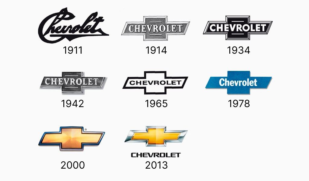
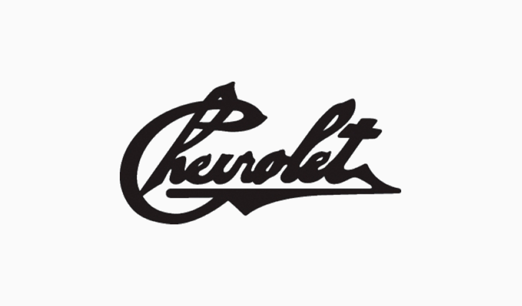
1911 – 1913
The old Chevy emblem was a handwritten black ‘Chevrolet’ inscription. It is believed to be Luis Chevrolet’s actual signature.
1913 – 1934
The very first cross-like logo was executed in white and gray or navy-blue and milk colors. The letters are representative of a regular old-style serif. Appear 2 strokes above and below the word.
1934 – 1942
1934 brings a monochrome decision. This modification of the logo comes in extra-bold sans-serif.
1942 – 1965
Here is used a 1913 symbol font. The bowtie is painted silver and the 3D effect is present.
1965 – 1978
In 1965 the Chevrolet logo went back to monochrome and sans-serif, this time white tone is prevailing. Additional lines are gone for good.
1978 – 2000
This period of the emblem’s evolution allows observation of a white and blue logo. In some pictures, the background resembles jeans fabric.
2000 – 2011
The Chevy truck logo of 2000, 2004, and 2011 is a range of transformations of metallic shades. Current, unlike the one showcased in 2000, has an inscription underneath.
Chevy logo font
Recent Chevrolet typeface is modern, sans-serif, and bold. The letters are visibly squared, yet without sharp corners. The first ‘e’ is connected to ‘v’, the second – to ‘t’.
Chevy logo colors
The up-to-date version’s palette consists of golden and silver metallic hues.
I’m a product and graphic designer with 10-years background. Writing about branding, logo creation and business.

