Bentley vehicles are amazing British luxury motorcars. They happen to be one of the official representatives of upper-class style, and there is a lot to say about it: its story is quite vivid and impressive. However, today’s star of the article is not the car itself, but the branding sign.
Bentley logo design (as much as any other successful one) plays a huge role in the company’s achievements. Who knows if it would be established to the present extent without it? And this assumption makes it worth getting acquainted with more accurate information on the matter.
The following text covers famous emblem’s:
- meaning;
- history;
- evolution;
- font;
- and colors.
Hope the reading will encourage you to new business heights! Enjoy!
Table of Contents
Bentley logo meaning
The invariable attributes of Bentley logo are spread wings with the capital letter ‘B’ taken in a circle situated in between. The official interpretation of it is royalty and power. Since originally a car was intended as a sports automobile solely, the symbol can mean flight and speed.
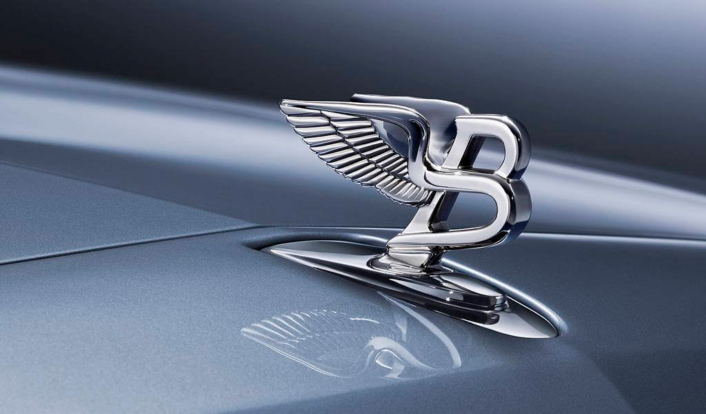
The interesting fact not everyone knows about Bentley wings is that the number of feathers may vary from model to model. Although the brand is sumptuous and everything produced under it – very expensive, the products are still divided into categories: simple or premium. The first will have equal feathers on each side (10/10), the last – unequaled (10/11, 13/14).
Bentley logo history
The Bentley symbol was first launched in 1919 as well as the automobile. The firm, founded in London by Walter Owen Bentley, from the very beginning earned the honorary title of prestige one. Its unaffordability to the majority of society caused great material losses. In consequence, the situation headed to insolvency. In 1931, it was outbid, which introduced certain transformations for Bentley emblem too.
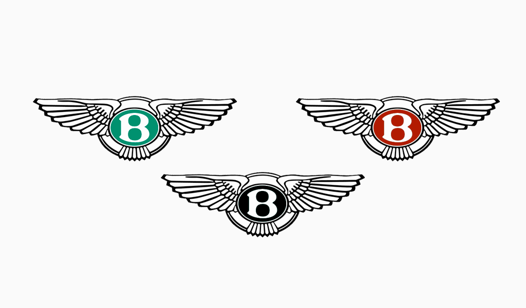
The said event separated cars by purpose into three, each of which has its variation of a logo. Sports, luxurious, and something that included both features, were showcasing black, red, and green labels accordingly.
The company switched hands once more in 1998.
Bentley logo evolution

The Bentley car logo is a rare example of cherishing traditions. A century has passed since its creation, even so, the design has not changed, except for the aforementioned color options. Such devotion deserves praise.
It is indeed a unique occasion when physical things not only survive hard times, like The Second World War but remains wanted and needed. Bentley cars symbol has been fulfilling peoples’ expectations a hundred years ago and so it keeps doing to the present day.
Will it ever be replaced? It is almost impossible to imagine that. The vehicle’s identity is built on the basis of the Bentley badge. Plus, it is a crucial part of marketing strategy. In such a way, it is pretty likely the logo will never be replaced with another one.
Bentley logo font

Mirroring symbols’ fate, Bentley font has not undergone any changes throughout the decades. It is a sans-serif, bold, monospaced, display typeface. The marked word is performed in vertically placed somewhat expanded letters.
Surprisingly, the sign serves as an inspiration to many recent enterprises. The main reason for this is its correspondence to the latest modern, minimalistic tendencies in visual design.
Bentley logo colors
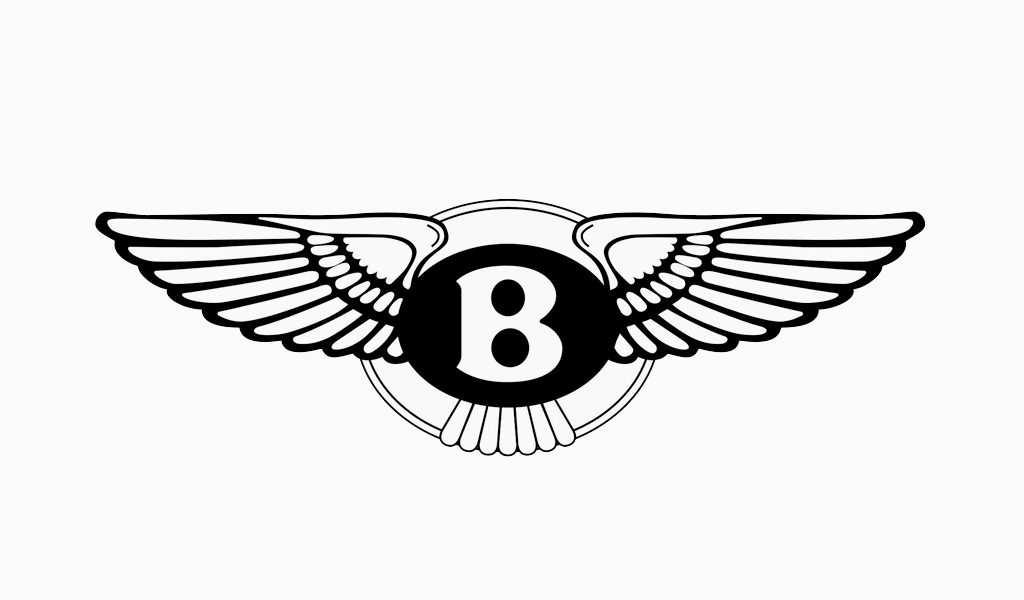
The Black, red, and green palette, provided in 1931, describes the colors of the central section of Bently logo. The tone depends on a car model and creates a background for the ‘B’ letter. It simplifies the process of recognizing a vehicle’s destination when being a client.
The rest of the logo’s parts – a frame around the circle and wings – are painted in a silver hue.
I’m a product and graphic designer with 10-years background. Writing about branding, logo creation and business.


