What is the first thing that comes to mind when talking about fashion dolls? Barbie, of course. The dream toy of our mothers and of nowadays children as well. Somehow, its popularity took over the world, and there even was a time when the product was sold almost minutely.
The company development and the story behind its symbol are in no way less interesting than the doll itself. In such a way, Barbie logo design has a past that may become an overwhelming object of research. And it is exactly what we are going to do in this article, plus, gain some inspiration for creating a recognizable sign for your own company. Below you will discover information about the meaning, history, evolution, font, and color of the famous brand logo.
Now, to the main subject. Inflate yourself with an atmosphere of success and boost new ideas!
Table of Contents
Barbie logo meaning
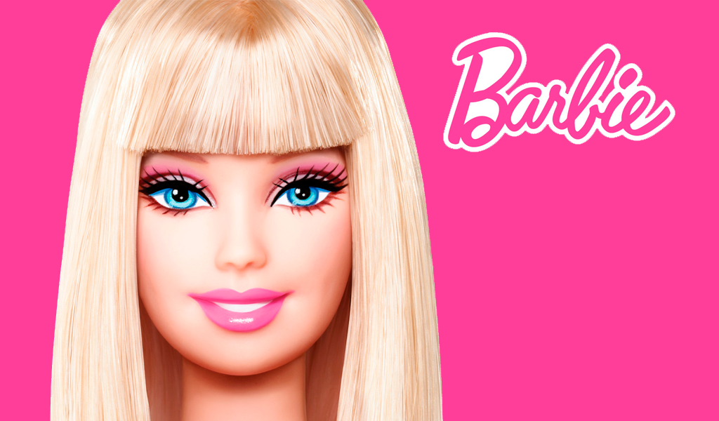
The first step when learning a subject is always to define its meaning. So it is with Barbie logo history as well. Little figure’s but global icon’s full name is Barbara Millicent Roberts. Once a co-chairman of Mattel, Inc, Ruth Handler, observed her infant Barbara playing a game. It was a very simple, fun performance of paper silhouettes. This was the inspiration behind the toy modeling, which was named after the girl. Afterward, the Barbie letters were written by hand and became an absolute breakthrough.
Barbie logo history
The history of the logo Barbie word represents started in March 1959. The emblem was created the same year as the doll’s first launch. Place of ’birth’ – Mattel Creation, California, United States of America. The popularity of a toy was swiftly growing, and the logo has been greatly conducive to it. Even now, regardless of the competition on the market, it remains a favorite print to many.
Barbie logo evolution
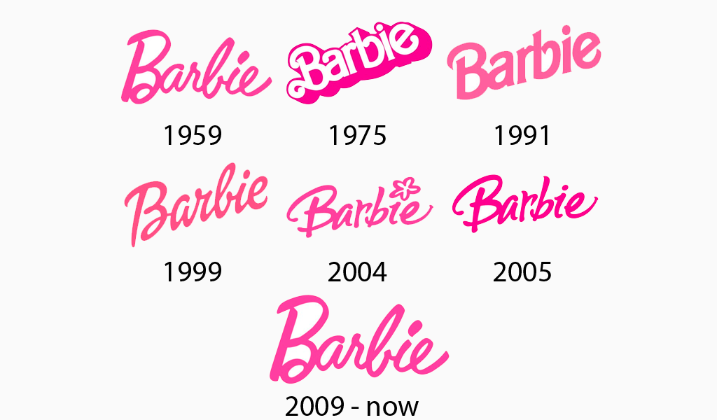
1959-1975
The original pink Barbie logo was a simple calligraphically written name. Laconic yet at the same time a bit offhand. The letters are placed on two levels: ‘B’ and ‘b’ on the lower and the rest slightly higher.
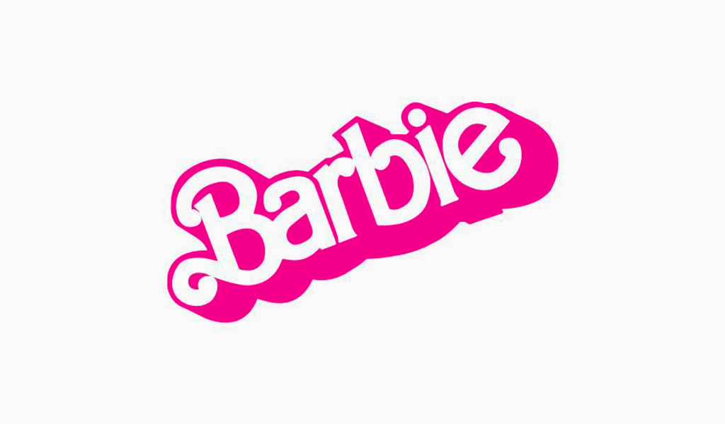
1975-1991
In 1975 was redesigned not only the font and color of a markword, but also its direction. Now, the emblem is bent to the right upper corner. The pink and white bolder than before the typeface takes place.
1991-1999
Diagonal remains here as well as in all further variants. In 1991 the logo appeared in delicate pink. The font is changed to a more contemporary sans-serif one.
1999-2004
In the 1999 update, the calligraphic style was reintroduced, enhancing the logo’s classic essence.
2004-2005
This is the shortest term of the doll’s logo variation lasting. Its identity consists in becoming more playful and ‘i’ letter specific. The dot was replaced by a flower.
2005-2009
In 2005, the floral element was removed, yet the typography remained consistent with previous designs.
2009-present
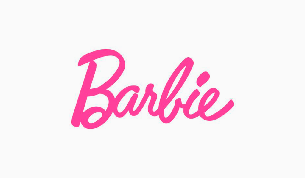
The up-to-date symbol is a Barbie head logo, which consists of the doll’s schematic representation with the original 1959 script underneath. After all modifications, the company came back to the old Barbie logo.
Barbie logo font
Barbie’s letter typeface is upon identifiable. Although, as was already figured out, the logo underwent a few changes, the style of it was never affected. The letters here assemble an elegant, laconic, cheerful script font, usually italic (except the 1975-91 edition).
Barbie logo colors
Nevertheless, the emblem was mostly presented in pink pallets throughout the generations, it is not the only way the world has known it. We get a chance to see the Barbie logo’s white-colored variation in its very second formation (1975-1991). It is white, but, still, letters cast a pink shadow. No wonder the company has such an appreciation of this tone: it is considered to be optimistic and feminine.
I’m a product and graphic designer with 10-years background. Writing about branding, logo creation and business.

