One of the main features of a logo is its uniqueness. It is because of this that it sets the brand apart from competing companies and makes it more memorable.
When designing a logo, the designer, of course, tries to make the graphic image exclusive. It would seem that in the implementation of this goal there is nothing difficult: a specialist at the disposal of a huge number of techniques for making the logo unique. In order to avoid similarity with other brands, you can change the content, shape or color palette of the graphic image.
But despite this, there are similar logos all over the world. This is due to the fact that the designers in their work, above all, guided by the idea, which should be conveyed to the consumer. The originality of the sign was of secondary importance, because a strong emphasis on it could disorient the viewer and become a reason to miss the original message.
Below we will consider similar logos of companies whose products or services we often have to deal with in our daily lives.
Examples of similar logos
The first place on similarity should be given to the logos of Carrier and Ford. The first one specializes in the development and production of climate control systems. As for Ford, it is a major automaker of cars and commercial vehicles.
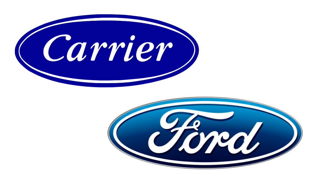
The logos of these organizations have several features in common, namely:
- Form. Both are ovals in horizontal projection within a frame;
- A border. One inner oval and one outer oval. The Carrier logo as such, the outer rim oval is absent, but due to the shadow it gives the impression of its presence;
- The font. It is probably a variety of fonts, but very similar to each other. We can judge this by the letter r which is present in both graphic logos;
- The color palette. The background is in dark blue. As for the color of the letters, they are white in Carrier and light gray in Ford;
- Light distribution. The spots of light are located in different places, but their presence and generally the same size contribute to the “degree of similarity” between the two logos.
The next example of similar logos is McDonald’s and Yummy and Dot. The latter brand sort of continues the activities of the first brand, which interrupted its work in our country for geopolitical reasons.
A rather remarkable example of similar logos can be noted in the brands Gucci and Chanel. They have similar features – intersecting semicircles, the same colors and font. What distinguishes them is the different location of the elements and the name. At Chanel the name of the brand is placed under the symbol, and for Gucci – on the contrary.
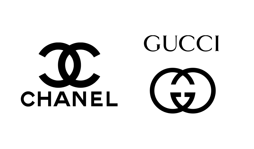
The two companies are competing in one area of activity. The fact is that both Chanel and Gucci specialize in the production of perfumes. Of course, fans are unlikely to confuse the products of these brands, but still the similarity in their case is extremely undesirable.
Similar are the logos of companies that specialize in completely different areas. These are Sun Microsystems, now owned by Oracle, and Columbia Sportswear. The first one produces software and hardware. The second specializes in sports and winter clothing, which can be found in almost every sporting goods store.
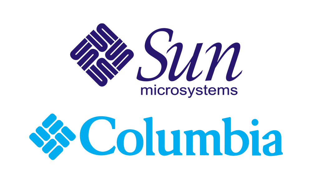
One look at the logos of these organizations is enough to understand the common detail they have in common. It is a rhombic symbol, built from eight elements of the same size. If they were painted in the same color, the similarity would be even greater.
The names of the companies on the right side of the symbol are also a common detail. It is unlikely these organizations made a complaint to each other about the similarity of the logos. After all, their fields of activity are completely different, and they are not competitors.
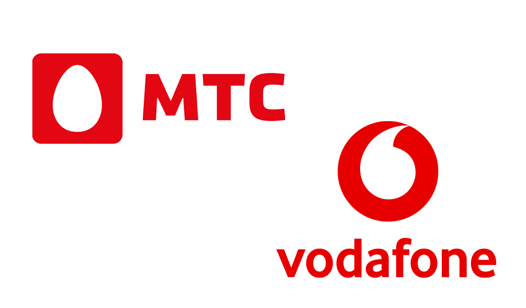
A few common details can be found in the logos of such companies as MTS and Vodafone. Incidentally, they specialize in the provision of cellular services. But MTS is aimed at the Russian market, and Vodafone at the European market. The similarities in the brands of these organizations are the color palette, location and font of the characters, as well as the emblems.
The challenge of logo resemblance
It would seem that the companies with similar brands should fill each other with lawsuits. In reality, it happens very rarely and only when organizations have the same target audience. That is, they act as competitors.
In other cases, similarity is not a problem for the following reasons:
- Completely different areas of business that do not overlap in any way, so there is no need to compete for customers.
- Different target audiences. For example, one company produces children’s clothing, and another – closet items for adult citizens.
- Different markets. There are global brands, and there are those who sell their products and services only in one country. Even if the companies work in the same direction and have similar logos, different markets will not cause overlapping of their interests.
Conclusion
Your own mark should not completely copy someone else’s logo. In this case, brand recognition will suffer. There is also a chance of being accused of plagiarism. But the common features of graphic images can still be present, as they emphasize certain brand qualities.
It should not be doubted that consumers will be able to distinguish products of different companies even if they have similar logos. Therefore, there is no need to be afraid of similarity.
I’m a product and graphic designer with 10-years background. Writing about branding, logo creation and business.


