The most iconic logos are clever, beautiful, creative, memorable and often even funny.
As you know, designing a logo takes time. You need to do research on your target audience before you can come up with any ideas.
Let’s get creative with our list of iconic logos from the UK.
Let’s get started.
Table of Contents
Jaguar
Jaguar cars are synonymous for luxury and British style. They produce high-end vehicles that are not only functional but also beautiful to look at.
Jaguar’s logo is a perfect representation of their brand with its leaping Jaguar and custom-designed font.
The cat’s explosive leap is a perfect metaphor for their fast acceleration. Meanwhile, the silver all-caps logo font is bold and authoritative but doesn’t take away any of the animal’s impact. The logo looks alive and ready to go thanks to clever 3D shading.
Cadbury
Cadbury’s logo is instantly recognisable by chocolate lovers and sweets fans. Purple is the traditional color of royalty and high-class in the UK. This theme is perfect for chocolate!
Cadbury also created their own font to stand out in their logo.
Their message is simple. Cadbury’s chocolate is the best.
UK National Lottery
The UK National Lottery was not always popular in the UK. They decided to rebrand in 2002 due to falling sales. They were not interested in selling scratch cards or playing the lottery.
They unveiled their new logo in 2006 and increased their advertising. It worked like magic.
The new logo is very effective as they have managed to combine their main message into one image. You don’t need any skills to play the lottery. All you need is luck.
Underground London
The London Underground, or as Londoners refer to it, “the tube”, was opened in 1863. It was the first underground passenger train system.
There are 270 stations, and 250 miles of tracks. Did you know that only 45% is underground? Most of the tube is located on the surface.
A little over 5 million commute by tube each day, which equates to more than a half a billion people every year.
Even more amazing is that the London Underground logo has remained virtually unchanged since 1916. Because of its bold primary colors and clear sans-serif font, the iconic UNDERGROUND red circle and blue bar are immediately recognizable.
BT
British Telecom, BT, is one of the most prominent UK companies. It provides broadband internet, mobile services and TV subscriptions, not only to Great Britain but also to other countries.
BT’s logo has had a unique icon for its name since the beginning. They used an abstract multi-colored globe until recently. This beautiful representation of their global reach was stunning.
They unveiled a brand new logo in 2019 with a different concept. They have chosen a minimalist approach and have obliterated their icon.
The new, stripped-down design features sans-serif BT letters in a plain circle. This makes BT’s brand identity more simple and appropriate for digital environments where logo space is limited.
Rolls Royce
Rolls Royce is known for making the best cars in the world. Rolls Royce has become a brand synonymous with luxury and wealth.
They only use the finest materials for their cars. Most of the production line is made up of highly skilled workers who handcraft the car during its assembly.
It’s difficult not to imagine yourself driving a Rolls Royce when you see it. Or even in the back, while the chauffeur drives. Their logo, which consists of two overlapping Rs, is a major driving force behind their brand.
This design speaks to a premium brand who knows their value. It is timeless and simple. If you’re looking to create a high-quality brand logo, sometimes less is more.
PG Tips
English people love tea and PG Tips are their favorite. You can find hundreds to hundreds of PG Tips in any UK supermarket.
In their logo design, PG has used calming red and green shades, and a noticeable-but-straightforward green leaf. This logo is eye-catching because of its contrast colors, but it also has a soothing and calming effect. It’s the perfect combination to represent your tea brand.
British Cycling
Brits love to ride their bikes (just ask Boris Johnson, their Prime Minister). The British Cycling organization provides support and advice and helps with planning events.
Their logo features clever imagery. With just a few lines they have created an image of a bicycle-riding rider. Is it possible to communicate your brand’s name only using images?
Boots
Boots has many stores throughout the UK that can be accessed by anyone who is looking for beauty and health products.
They’re also jumping on the minimalism train. While they have retained their iconic font, which is easily recognisable on the high street, they have now changed their background to a simple yet elegant and vibrant purple. Their logo communicates trust and intelligence, which is a great choice for a brand that emphasizes health and beauty.
Virgin Media
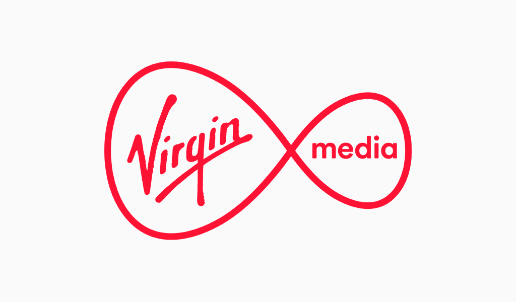
Virgin Media, Richard Branson’s company, is very similar to BT. It offers internet, phone, and TV subscriptions. Virgin Media’s original logo was more detailed than it is now. They, too, followed the trend of simplifying their design to match the current pattern of simple, clean, minimalist logo designs.
The Union Jack flag was even dropped from their logo and replaced with the word MEDIA. They simplified their logo so that it can be used across many marketing channels, online and offline.
Virgin Media uses red for its primary brand color. Their logo, which is a combination of their distinctive Virgin font style and their stick-to-it attitude, is immediately recognisable.
More to you
Your logo is a sign of your presence online and in the real world. It is also a representation of your brand’s identity, products, and services. This is why it’s so important to do it right.
As you can see, many UK brands have updated their logos over the years to reflect changes in their businesses and keep up with current trends.
It is never too late for a logo rethink and to learn from some of the most successful companies about the secret sauce to logo success.
Now that you’ve being inspired, why not try Turbologo Logo Maker and design the next iconic UK logo.
I’m a product and graphic designer with 10-years background. Writing about branding, logo creation and business.

