If you can recall all three elements, you are a genius melody composer. Music has been a part of our lives since time immemorial and has influenced our moods.
Technology has changed the way we listen to music. It is now much easier to access millions upon millions of songs thanks to technology. The impact of one brand can be huge, with streaming technology leading the way. The brand ambassador is Spotify’s logo.
The iconic Spotify logo can be found everywhere. The iconic Spotify logo is everywhere, on smartphones, tablets, and PCs. It attracts attention on websites, social media handles, and app stores other promotional mediums.
Table of Contents
Spotify logo history
Spotify is one of the most well-known music streaming apps. Spotify was created in 2006 to stream millions of songs and allow users to create personalized playlists. The first Spotify logo was introduced in 2008.
The company’s current value is $16 billion, further proving its exciting success in music, podcast, and video streaming.
Spotify is an app that’s accessible worldwide and can be used on many operating systems. Spotify has been a huge success in the ten years since its creation.
Spotify had 170 million monthly active Spotify users in May 2018. That’s 170,000,000 people listening to true crime podcasts, downloading top 40 albums, and viewing new music videos.
Spotify has much to offer its expanding audience. In 2014 they decided to update their logo to reflect the modern look they were trying to create. It was a vibrant and exciting design that was both simple and eye-catching.
Spotify logo evolution
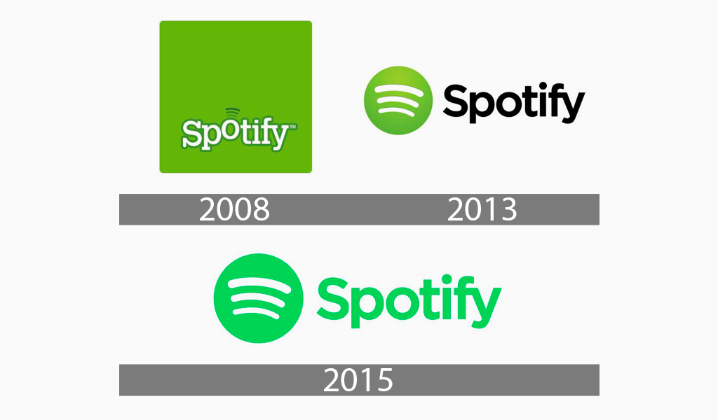
The current Spotify logo is different from the original. The iconic design, known as the music headstone Spotify logo, has been updated twice in the past 12 years.
The first logo of Spotify — 2008

Unlike IKEA, Spotify chose not to use this element, another Swedish business that proudly displays its national colors in its logo. The first Spotify app logo was inspired by a design that was popular in the 2000s. This is evident in the first Airbnb logo. The original Spotify symbol consisted of the name of the company written in a white serif font. It was unusual for a company logo to use avocado green as the background. It is rare for large logos to choose green as their main branding color. It is associated more with nature. To increase contrast with the background, a slightly darker green was used to outline the letters.
Three slightly sloping, curved lines were then placed above the letter O. This might have been an allusion to sound waves but it is more a representation of streaming. This logo was used between 2008 and 2013.
Spotify logo 2013 to 2015

The Spotify trademark was completely redesigned after five years. The designer removed the wordmark and the square, resulting in a new logotype that features a lemon-green circle with three arc-shaped lines.
The lines were now white, instead of dark green. On the right side, the emblem featured a bold font and sharp lines. The logo is clean and distinctive thanks to the thick stripes and even font.
Spotify logo from 2015 to the Present

In 2015, Spotify’s official signature was redesigned. Although it was a small change, it was still very effective. Both the circular emblem as well as the wordmark were painted in bright green by the designer. The lines that depict waves are still white, but the bright green appears more neon-colored.
Spotify logo: why does it work?
The iconic symbol of Spotify, the green logo, deserves to be included in this list. It is a minimalist and modern logo because it has fewer graphic elements than color, shape, and typeface. It is also balanced and clear thanks to its color scheme.

The Spotify logo is easily recognizable and readable. The logotype can be used on any advertising platform and is flexible and adaptable. Despite two major updates — often referred to in discussions as Spotify change logo — it is clear that it still retains its core tone.
Its consistency has been well received by its audience. It has allowed the brand to gain trust and gain followers. It is a powerful logo because of its positive attributes that align with branding rules.
Spotify logo meaning
You must ensure that all elements of the logo are aligned. This design principle is the basis of Spotify’s official logo. Although some people imagine a Spotify logo tilted, the real version has a circular shape, a green color, and a legible sans-serif font. It has fewer elements which give it a modern look. Let’s take a closer look at the various elements of the Spotify logo.
The shape and Spotify symbol

A Square
Spotify’s original logo used a square rounded. A square can represent many things. It can represent directions: north, south, east, and west. It is an element of nature and represents fire, water, air, and earth. Square shapes are used in business to convey stability and reliability. It can also convey a sense of honesty and unity. Its rounded form communicates friendliness and softness.
A circle
A circle can be linked to the sun, moon, and earth. It can be made with a feminine tone. A ring is unique because it has a particular shape. It represents love, community, and infinity. Good music is timeless. Spotify chose a solid figure to be its trademark. It acts as the background green for the three arc-shaped lines. A circle can be used to symbolize integrity, commitment, and perfection.
Sound Waves
All logotypes of Spotify have featured sound waves. Three lines represent musical energy or waves, from the original logo to the current. This shape is what makes Spotify a music company. These horizontal lines, which are free to move, convey a feeling of distance, calmness, and never-ending.
The Spotify logo colors
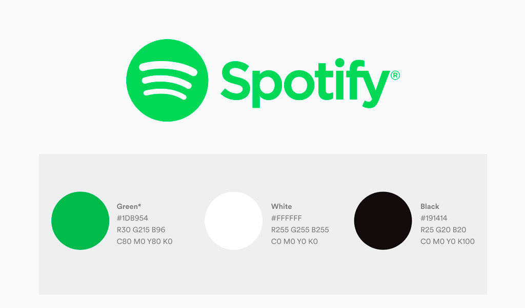
Black color
Black is the company’s most familiar color. The current wordmark is a solid black color on a neutral background. It is black because there is no light. This has close ties to the mystery. The emotions that colors can convey are many: they can either emit positive or negative vibes. Spotify chooses the color because of its positive emotions. It is used to symbolize power, leadership, and elegance.
White color
White is often associated with angels, heaven, and weddings in many cultures. It is also a symbol of purity, cleanliness, and innocence. It can be used by brands to promote freshness, goodness, and simplicity. The color represents Spotify’s sound waves and is the current Spotify logo. In the original logo, the brand’s name was white. White is neutral and the opposite of black.
Green Color
The natural world is dominated by green. It is the color we associate with wealth, vegetation, and rebirth. It’s also soothing, stress-relieving, and refreshing. It is also a symbol of growth, prosperity, and freshness. Spotify’s main color is green. Spotify has always favored the cheerful and healing color green, from the very first trademark to the current one. Its wordmark has been featured in three forms: a square, circle, and wordmark. Spotify uses green to convey a sense of calmness, serenity, and progress.
Spotify Logo font
The Spotify logo was designed in a sans serif font, or a modified Gotham. It is legible and easily identifiable thanks to its thick, straight lines. It conveys the identity Spotify is trying to communicate to its target audience.
Why is the Spotify logo tilted?
The Spotify logo looks slightly tilted because of the curved sound waves inside the circle. Some people interpret this effect as the Spotify logo tilted, but in fact the official design is perfectly balanced. The three lines are intentionally curved to symbolize sound and music waves, creating a sense of motion and energy while keeping the logo modern and simple.
Some users even wonder “is the Spotify logo crooked” when they first see the design. This impression comes from the curved lines, but they are deliberately tilted to symbolize sound and music.
Final words
Easy to remember logos are the best. The most memorable logos are engaging, fun, and intriguing. They are everywhere and everywhere. Truly great logos cannot be overlooked, lost or forgotten in the crowd.
Spotify does this in many ways, including its app design and website. It also uses subway walls to advertise its products. The new logo for Spotify is vibrant, interesting, and difficult to miss. The bold green design encourages you to dig deeper and adds class and sophistication to Spotify’s position as a leader within the music streaming industry.
I’m a product and graphic designer with 10-years background. Writing about branding, logo creation and business.

