A logo is a visual language through which a brand’s personality communicates with its target audience. A perfect logo should be instantly recognizable and easily reproducible. Don’t confuse viewers with lengthy explanations about all aspects of your company’s activities. It is much better to reach potential customers with a simple logo and its clear message. Here are the most valuable logo design tips for your attention.
Create your own logo with Turbologo logo maker. It takes less than 5 minutes and no design skills needed.
Go to Logo MakerTable of Contents
Take Advantage of AI Assistance
Do you want to design your own logo but don’t have the experience or skills of a graphic designer? This is no longer a problem. With the help of advanced contemporary services based on AI, you will receive hundreds of ready-made solutions for a wordmark logo or combination marks just by specifying a minimum of data. One such site is Turbologo. The entire logo design process is built step by step for the convenience of the user.
First, you enter the company name and its field of activity. If you wish, you can choose different elements like the logo colors, icons, and slogan yourself. Moments later, numerous layouts in different styles unfold. Choose your favorite logo type option and change it as you like; a vast range of customization tools are available for free!
There are a Few Things to Keep in Mind When Editing
Design elements should be combined: use either the same thickness of lines for graphics and font, or, on the contrary, very contrasting ones to create interaction between the components of the abstract logo. Unnecessary design elements or decorations have no place in a good logo design.
After finishing the design process, evaluate how your logo design looks on the mockups on the same page. If you like everything, then choose your preferred service package and download the logo for instant use. An additional advantage of Turbologo is the option of adding full-fledged branding materials with a new logo and free editing for up to a year.
Design Must Be Versatile!
The main requirements for a modern logo are versatility, adaptability, and scalability. This means that the logo and its visual hierarchy should look equally good and readable on letterheads, business cards, billboards, and even on the site’s favicon. If you use a lot of minimal details or different shades, then when reduced, the logo will merge into an unreadable spot that does not carry any semantic meaning.
An Important Point: Check how a color logo will look in monochrome, as you may sometimes need such a version for printing. Important details should not disappear; visual elements should not merge with each other.
Logos should only be designed in vector graphics; this format is pixel-free and scales easily. Also, it is better for printing. Even if you’re not planning to print anything now, everything may change in the near future; it is better to be prepared for such a situation.
Tips for Working with Color
Colors have meaning and correspond to brand values. Most often, designers are recommended to adhere to these associations in their work, but when designing a logo, it is more important to take into account the scope of the business. Flashy and aggressive colors are not suitable for eco-brands; it is better to choose natural shades, but for products or services in the high-tech sector, there are no such restrictions.
- Choose a color palette that differs from your competitors’ to make your logo stand out.
- Think about the compatibility of the color with white space in the background, since the logo is very often placed on various media: packaging, website, merch, signs, etc.
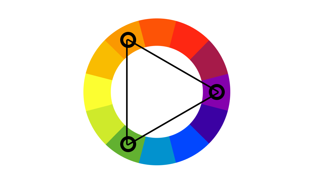
- Refer to the color wheel to choose the best combinations, shades that complement each other.
- Don’t use too many colors, especially in minimalist logos.
- Avoid a deep tone; it looks dirty.
- Be careful with gloss; it can take your logo into a retro style.
Avoid Using Clichés in Professional Logo Design
Clichés are developed not only by automated services but also by people. This often stems from a lack of experience and knowledge. This problem is typical for a professional designer with little experience, as well as for business owners who decide to independently design a logo and brand identity.
Surely you have come across examples of such corporate symbols more than once. For example, if you enter the phrase “transport company logo example” into your browser search, then six out of ten proposed logo options in one way or another play on the theme of cars and trucks, and another three are roads. These logos are strikingly similar. They do not allow you to distance yourself from competitors, do not increase brand recognition, and eventually do not constitute a memorable logo.
Important! Excessive creativity is also harmful. It makes it difficult to perceive both the visual image and the meaning. Look for a middle ground. A good brand’s identity does not use ready-made clichés but takes into account category trends.
Choose the Right Font
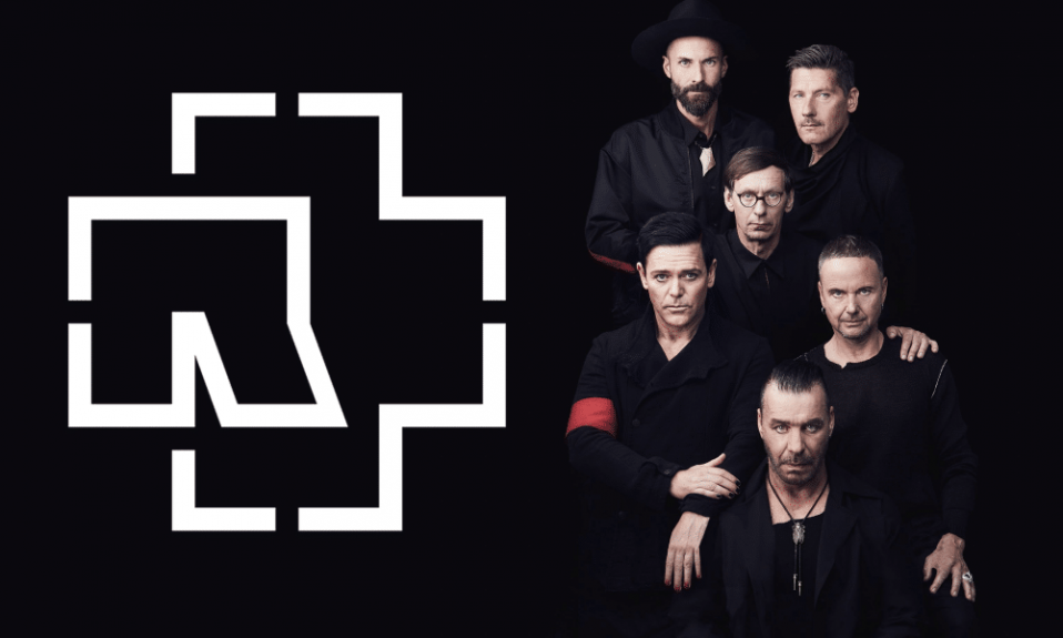
First of all, choose a readable font that should convey the essence of the company, especially when it comes to decorative fonts or monogram logos. First, Serif is widespread for logos that have to look traditional. Second, Sans-Serif fonts tend to be used in contemporary business logo typography (FedEx logo). For example, if you run an IT-related company (tech blog, etc.), you might consider using a handwritten sans-serif font.
Fonts should be compatible with logo symbols. The logo should evoke certain emotions in the target audience and be further associated with the brand’s identity; to achieve this, you should listen to your own feelings and have good observation skills.
Avoid Outdated Graphic Techniques
When Photoshop, Adobe Illustrator, and other photo editors became popular, many people became interested in graphic design. Using the effects built into the program, homegrown designers did not follow any golden rules and acted in accordance with their initial idea of a great logo. At first impression, it looked fresh, unusual, and interesting. But gradually this approach discredited itself, and some of the techniques almost ceased to be used. At the same time, for some unknown reason, some customers persistently ask for these effects to be added when developing logo designs.
The top three legacy effects to avoid are shadows, glows, and 3D volume. When using these techniques, the logo becomes inconvenient to use, loses its versatility, and looks worse on various media.
Of course, there are exceptions. Sometimes glow, shadow, or volume form organic shapes. But this happens only in cases where they are initially included in the brand identity design and reflect some idea.
Summing up
While creativity is significant in logo design, we should never forget about composition, the combination of fonts, color palette, and much more. We are sure that now you know how to approach such a serious task and will be able to design a truly effective logo with a lasting impression on Turbologo.
Blog editor and content marketing specialist at Turbologo. Writing about Marketing and design. Victoria’s articles contain useful tips on how to build a brand and promote it online.