Over the past ten years, I’ve reviewed thousands of logos — from rough drafts by small business owners to the emblems of global giants. But few designs captivate me like the Chanel logo. It’s clean. Bold. Enduring.
If you’re building a brand that’s meant to last, exploring the history of the Chanel logo is more than inspiration — it’s practical. In this guide, we’ll look at the Chanel logo evolution, uncover the Chanel logo’s meaning, and explore how the most recognizable monogram in the fashion world became a lesson in identity.
Table of Contents
Chanel Logo History
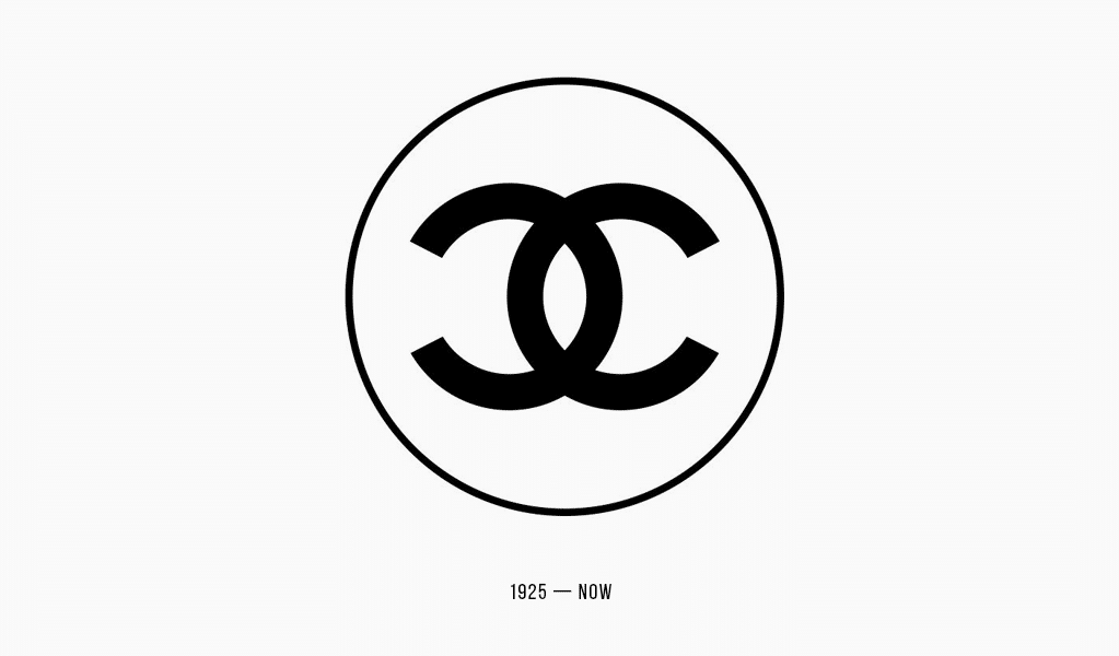
The Chanel emblem — two interlocked, mirrored Cs — debuted in 1925 alongside the launch of Chanel No.5. But to truly understand the logo of Chanel, you need to go further back.
Coco Chanel (born Gabrielle Bonheur Chanel) started out designing hats in a small Parisian boutique in 1910. As her influence grew, so did the need for an emblem that matched her vision. Instead of something elaborate, she chose her initials — a choice both personal and powerful.
The Coco Chanel symbol — two clean, overlapping C’s — was striking in its time. Its symmetry and lack of ornament stood apart. Some say the idea came from the stained-glass windows at Aubazine Abbey, where Chanel herself spent part of her youth. Others believe it was a tribute to Arthur “Boy” Capel, the designer’s great love and early supporter — whose initials were also C.
Whatever the source, the Coco Chanel emblem quickly became part of everything: perfume bottles, handbags, jewelry, couture. The Chanel logo text, often in black and white, reflected Chanel’s core philosophy. She saw black as a symbol of elegance and strength, rebellion, and minimalism. No gold, no embellishment — just presence.
Expert tip: When creating your own logo design, start with meaning. Don’t chase trends. Ask: what visual symbol reflects your story, your values, your name? That’s the foundation of something timeless.
What Does the Chanel Logo Mean? Decoding the Symbolism
On the surface, the Chanel symbol is a monogram — just two Cs. But its message goes deeper.
The brand has always stood for confidence and independence. The Chanel brand identity wasn’t built on extravagance, but on refined clarity. In that light, the logo becomes a metaphor: clean, deliberate, and whole.
Some say the mirrored Cs suggest duality — masculine and feminine, bold and soft, simplicity and richness. Others see the outline of horseshoes — a nod to luck, something Chanel admired. There’s even a hint of an eye in the negative space — watchful, precise.
More than anything, the Chanel logo meaning is emotional. It stands for restraint, assurance, and the kind of status that doesn’t scream. Chanel wasn’t just selling fashion — she was shaping how women felt about themselves. Her logo and identity made that feeling visible.
Chanel Logo Evolution
In nearly a century, the old Chanel logo has never been redesigned.
Let that sink in.
While many fashion houses have changed their look to keep up with trends, the Chanel symbol has stayed exactly the same. The story of the Chanel logo evolution is one of loyalty — not reinvention.
In the 1940s, the company added a bold sans serif wordmark: CHANEL, in all caps. This Chanel font style was minimal, modern, and assertive — a perfect match for the symbol. No serifs. No frills. Just structure.
Later on, the Chanel text font continued to appear on packaging, bags, garments — sometimes embossed in gold, sometimes printed in black, always unmistakable. But the logo itself? Untouched.
Expert warning: Many businesses redesign their logos too soon or too often. This weakens recognition. Unless your current logo is clearly working against you, improve it — don’t erase it.
Lessons from Chanel: How to Apply This Logo Wisdom to Your Business
You don’t need a global fashion house to create a memorable logo. You need focus. And the iconic Chanel mark teaches us exactly that.
Here are three simple lessons:
- Simplicity is strength. T. e entire Chanel brand logo is two letters. Yet it carries more meaning than many detailed logos ever will. Focus on the one idea you want to communicate — and express it with clarity.
- Consistency builds identity. The logo of Chanel has lasted almost 100 years. That’s why people remember it. Change confuses; consistency earns trust. Stick to a core design, and build recognition over time.
- Design for flexibility. The Coco Chanel logo appears on everything from perfume boxes to Instagram posts. Sometimes it’s gold, sometimes white on black, but it always works. Your logo should do the same — clean enough to live across sizes, colors, and mediums.
Let’s say you run a bakery named “Anna Bella.” A refined “AB” monogram could be your own Coco Chanel symbol — unique, memorable, and tied to your name.
This is exactly where tools like Turbologo help. Our AI-powered logo maker lets you experiment with shapes, initials, and layouts in seconds — no design skills required.
Chanel Logo Font
While the symbol does the heavy lifting, the Chanel font style plays a key supporting role. It’s a custom sans serif typeface with even stroke widths and geometric simplicity — a font that demands attention without shouting.
Fans often ask, “What is the Chanel text font?” It’s proprietary, but similar fonts include Helvetica Neue Bold, Couture, or CC Wild Words — modern, minimal, and confident.
Expert tip: If you’re pairing a wordmark with a symbol, skip decorative fonts. Choose something strong and neutral. Let both parts work together — not compete.
The Chanel Logo Today: From Fashion to Culture
The Chanel sign is no longer just for handbags. You’ll see it in memes, NFTs, TikToks, and clothing and street murals. It’s not only a fashion house icon — it’s a visual shorthand for taste, value, and legacy.
Because the brand never watered it down, the Chanel emblem remains sharp, even in fast-paced digital spaces. It’s not just a logo anymore — it’s a wearable identity.
And that’s the real takeaway: if your logo is strong enough, it outlives trends, devices, and even product lines.
Chanel Logo: Key Inquiries on Its History and Design
What does the Chanel logo mean?
It represents Coco Chanel’s initials — but also reflects elegance and timeless identity.
Has the Chanel logo ever changed?
No. Since its debut in 1925, the Chanel old logo and current design are nearly identical.
What font does Chanel use?
A custom sans serif font similar to Helvetica. Sleek, minimal, and bold.
Is it okay to use initials for a logo?
Absolutely. Monograms like the Coco Chanel logo, LV, or GG are famous for a reason — they’re flexible, simple, and rooted in identity.
Final Thoughts
The Chanel amblem proves a simple logo can say everything — when it has meaning behind it.
A strong identity isn’t about trends or tricks. The Chanel symbol text, with its mirrored restraint, reflects a mindset: bold, intentional, timeless.
Whether you’re launching the most exclusive brand or a local coffee shop — your logo is the first handshake. Make it real.
And when you’re ready to explore ideas, use an AI logo tool like Turbologo. Start simple. Test. Refine. Build something that lasts — just like the Chanel brand identity.

SEO specialist, link builder, and blog editor at Turbologo. Writing insightful content about marketing, design, and branding. Sharing practical tips on building and promoting brands online.