
Over ten years of working with logos, I have seen the same situation many times. A business owner carefully calculates rent, advertising, equipment, and salaries, then assigns whatever happens to remain to branding. In a rush, they choose the first suitable icon, place the company name next to it, and consider the job finished.
Six months later, it turns out that the mark cannot be printed clearly on a storefront sign, the font does not support all required characters, and the website, social media pages, and sales proposals look as though they belong to three different companies.
In this guide, I will explain how branding on a budget works, what kind of visual identity a small business needs at launch, and which elements do not deserve investment yet. The main principle is simple: reduce the size of the system, not the quality of its foundation.
Table of Contents
Budget Branding Does Not Mean Cheap Design
First, it helps to separate three concepts that business owners often confuse.
A brand is the impression that remains after a customer interacts with a company. Brand identity is the set of visual signals that help people recognize that company. A logo is only one element within this system.
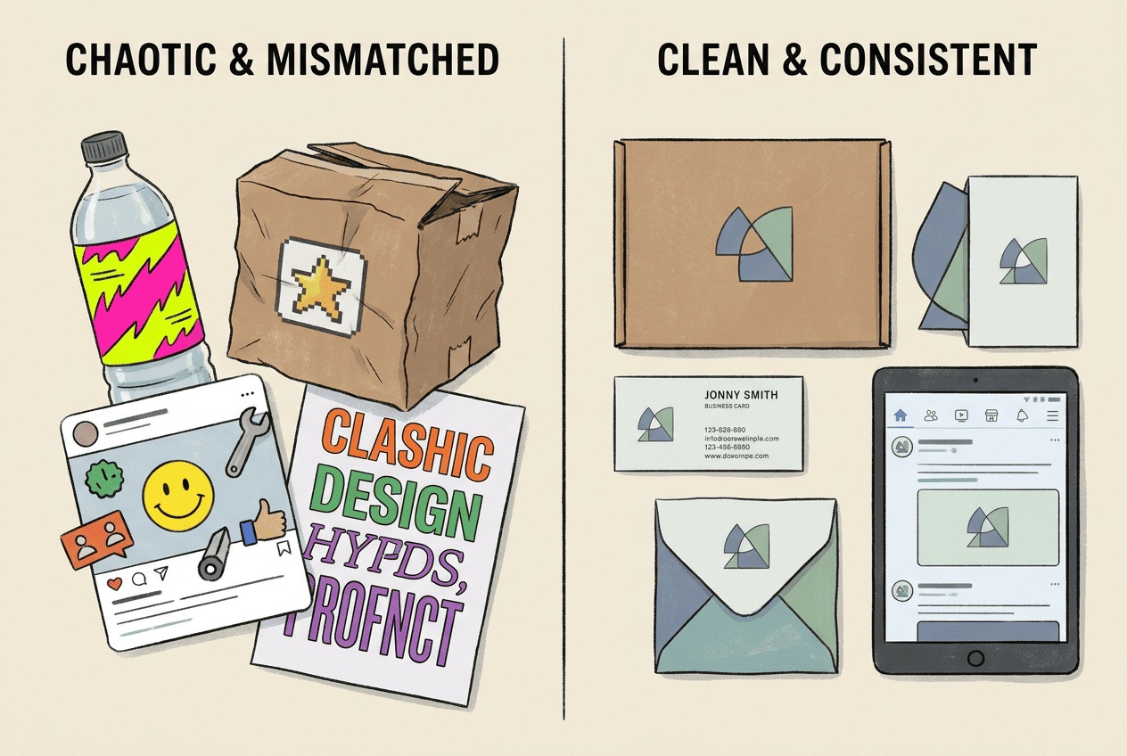
Consider a small coffee shop. It has a clean logo, but the menu uses an unrelated font, social media posts appear in five different colors, and the cups display another version of the business name. Technically, the coffee shop has a logo. Customers still do not see a coherent brand.
That is why corporate identity does not begin with an attractive picture. It begins with rules. How should the name appear? Which colors repeat across materials? How should advertisements look? Which version of the mark belongs on a dark background? Clear answers reduce the amount of money spent on redesigns.
A budget-conscious approach does not require dozens of branded applications or a 150-page brand book. A business can launch with a minimum viable identity, sometimes called MVP branding.
This basic system includes:
- primary and compact logo versions;
- a palette of coordinated colors;
- two suitable fonts;
- templates for the main customer touchpoints;
- brief usage rules;
- files for websites, social media, and printing.
Everything else can be added when a real business need appears.
Expert tip
Do not start cutting costs by removing essential logo files and variations. Postpone merchandise, mascots, and complex illustrations instead. Keep the vector file, transparent background, monochrome version, and usage rules. These technical details often become expensive problems later.
What a Business Needs at Launch
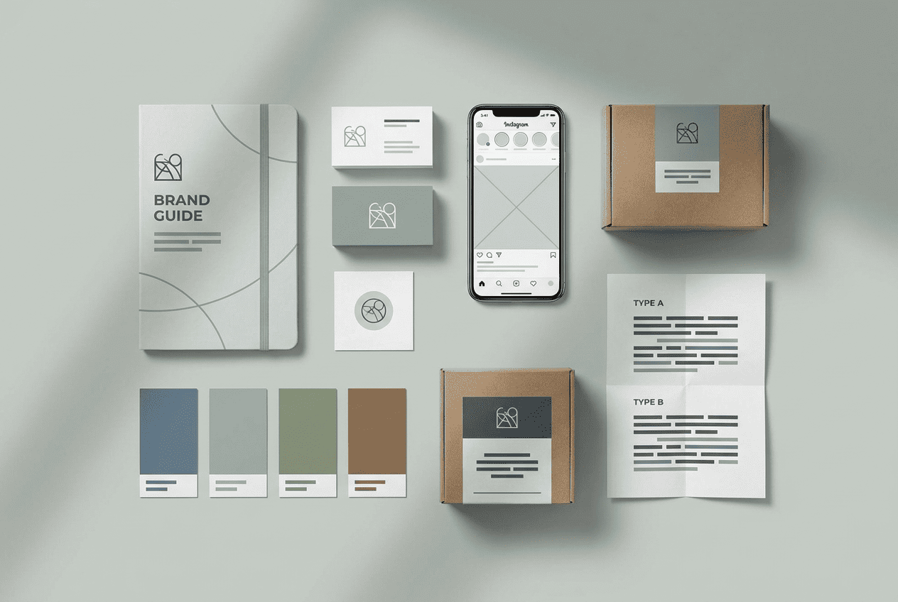
There is no universal list of branded materials. A construction company, an online store, and an independent consultant need different assets.
A coffee shop should first design its sign, menu, cup, map listing, and social media pages. A consultant will get more value from a profile image, website, presentation, and documents. An online store needs product cards, packaging, advertising banners, and a favicon. A construction company may prioritize sales proposals, employee uniforms, and vehicle graphics.
Problems begin when a business owner pays for every possible layout before launch. Half of those designs may never be used.
Choose three to five touchpoints through which customers interact with the business most often. This creates a practical branding budget rather than a decorative shopping list.
The Logo and Its Variations
A primary logo rarely works on every platform. A long company name may look good in a website header but turn into an unreadable stripe inside a circular social media profile image.
The minimum set should include a primary composition, a compact version, a standalone symbol, and variations for light and dark backgrounds. A single-color version is useful as well. It is needed for documents, packaging, fabric, engraving, and surfaces where full-color printing is unavailable.
Testing takes only a few minutes. Reduce the mark to the size of an app icon. Then view it in black and white and place it over a photograph. If small details disappear, the name becomes unreadable, or the composition falls apart, simplify the logo.
The Color Palette
An initial identity usually needs one primary color, one supporting color, and one accent color. Add neutral shades for backgrounds and body text.
Do not select colors only through simplified charts claiming that blue always creates trust or red always encourages purchases. Context matters more. Blue appears in banking, healthcare, construction, and technology. Its meaning changes through the shade, typography, photography, and communication style.
It is more useful to study five direct competitors. If every company in the category uses dark blue, there are two possible directions. The business can remain within a familiar category code or choose a different visual territory. The correct decision comes from positioning, not a universal color formula.
Check contrast whenever colors are used for website text. WCAG 2.2 recommends a contrast ratio of at least 4.5:1 for normal text and 3:1 for large text. Logos are an exception, but labels, buttons, and core content still need to remain easy to read.
A Font Pair
Two typefaces are normally enough. Use one for headings and another for body text. In some cases, one font family covers both tasks through different weights and styles.
Before choosing a typeface, check its full character set, numerals, currency symbols, and license. An attractive font preview does not guarantee that every required character has been designed well.
A useful starting point is a guide to font types and how to choose them. It helps connect the character of a typeface with the type of business, rather than choosing a font because it looks fashionable in isolation.
A Mini Guide Instead of a Large Brand Book
A small business rarely needs a detailed brand book at launch. A one- or two-page guide is usually more useful.
Record the logo variations, HEX color codes, font names, approved backgrounds, minimum logo size, and several restrictions. Do not stretch the logo. Do not change its colors randomly. Do not add shadows. Do not place it directly against an edge.
This document allows a contractor, employee, or business owner to prepare a new banner without lengthy approvals. As the team and number of communication channels grow, the mini guide can become the foundation of a complete brand book.
Where It Is Safe to Save Money

The main rule is straightforward: postpone elements that do not yet support sales, but retain the technical quality of the foundation.
| You Can Postpone | You Should Not Ignore |
|---|---|
| A mascot and complex illustrations | Logo readability |
| Merchandise and office branding | A vector file |
| Dozens of templates | Versions for different backgrounds |
| A custom corporate typeface | Font licenses |
| A large brand book | Exact color codes |
| An expensive photoshoot | A consistent image style |
| Logo animation | Commercial usage rights |
A low-cost identity becomes expensive because of repeated work, not because of its initial price.
Consider a company that orders a large storefront sign and sends the manufacturer a small PNG file. The image is enlarged to two meters, and the edges become blurry. The company then has to rebuild the logo or pay someone to redraw it as a vector.
Vector graphics describe shapes, lines, and text mathematically, so the image can scale to different sizes without losing quality. A detailed guide to logo file formats explains when to use SVG, PNG, PDF, and other common formats.
How to Choose a Brand Identity Development Method
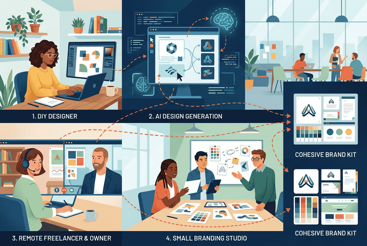
In 2026, a business owner has four practical options: build the system independently, use an AI design tool, hire a freelancer, or work with a branding agency.
Each option has a suitable use case. Arguing about which one is universally better does not help.
| Criterion | DIY | AI Tool | Freelancer | Agency |
| Cost | Low | Low | Medium | High |
| Timeline | Hours to weeks | Minutes to one day | Several days | Several weeks |
| Design skills | Required | Almost unnecessary | Not required | Not required |
| Control over edits | Full | High | Depends on the agreement | Depends on the process |
| Strategic depth | Low | Basic | Varies | High |
| Best use case | Testing an idea | Fast launch | Custom refinement | Large-scale project |
The DIY route works for an experimental product and an owner who is ready to study composition, typography, and file formats.
An AI tool fills the gap between manual design and hiring a specialist. The user enters a company name, industry, and visual preferences, and the system suggests several directions. The result can then be edited and refined.
A freelancer makes sense when the project already has a clear idea that needs professional execution. An agency is justified when a company enters several markets, launches a product portfolio, develops packaging, or undertakes a significant rebrand.
Not every small business needs an agency. At the same time, an AI system does not replace research, customer interviews, or complex brand architecture. The right tool depends on the cost of making the wrong decision.
How to Create a Logo and Brand Kit with Turbologo
A small business often needs more than a single logo file. Colors, fonts, and brand applications should support the same visual idea.
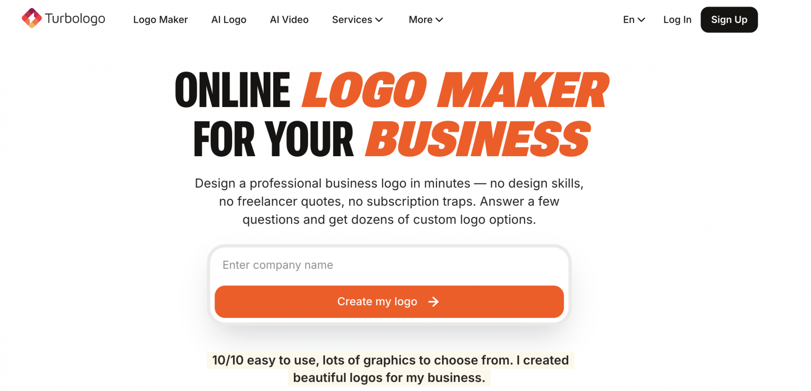
With Turbologo, the process begins with the company name and business category. The service then generates options that differ in symbol, composition, typography, and color palette. There is no need to choose the first result. Save several directions and compare them across the platforms where the brand will appear.
Four areas deserve attention.
The first is structure. Does the horizontal version fit a website header? Does the symbol remain recognizable inside a square profile image?
The second is typography. Is the company name easy to read? Does the font suit the expectations of the category?
The third is color. Does the composition work on white, dark, and photographic backgrounds?
The fourth is the file package. Are there versions for digital and print use, a transparent background, and a vector format?
This process allows a business owner to design a logo with AI without learning professional graphic design software. The value is not limited to generation speed. The owner receives a foundation for a brand kit and keeps the visual language consistent across different materials.
This approach is particularly useful during an MVP launch. The product, name, and positioning may still change, so investing a large amount in an identity that will need revision three months later creates unnecessary pressure. It is often better to begin with MVP branding, test demand, and expand the identity after collecting real data.
Expert tip
Do not evaluate a logo only on a large white screen. Those conditions are almost sterile. Place it in a profile picture, product card, sales proposal, and mobile website header. Weak decisions become visible much faster there.
A One-Day Brand Identity Plan
Moving quickly does not mean skipping the essential stages. It means reducing them to a sensible minimum.
Start by describing the business in one sentence: “We help [audience] achieve [result] through [product or method].” This statement removes random visual ideas. A law firm and an app for teenagers should not look identical simply because both owners like purple.
Next, choose two brand qualities. Not seven or ten. “Calm and competent” already gives a clear direction. A combination such as “bold, dependable, playful, premium, technological, and homely” does not support a useful design decision.
Then study five competitors. Record their colors, logo types, common symbols, and photography styles. The goal is not to copy them. The goal is to understand the visual language of the category and find room for distinction.
Create several logo structures: a wordmark, monogram, symbol with a name, and emblem. Compare directions rather than small details. Choose the structure before moving to color.
Build the palette and font system. Then apply the identity to three primary touchpoints. If the system looks coherent across them, record the rules in a mini guide.
Finally, export the files and organize them into clear folders: “Primary Logo,” “Dark Background,” “Light Background,” “Icon,” “Print,” and “Social Media.” Six months later, this folder structure may save as much time as the design tool itself.
Mistakes That Make Budget Branding Look Cheap
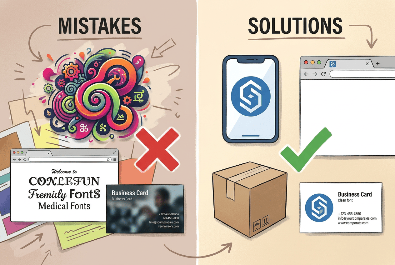
The first mistake is trying to tell the entire company story inside the logo. A coffee shop adds a cup, coffee bean, mountain, founding date, and slogan to one mark. The composition remains visible on the storefront sign but becomes a shapeless spot in a social media avatar.
The second mistake is using too many visual effects. A gradient, shadow, three-dimensional volume, outline, and three decorative fonts do not make a design look more expensive. They make it harder to reproduce.
The third mistake is the absence of a system. Every social media post is designed from scratch, so the company keeps paying for design while still failing to build recognition.
The fourth mistake is choosing according to personal taste. A business owner may love handwritten fonts while the audience expects a clear, structured service. Brand identity should work for the customer rather than decorate the owner’s project folder.
The fifth mistake is copying design trends. In 2026, generators can reproduce popular visual styles quickly. A fashionable shape alone does not create distinction. Recognition develops through consistency, product details, and the character of communication.
The sixth mistake is failing to check usage rights. Before commercial use, review the service terms, font licenses, and origin of visual elements. If the company plans to register the mark, conduct a separate trademark search and consider the requirements of the relevant jurisdiction.
When It Is Time to Expand the Identity
A minimal system is not meant to last forever. It solves the launch problem.
Deeper development becomes necessary when a company enters new countries, creates several product lines, opens a network of physical locations, or gives a large team responsibility for communications. Another signal appears when new materials no longer fit the existing rules and every new application requires a separate design solution.
At this stage, the company may need a design system, brand voice, photography rules, illustration principles, video guidelines, packaging standards, and partner materials. Rebranding may also become relevant. Still, a refresh should not begin only because the owner has become tired of a particular color. Start with an audit and identify where the current identity restricts the business.
Pre-Launch Checklist
Before publishing the website or launching the first advertising campaign, check that:
- the logo remains readable at a small size;
- light and dark versions are ready;
- SVG, PNG, and PDF files are available;
- colors are recorded in HEX, RGB, and, where necessary, CMYK;
- the fonts include all required characters;
- license terms are clear;
- the main customer touchpoints are designed;
- a mini brand guide is ready;
- the mark does not copy a direct competitor;
- employees know where to find the current files.
When every point is covered, the business has a working identity. It does not need to be complex yet. It only needs to look consistent, work across real applications, and avoid creating unnecessary costs.
Frequently Asked Questions
Can I create a brand identity myself?
Yes. For an initial launch, define the positioning and prepare a logo, color palette, two fonts, several templates, and a short guide. Complex projects are better handled by experienced specialists.
Does a small business need a brand book?
A one- or two-page mini guide is often enough at launch. A full brand book becomes useful as the team, number of products, and communication channels grow.
Which logo format is required for printing?
Use a vector SVG or PDF file. PNG works for websites and social media, but large-format printing requires a file that scales without losing quality.
Can I use a logo created by an AI generator for business?
Yes, provided the service terms allow commercial use. Before launching, check the license, available file formats, and editing options.
Conclusion
Strong small business branding does not begin with a large budget. It begins with discipline.
The business needs a readable logo and variations for different situations. It needs coordinated colors, suitable fonts, and several practical templates. Most importantly, it needs rules that hold all those elements together.
Do not try to build the visual system of a multinational corporation on day one. Create a foundation that allows the business to reach customers without visual chaos. Test it across real touchpoints. After the first sales, it will become clearer which parts deserve development and which were simply attractive ideas with no practical use.

I’m a product and graphic designer with 10-years background. Writing about branding, logo creation and business.