Nowadays a retro style is picking up speed because clients want to feel this period through visual associations. Numerous retro elements of company logos and branding include fonts whose designs are reminiscent of the 90s to target specific audiences and evoke warm nostalgia. A visually appealing retro font is critical to adding a vintage feel to any project’s design.
In the 1990s TTF fonts became popular and common, when computers and the Internet began to gain momentum.
Computer editing programs allowed using new OTF fonts because of its unique shape. This period gave a start of sans-serif fonts, as well as a retro fonts’ revival. Designers in the ’90s had a huge variety of unusual word forms, and it was a breakthrough for design.
One of the easiest ways to show a vintage design of your product is quality fonts in the style of the 90s. Retro design is on trend, so everything from food packaging to fashionable clothes evoke associations with past decades.
Table of Contents
What are retro 90s style fonts?
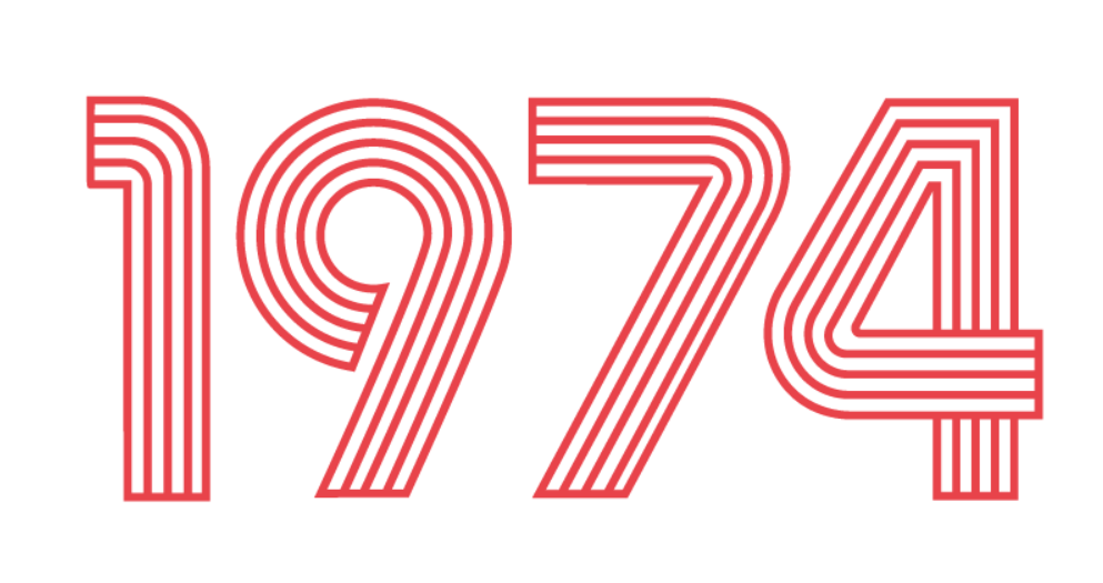
Fonts, which are called retro, were created in the 20th century. Modern designers use retro fonts to show a past era.
Newspapers, TV programs, computer games and marketing encouraged graphic designers to use retro fonts again. Entrepreneurs from the 90s printed vintage fonts in their advertisement.
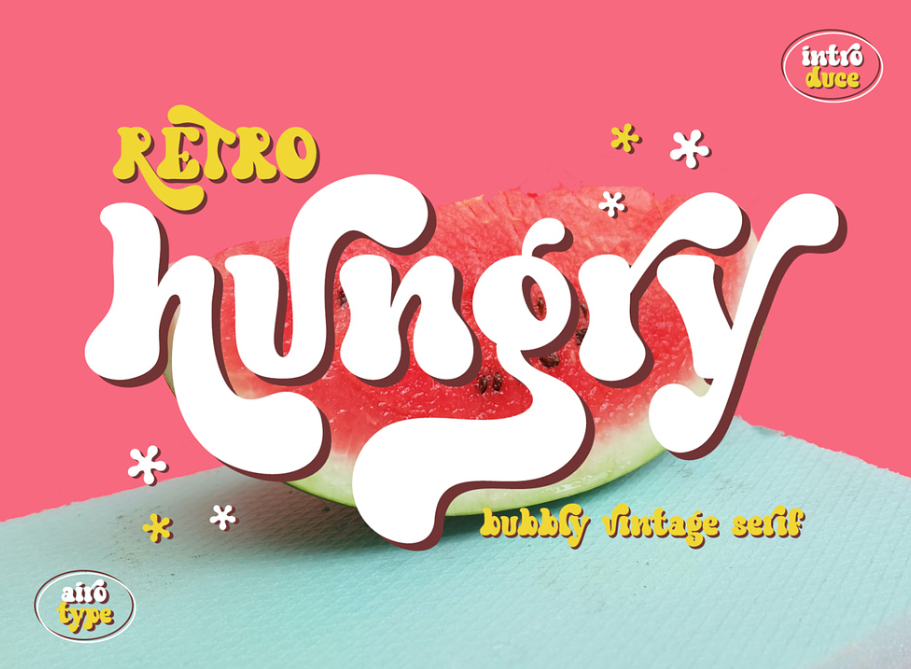
In the twentieth century, each decade differed from the other with its individuality. The 1950s were popular by comics, and the 1990s were more about cartoons.
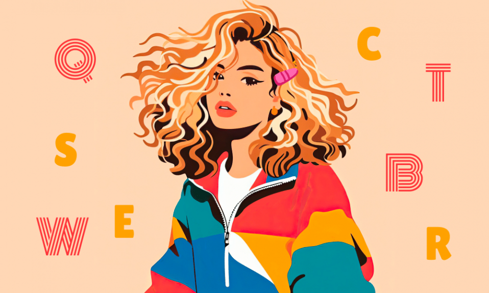
Using fonts of vintage style allows immersing yourself in past decades. 90s fonts differ from others in thickness and size of letters. This style is good enough for show business and the entertainment industry.
Such fonts are popular for creating eye-catching of viewers. Retro fonts are always relevant and create a light nostalgia. At the same time, they may emphasize the non-mainstream nature of the company, time-tested quality, or appeal to a certain time epoch, its values and mood.
Why a 90s font is so unusual?
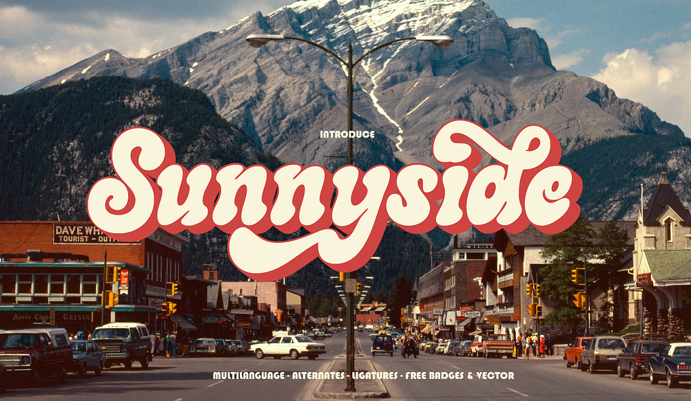
If you’re looking to create a completely historical ’90s atmosphere, then aside from using TTF’s retro Art Deco font materials, there are important characteristics to fully embrace a specific era in your style:
Grunge texture
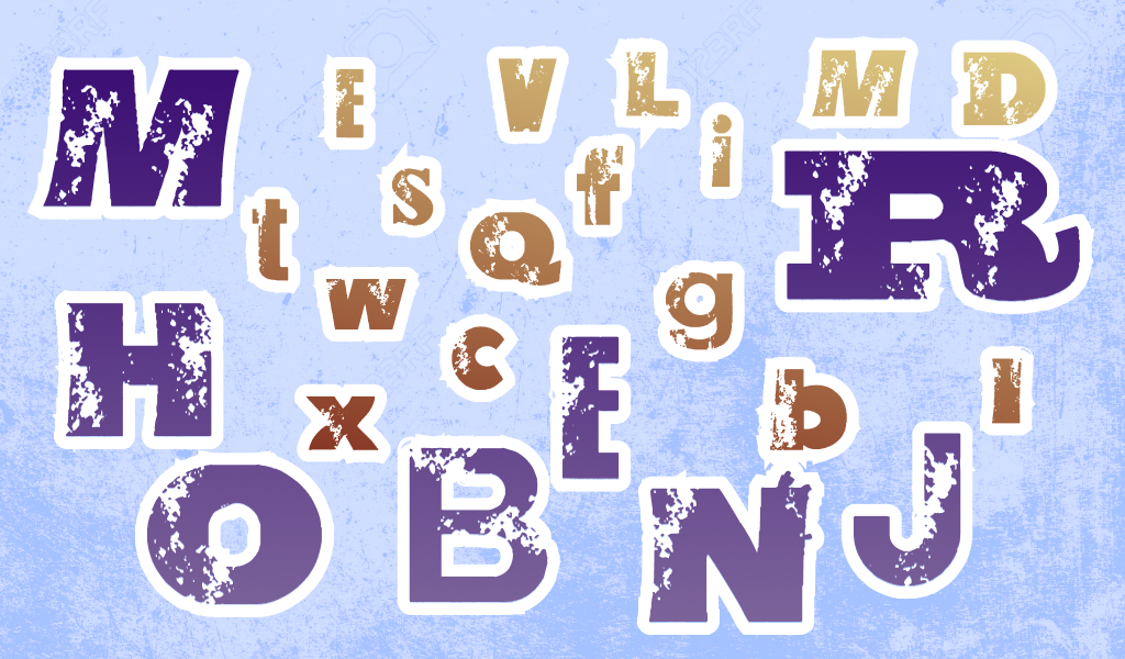
Grunge was one of the symbols of the 90s. A rough edge of letters is a distinctive feature of this period. Grunge fonts imitates using of a real pen or a marker. This style is not neat. It is for those who like a mess.
Rounded shapes
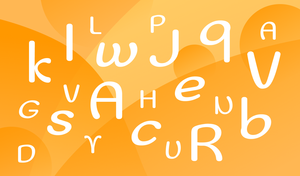
Fonts of vintage style became softer and more rounded. Such elements as spots create the impression of an ancient design and give the text a vintage charm. The 90s font can create an impression of unpredictability and experimentation.
More thickness
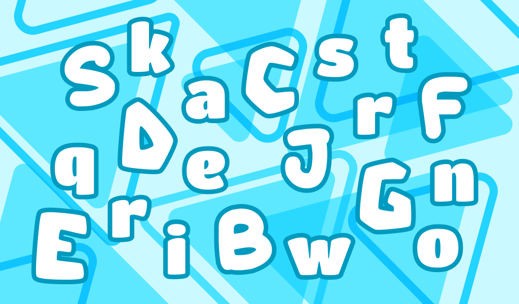
Fonts of the 90s became more noticeable and visible that fonts from previous years. Entrepreneurs needed to attract customers’ attention by thick letters of atypical forms. Fonts became not only a style of any text, but also an instrument in public relations and advertisement.
Bright color
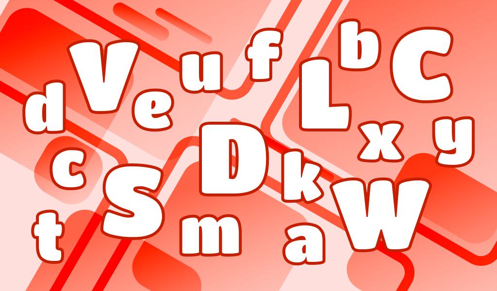
80s style fonts were boring and neutral. That’s why fonts of 90s so differ from others. This style is not only about interesting shapes of letters, but also about bright colors. Any 90s font will add an old-school and vintage vibe to promotional materials. Use it to create advertising banners and posters.
Combine different 90s fonts
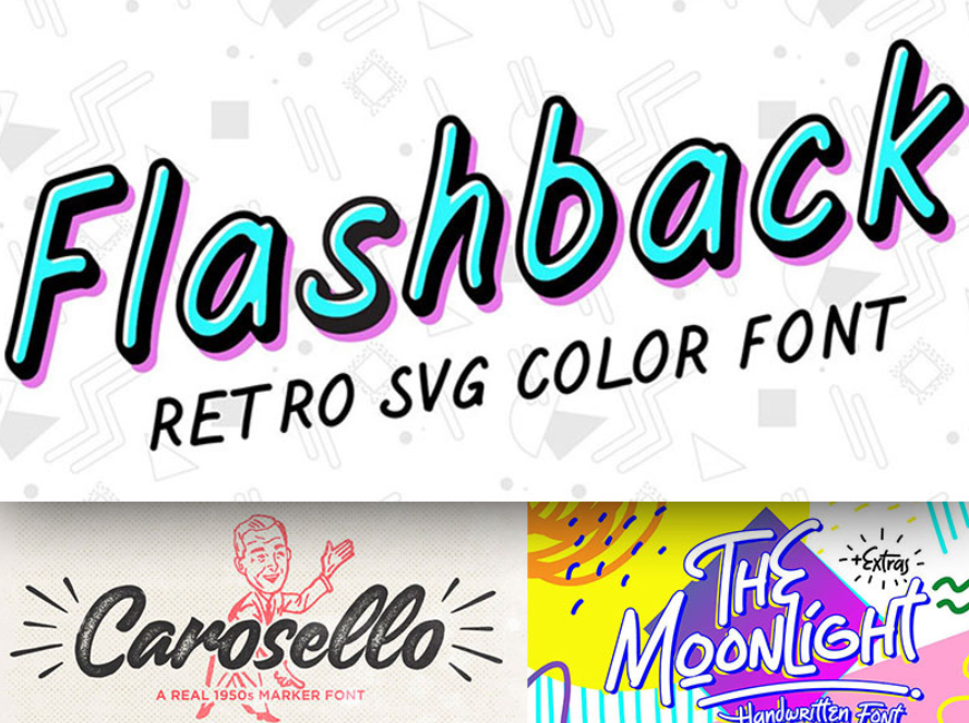
Don’t limit your design choices to just one 90s font. Experiment with combining different TTF fonts and lines to create a unique and eclectic look. Mix a grunge TTF design with a futuristic font, or pair a handwritten font with a geometric one. Mixing styles like this will add depth and interest to your design.
Understanding the influence and timelessness of retro fonts from the 90s, their use will effectively suit any designer’s modern project and create a visually appealing and nostalgic experience. Whether it’s the rebellious spirit of grunge or the elegant futurism of the digital age, typeface elements continue to captivate audiences and leave an indelible mark on design and pop culture.
What fonts were created in the 90s?
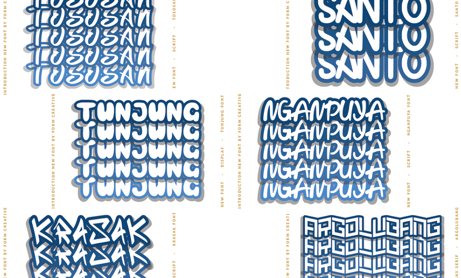
While some of the best fonts of the ’90s already existed, others became famous in the design world after being adopted during the decade. Template Gothic sans-serif is one of the fonts developed in the 1990s, Comic Sans is another famous example.
Comic Sans
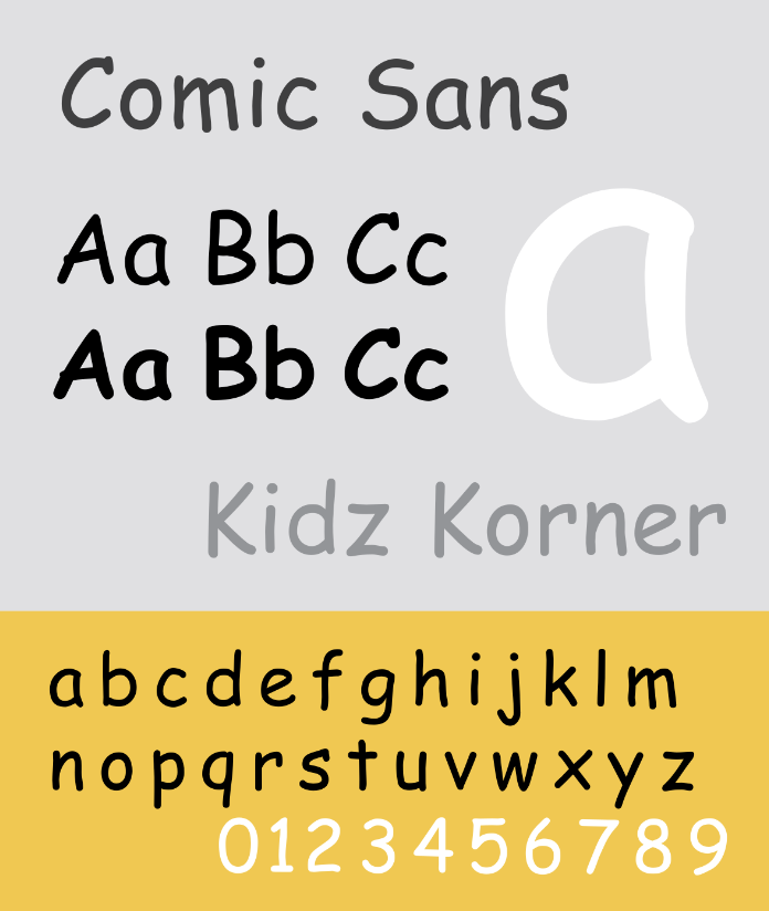
Comic Sans is probably the most famous retro font design family of the 90s. If you were born in said decade, you could probably use this old-school style font for projects.
The font feels playful and is best used for more light-hearted scenarios, although you can get creative and try a variety of different colors. You can use it in music videos or other projects to evoke nostalgia.
Puffypuff
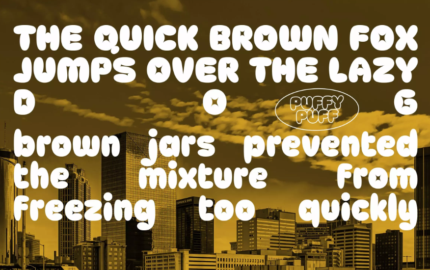
This font is popular among logo designers for creating unusual clothes print, T-shirts, for example. This style differs from others in rounded edges and infantile look. It’s a perfect font if you want to attract clients’ attention.
Industry
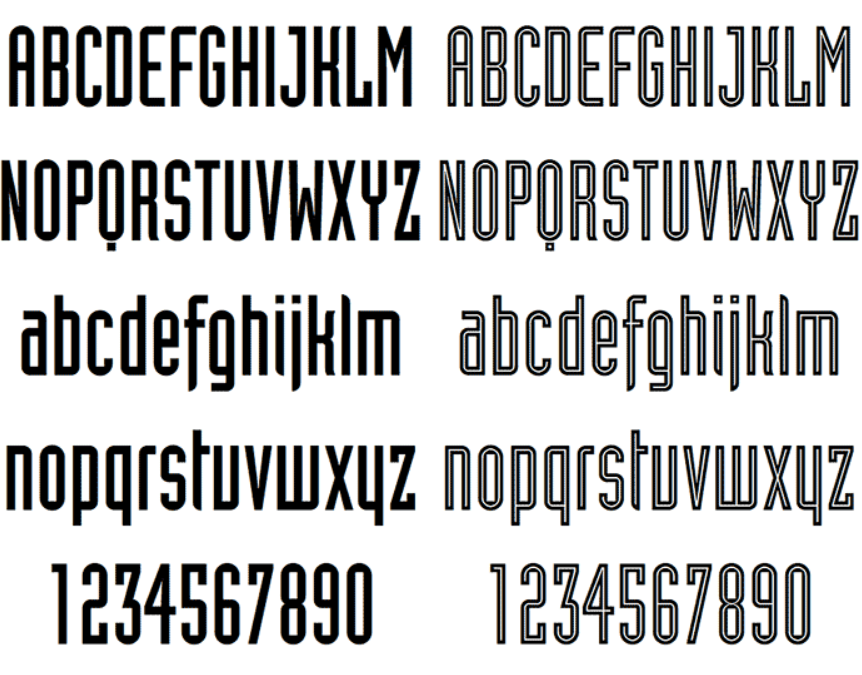
This font is an ideal choice for comics and cartoons heroes. It has 3D letters with rounded lines.
The Moonlight

The Moonlight is a great handwritten font that has the charm of the 90s. The set includes 2 fonts (regular and underlined), OTF files include alternative glyphs and ligatures.
It looks great on book covers, product labels and packaging, clothing, social media.
Wasted Youth

The 90s is a period of grunge popularity, and Wasted Youth is an excellent choice for creating a rough retro design that evokes similar associations. The set includes 3 handwritten fonts with different textures and degrees of distortion.
Brush and marker effects give the letters an authentic look — the perfect choice for 90’s style typography. Ligatures, underscores and alternative glyphs will help to decorate any text easily.
Lagoon Beach 2-in-1 Font Pack
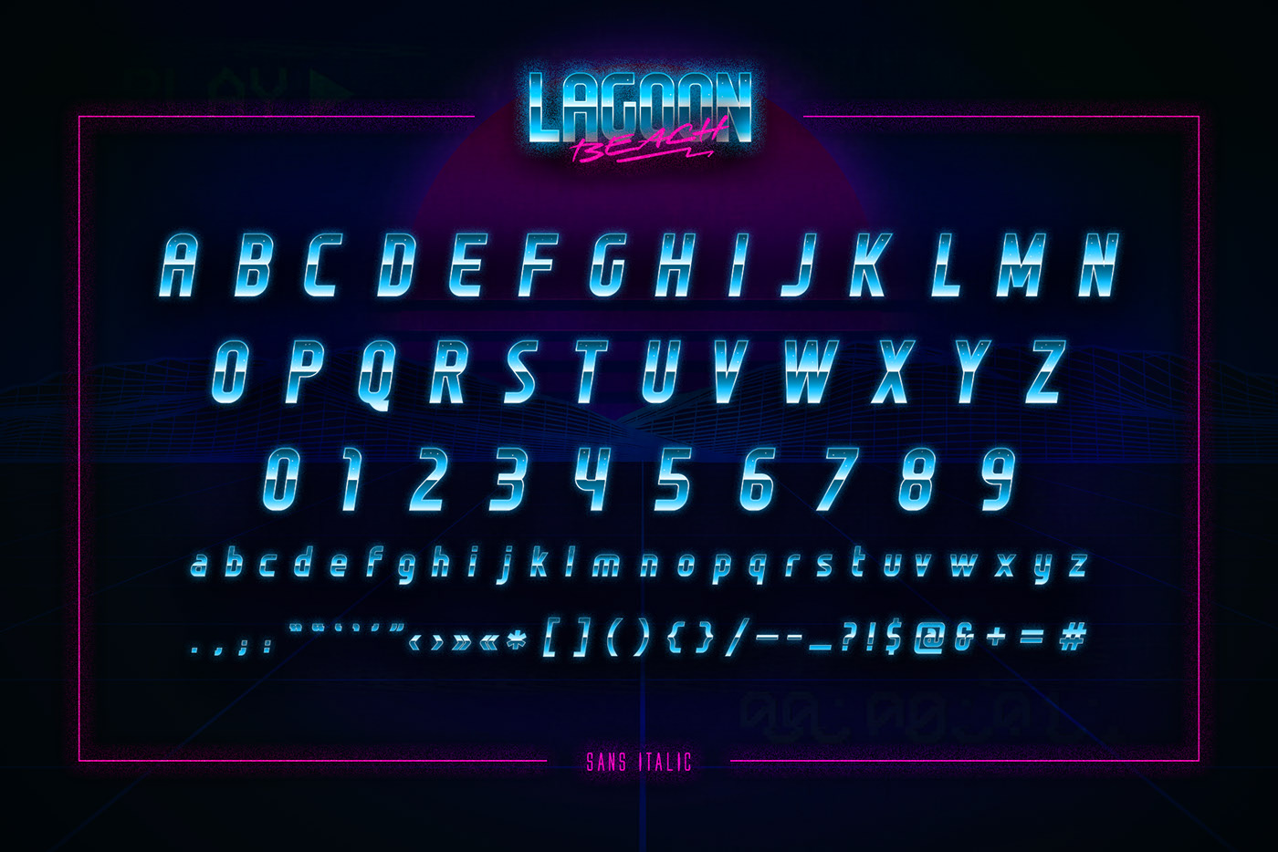
Lagoon Beach is a font pair whose author was inspired by the era of videotapes and CDs. The sans-serif font and the handwritten font are perfectly combined, so you don’t have to look for a winning combination.
Memphis
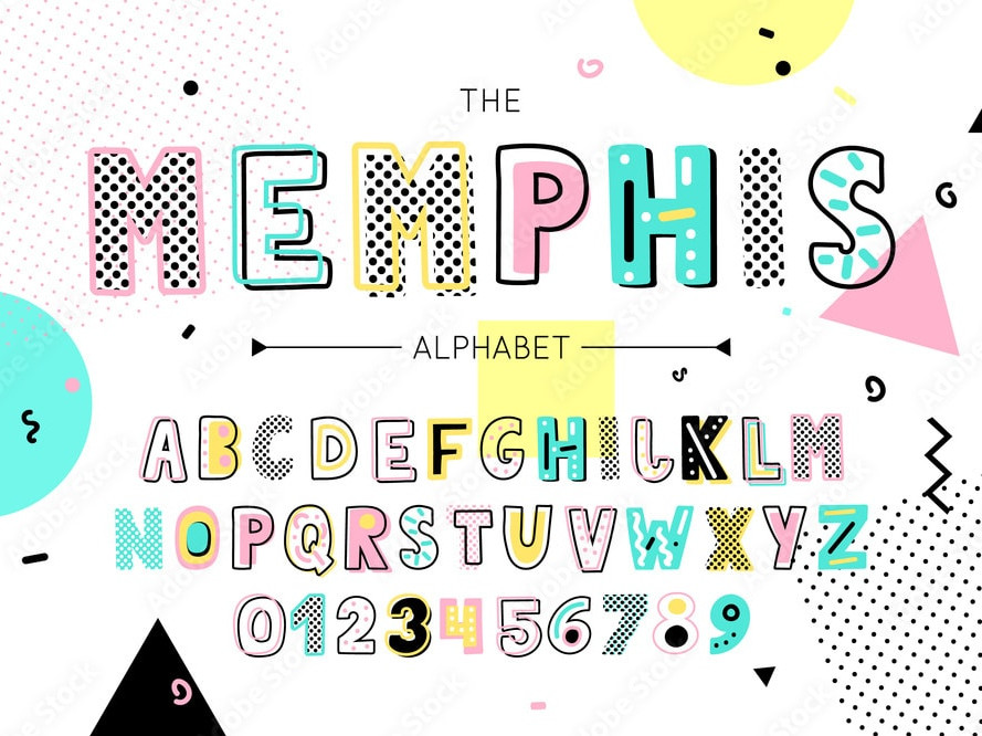
Memphis is a decorative font in the style of the 90s, which will perfectly fit into a vintage design. This unique font will help make your project more memorable. It consists of uppercase letters of different widths, includes numbers and punctuation marks.
Block Marys
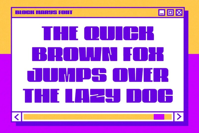
This massive decorative font has 4 versions (regular, oblique, contoured and oblique contoured). The set includes additional symbols and alternative glyphs.
Skatepark
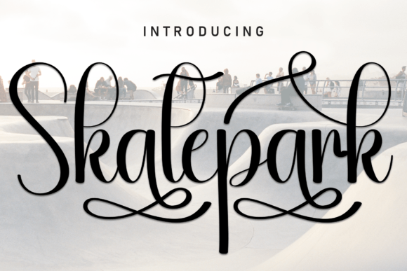
If you are looking for one of the best retro fonts to create a grunge style design, Skateparx is a great choice. With it, you will develop amazing typography for posters, flyers, T-shirts, souvenirs, album covers and more. The kit includes a simple and contoured version, as well as alternative glyphs, additional characters and a web font.
Sandra
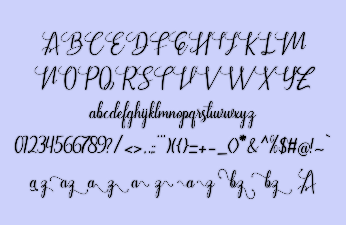
Sendha is a decorative 3D techno font for posters, album and movie covers. It is also great for projects related to the topic of esports. The buyer will receive uppercase and lowercase letters, punctuation marks, symbols, ligatures, alternative glyphs, multi-language support and a web font.
Nebula
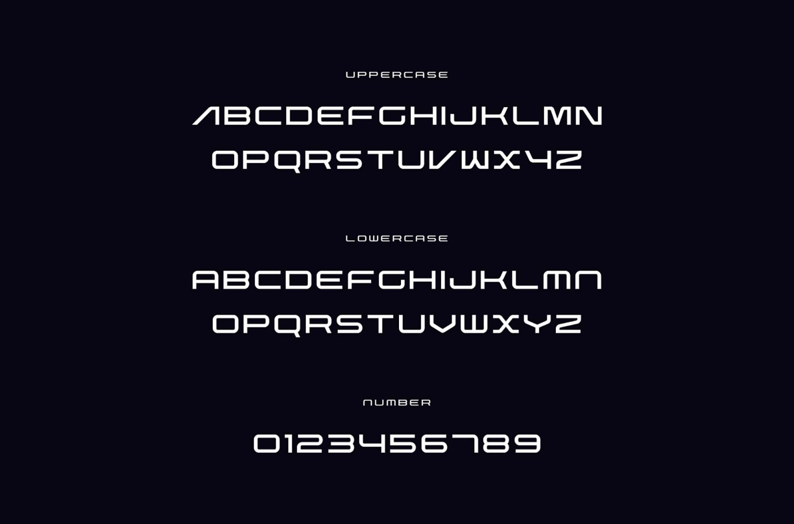
Nebula is a fun font that will look great on posters, T-shirts and other clothing, souvenirs, packaging, social media and branding. The unique “fluid” style makes it one of a kind. Nebula consists of uppercase letters. It will become one of your favorite fonts of the 90s.
Boldie Slab

Boldie Slab is a funny font that will not leave anyone indifferent. It has 4 shapes, so it is quite versatile. The set includes lowercase and uppercase letters, numbers, punctuation marks, symbols, ligatures, alternative glyphs. In addition, the font supports several languages.
Benefits of 90s style fonts:
- a vintage style that complements the retro charm and gives an additional authenticity
- a wide range of variations and styles, allowing you to choose the most appropriate version for a print material
- unique shapes create an interesting visual effect and draw attention to the text
- can be used for both headings and text, due to its readability and ease of perception
- make the design more relevant and attractive to the nostalgic feel
SEO specialist, link builder, and blog editor at Turbologo. Writing insightful content about marketing, design, and branding. Sharing practical tips on building and promoting brands online.

