Companies pay tons of attention to image while running promotion campaigns as a well-noticeable brand is the best way to stand out from the crowd. But what is next? What actually happens when an advert did its job and the customers finally came to purchase your goods? Well, it is the goods that do the rest as even the most attractive packing isn’t able to deliver you from dissatisfaction with the purchased. So, it is important to keep in mind that quality also matters. A story of Sony Ericsson logo is just about that. First things first, however.
Sony Ericsson logo history & evolution
The story includes two powerful companies each located on the other part of the Earth. As you probably have guessed Ericsson company originates from Scandinavia. And Sony doesn’t need introduction at all. Their cooperation in a field of mobile technologies eventually led to creation of a new brand. A unified Sony and Ericsson logo was introduced in 2001.
The company’s first creation struck hearts of millions as it was a well-developed gadget. Sophisticated design and ergonomics were interrelated with advanced software which was a huge breakthrough back in 2003. The smartphone featured a big, multicolor display, a variety of applications and it even was supporting many formats.
Sony Ericsson logo meaning
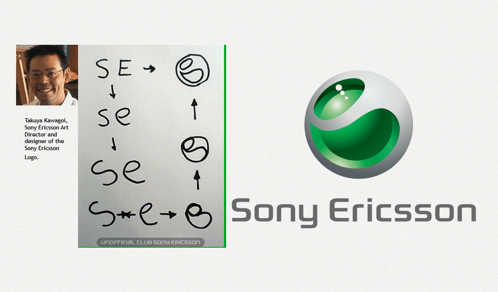
But a few labels could boast original naming. And initially it was the case with the company. The first logo variation was a static image of green and white ball. It symbolized a merge of “S” and “E” letters. But then, Sony Ericsson logo design was endowed with more distinctive features and final acquired its own name. They also added a moving wave and called it “Liquid Energy”.

Sony Ericsson logo font
A type used for logo and “Make. Believe.” slogan was called “Lato”. It is of Sans Serif type and was created in 2010. There is a very similar font called Sony Sketch EF. And the name implies that its original font crated by Sony, so you can’t use it due to copyright restrictions. However, Ericsson company fonts were “Humanist Black” and a very similar one called “Verajja Bold”, which were possible to use.
Want to make your own tech logo? Explore tech logo design ideas in our gallery.
The logo was really good and popular but it didn’t help the company much. Unfortunately, the company considered sensor technology to be a failure. They implied that button phones era will last forever and failed themselves.

SEO specialist, link builder, and blog editor at Turbologo. Writing insightful content about marketing, design, and branding. Sharing practical tips on building and promoting brands online.

