

Over the last few years, branding has changed dramatically. Businesses used to rely on a green logo, recycled-looking packaging, and a few sustainability claims. That was enough to appear “eco-friendly.”
Not anymore.
People recognize artificial branding faster than most companies expect. Especially in industries built around trust, lifestyle, aesthetics, and emotional connection.
Eco branding in 2026 is no longer about adding leaves to a logo or using kraft paper textures everywhere. It is about creating a brand that feels honest, calm, and believable.
In this guide, I want to break down the sustainable branding trends that actually work, explain what already feels outdated, and show how modern businesses can create an eco-focused visual identity without looking fake or generic.
Table of Contents
Why Eco Branding Became a Business Standard
Customers are tired of aggressive visuals.
Bright neon palettes, loud advertising, polished stock photography, and exaggerated claims about sustainability no longer build trust. In many cases, they do the opposite.
This shift is especially visible among small businesses, wellness brands, coffee shops, skincare startups, fashion labels, and local creators. Many of them started moving toward softer aesthetics, natural color systems, and more human-centered communication.
The reason is simple: people want brands that feel real.
| Branding Element | What Customers Feel |
|---|---|
| Natural color palette | Calmness and authenticity |
| Minimal packaging | Transparency and honesty |
| Clean typography | Stability and trust |
| Real photography | Human connection |
| Simple logo | Confidence and clarity |
That is the key difference between a trend and actual branding strategy.
A trend is visual decoration.
Branding is understanding why those visuals influence trust, perception, and buying behavior.
If this topic feels relevant, the article about brand authenticity in 2026 explores why modern audiences increasingly choose brands that feel human instead of overly polished.
The Biggest Sustainable Branding Trends in 2026
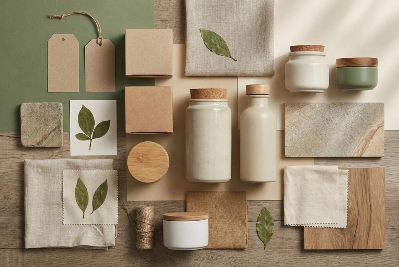
The first major trend is earthy color palettes.
Bright “eco green” is slowly disappearing. Brands are choosing olive, sage, clay, sand, muted blue, graphite, and warm neutrals instead.
These colors create emotional stability. They feel quieter and more premium.
For eco-conscious businesses, color becomes part of trust itself.
If you want inspiration for modern palettes, the guide Colors to Use in 2025 is still highly relevant for sustainable visual systems and natural branding combinations.
The second trend is soft minimalism.
For years, minimalism became sterile. White backgrounds, thin typography, empty layouts – everything started looking identical.
Now brands are bringing back warmth through textures, grain, imperfect lines, organic layouts, and tactile materials.
The third trend is sustainable packaging as part of identity.
Packaging is no longer just a protective layer around a product. It became a communication tool. Recycled materials, refill systems, reusable containers, and simplified packaging structures all influence perception.
The fourth trend is adaptive branding systems.
One logo is no longer enough. Businesses need flexible assets for social media, websites, packaging, mobile apps, video content, email signatures, and advertising creatives.
Expert Tip
Eco branding does not start with green colors. It starts with credibility. If customers do not trust the brand, visual sustainability cues will not help.
What Already Looks Outdated

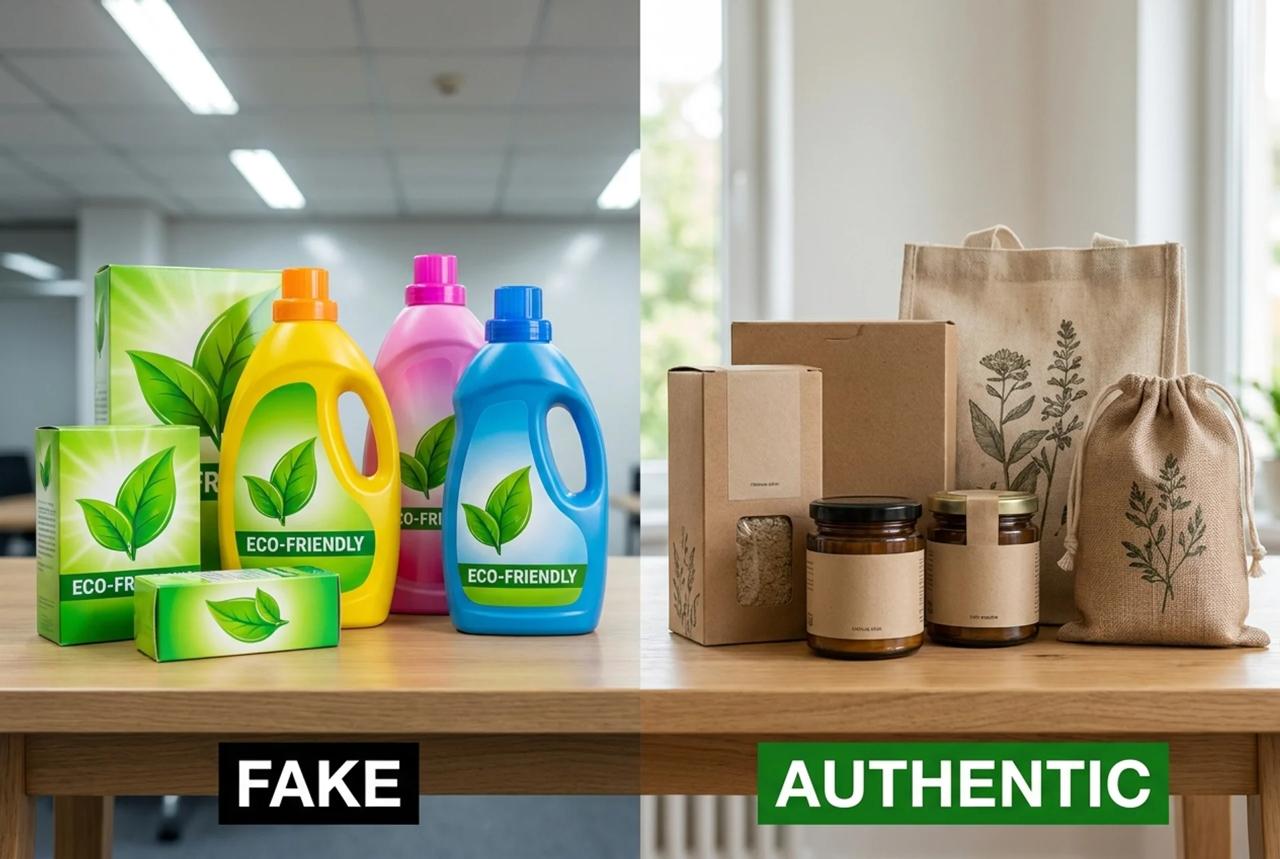
The first outdated trend is overusing eco symbols.
Leaves, trees, water drops, recycling icons, and “green” gradients became visual clichés. Many brands still use them automatically, even when they do not match the actual product.
The second problem is fake sustainability.
Customers notice greenwashing quickly. Brands that claim sustainability without proving it usually damage trust instead of building it.
The third issue is Pinterest-copy aesthetics.
A beige background, ceramic mug, minimalist serif font, and a plant branch used to feel fresh. Now it often looks interchangeable.
The fourth mistake is rebranding only because of trends.
Sometimes businesses do not need a new logo at all. They need better photography, typography, packaging, tone of voice, or social media consistency.
Before redesigning everything, it helps to understand how modern identity systems actually work. The article Corporate Identity 2025: Strategic Approach explains this process well.
How to Create an Eco-Friendly Logo Without Looking Generic
A sustainable logo should feel clear and intentional.
Many businesses overload their marks with environmental symbolism. In practice, this usually weakens memorability.
For skincare brands, soft typography and calm spacing often work better than obvious leaf icons.
For local food brands, handmade-inspired details and warm shapes feel more authentic.
For digital startups, clean geometry combined with muted natural palettes creates a stronger modern eco aesthetic.
Using Turbologo, businesses can quickly create logo concepts for sustainable brands without hiring a design agency. The platform helps generate logo systems, typography combinations, color palettes, business cards, and social assets in a unified style.
Still, the most important step happens after generation.
A logo should always be tested in real environments:
- packaging;
- website headers;
- social avatars;
- advertising creatives;
- mobile screens.
A good eco logo passes three checks:
- It stays readable in small sizes.
- It does not rely on visual clichés.
- It matches the actual personality of the product.
For additional inspiration, the article Top Logo Trends of 2025 You Can’t Miss remains useful because many of those trends continue evolving into 2026.
Eco Branding and AI Design Tools

AI changed branding workflows dramatically.
Small businesses no longer need months of agency work just to launch a basic identity system.
But AI also created a new problem: visual chaos.
Many AI tools generate isolated images instead of cohesive brand systems. A company ends up with a random logo, unrelated social graphics, inconsistent packaging, and disconnected advertising visuals.
That is why systems matter more than individual designs.
Turbologo focuses on helping businesses build complete visual ecosystems instead of standalone assets. Logos, social media visuals, business cards, banners, icons, and templates can all follow the same branding logic.
This is especially important for sustainable branding because eco-focused aesthetics depend heavily on consistency.
If a business needs multiple creatives quickly, the article AI Design Generator by Turbologo: How to Create a Full Set of Creatives in 10 Minutes explains how AI-powered systems can speed up branding production while maintaining visual coherence.
Another important shift is the rise of AI-assisted content production for social media.
Brands now need constant visual output. Stories, posts, ads, carousels, and promotional graphics all need to match the same visual tone.
That is why visual consistency became one of the strongest branding advantages in 2026. The article Social Media Branding 101: How to Maintain a Consistent Brand Identity in 2026 explores this idea in detail.
Expert Tip
AI is excellent for acceleration. It is not a substitute for positioning or strategic thinking. Businesses still need a clear understanding of who they are and why customers should trust them.
How to Avoid Greenwashing
Greenwashing starts when branding promises more than the business actually delivers.
If a company talks about sustainability while still using excessive plastic, customers notice.
If a product claims to be “natural” without explaining materials or sourcing, skepticism grows.
The solution is specificity.
Not:
- “We care about the environment.”
Instead:
- “We reduced plastic packaging.”
- “We use recycled cardboard.”
- “We offer refillable containers.”
- “We source locally.”
Eco branding works best when brands communicate concrete actions instead of vague slogans.
What Branding Will Look Like in the Next Few Years
Brands are becoming calmer.
There will be less:
- aggressive visual noise;
- flashy palettes;
- fake luxury aesthetics;
- overdesigned logos.
There will be more:
- tactile textures;
- quiet color systems;
- human-centered branding;
- adaptive AI workflows;
- transparent communication.
AI will not replace designers.
It will become a practical assistant that helps businesses test ideas faster, especially during early-stage branding and MVP launches.
Frequently Asked Questions
What is eco branding?
Eco branding is a visual and communication strategy focused on sustainability, transparency, and authentic brand perception.
Which colors work best for sustainable branding in 2026?
Muted earthy tones such as olive, sage, clay, warm gray, sand, and deep muted blue are dominating eco branding palettes.
Can small businesses build eco branding without agencies?
Yes. Modern AI branding platforms like Turbologo help businesses quickly create logos, social assets, and visual systems without advanced design skills.
How can businesses avoid greenwashing?
By using specific, provable sustainability claims instead of vague environmental marketing language.
Final Thoughts
Eco branding in 2026 is no longer about looking environmentally friendly.
It is about feeling believable.
The strongest brands are not the loudest ones anymore. They are the brands that look calm, intentional, human, and consistent.
That shift changes everything.
I’m a product and graphic designer with 10-years background. Writing about branding, logo creation and business.


