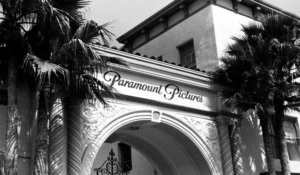
The Paramount Pictures logo can be found on the screensaver of more than a hundred popular films. It is one of the most famous film studios in the world. But what does the Paramount Pictures logo stand for, and how has it changed throughout the company’s existence? We will tell you about it in this article.
Create your own logo with Turbologo logo maker. It takes less than 5 minutes and no design skills needed.
Go to Logo MakerTable of Contents
Brand History

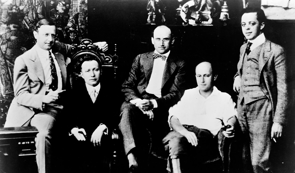
Paramount Pictures film studio was founded in 1912 by Adolph Zukor. The company was originally called Famous Players Film Company. Adolph and his associates opened the first movie theater, where they showed full-length feature films with leading theater actors. A year after opening, the studio produced five films that gave Adolph Zukor fame.
In 1916, Adolph decided to merge his Famous Players Film Company with Jesse Lasky’s film studio, the Lasky Feature Play Company. This merger created a powerful brand, Famous Players-Lasky Corporation.

That same year, another merger took place between the companies. Now Paramount Pictures Corporation was merged with Zukor and Jesse’s studio. The new name was Paramount Famous Lasky Corporation.
Famous Lasky Corporation was the first film studio in the United States to simultaneously handle the process of making films, promoting them, and showing them to the public.
The company did not begin using the familiar name Paramount Pictures until the mid-1930s.
The first logo of Paramount Pictures

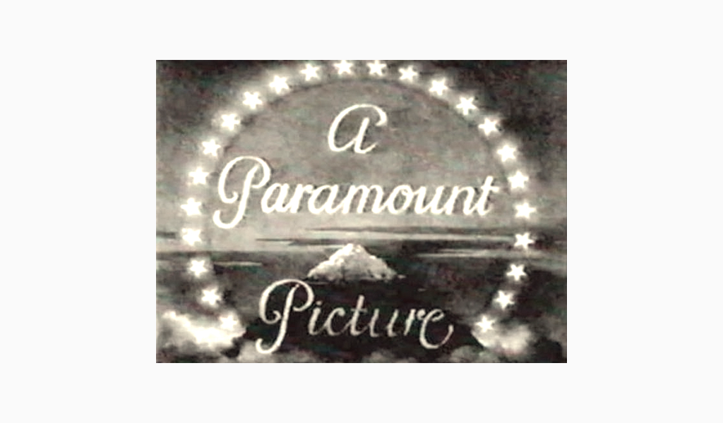
The first version of the logo of Paramount Pictures studio appeared in 1914. Its author was William Hodkinson. It depicted a mountain with a snowy peak surrounded by stars. The prototype mountain was Ben Lomond, located in Utah, where William lived. The logo has hardly changed since that time.
History of Paramount Pictures logo changes

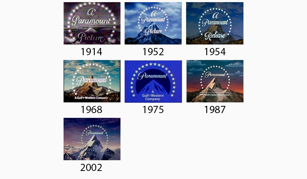
1952 – the mountain on the logo becomes elongated, the logo itself is now brighter, in blue tones.
1954 – the logo is less colorful, the lettering and stars are in the foreground, and the mountain acts as a background.
1968 – the mountain in the logo is lit by the sun, the “a” above the inscription “Paramaunt” disappears.
1975 – the image of the mountain becomes painted, the logo is painted blue, the background is now monochrome.
1987 – the picturesque design of the logo returns: the difference from the 1968 version – the sky is colored in warm colors, reminiscent of the sunset.
2002 – the current version of the Paramount Pictures logo appears, the coloring of the logo is blue and white.
Paramount Pictures screensaver
An animated version of the Paramount Pictures logo is used as the screensaver for Paramount Pictures movies.
Reasons for the success of the Paramount Pictures logo
The company has been around for over 100 years and has not lost its popularity. What are the strengths of the Paramount Pictures logo?
- Retention of Concept. Over the years, the movie studio has changed the logo 6 times, but all the designs echoed each other. This has helped maintain brand recognition even after rebrandings.
- Reliability. The mountain is associated with stability and longevity. This has shaped the perception of the company as a reliable film studio.
- Fabulousness. The logo design looks magical due to the stars, snowy mountain caps and voluminous clouds.
Conclusion
The Paramount Pictures logo has changed several times, but has kept its unique style. And years later, people easily recognize the film studio’s logo and feel nostalgic.
I’m a product and graphic designer with 10-years background. Writing about branding, logo creation and business.


