
Renault Company (original name “Renault Group”) is a large-scale world-famous French corporation, the main activity of which is the production of high-tech, high-quality, safe vehicles. Today, the firm is part of the giant alliance “Renault-Nissan-Mitsubishi”. The company is headquartered near Paris, in the city of Boulogne-Billancourt.
The popularity of the brand was rapidly increasing due to the introduction of advanced technologies in production. This approach made the company’s cars widely demanded all over the world. At the moment, Renault Corporation is engaged in the production of cars, taking into account the climatic conditions of the country, where the products of the brand will be sold.
Table of Contents
History of Renault brand

In 1898, three Renault brothers (Louis, Marcel and Fernand) create the Société Renault Frères brand. By the end of the year, the company demonstrates the first developed car. A distinctive feature of the produced car is the presence of the world’s first gearbox with a direct top gear.
1902 – Louis Renault decides to obtain a patent for his invention – the supercharged processor (later the supercharger). Two years later he patents the design of the removable spark plug. In 1917, Louis Renault, the head of the company, creates the first tank in the world with a classic layout (Renault FT).
In 1944, Louis Renault dies, so the company is transferred to the French government. But that is not the end of the company’s activity. Two years later Renault has produced Renault 4CV sedan. And by 1985, the brand begins producing the world’s first minivans (Renault Espace).
In 1996 the company is privatized, and then its name is changed to “Renault S.A.”.
The meaning of Renault logo
Thousands of car enthusiasts ponder about what the Renault logo means. There are various assumptions, but the true meaning, encrypted in a figure, not everyone guesses. The Renault car logo (rhombus) is a schematic representation of a diamond: that’s what the brothers-creators originally intended.
The first Renault logo
The first Renault logo appeared in 1899. It was a horizontally elongated oval, decorated with a monogram on top. Inside it had the initials of the founders of the brand. The letters are made in the original font, resembling a handwritten one. The inside of the oval was also added with an edging, resembling small beads. This version of the logo design was used by the company for 7 years.
Who designed Renault’s logo?
Three brothers (Louis, Marcel and Fernand Renault) were involved in the development of the logo. They not only founded the Renault brand, but also drew the idea of the mark for the company.
History of Renault’s logo changes
The history of the Renault logo is incredibly rich: it reflects all the key stages in the development of the brand. The best way to trace Renault’s logo changes is by photo.
1906
1906 – the emblem becomes round. The initials disappear from the figure. Inside the sphere, around the perimeter, is a multifaceted pinion. In the center of the composition a sports car is depicted. The logo, as in the previous version, is presented in black and white.
1919
1919 – the logo again undergoes significant changes, only the form remains. An image of a tank is inserted inside a black wide circle in a semi-profile, extending slightly beyond the figure.
1923
1923 – Renault’s trademark becomes the radiator grille placed inside a white circle. A chopped “Renault” inscription is inserted in the middle of the grille.
1925
1925 – the grille is transformed into a rhombus representing a diamond. This design solution marked the beginning of the modern Renault logo. The word “Renault” is placed in the middle part of the rhombus, complemented by two black dots on the edges.
1946
1946 – the diamond now becomes more elongated vertically. The colors of the logo are also changed: a yellow color is added (the inner part of the grille compartments is painted in it). The inscription “Regie Nationale” appears on the logo along with the company name. The text font also changes, becoming bolder and the serifs disappear.
1959
1959 the logo is in black and white again. The rhombus shape is retained, as is the inscription in the middle. But the letters become more elongated.
1972
1972 – The Renault logo becomes minimalist. The rhombus is now empty inside, and its wide edges are complemented by parallel stripes. The background is painted a muted yellow color. The “Renault” inscription is shifted under the rhombus, the letters are serifed again.
1992
1992 – the logo gets rid of some elements: only the stylized rhombus remains (as in the previous version of the logo). The lettering also disappears, the background becomes white.
2004
2004 – the look of the rhombus is significantly changed, the stripes disappear from it. The two lower parts of the figure are painted in black and the upper parts remain white. The diamond is complemented by a black border. In this variant of the logo the name of the brand appears again, but now it is located at the bottom and has black underlining.
2007
2007 – the word “Renault” is also underneath the graphic composition. The diamond becomes larger, its texture reminiscent of silver bars. The yellow background fill returns.
2015
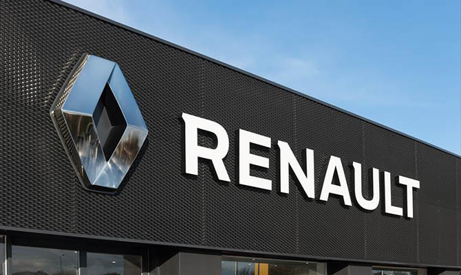
2015 is adopted the logo design that the company currently uses. The emblem now consists only of the rhombus image that was on the 2007 logo. Gone is the lettering, and the background is painted white again.
Conclusion Renault Logo: Evolution and Its Impact on Brand Identity
The Renault logo looks stylish and presentable: it tells an interesting story of one of the leading carmakers of the New Age.
Renault Logo: Key Questions and Insights
The Renault logo: who designed it?
The design of Renault’s first logo was invented by the brothers who founded the brand (Louis, Marcel and Fernand Renault).
When did the Renault logo appear?
Renault’s first trademark was created in 1899.
What does the Renault logo look like?
The modern Renault logo (2015) is an image of a rhombus in a steel-like texture. There is no brand name on the logo.
How many times has the Renault logo changed?
The first logo appeared in 1899. Then the Renault logo design changed 11 more times: in 1906, 1919, 1923, 1925, 1946, 1959, 1972, 1992, 2004, 2007, 2015.
What does the Renault logo mean?
The Renault logo depicts a rhombus. The brand’s founding brothers associated this figure with a diamond.
I’m a product and graphic designer with 10-years background. Writing about branding, logo creation and business.


