A website is the best place for business owners to display their new logo. Websites are an integral part of any marketing strategy. Customers who are doing their online research about a brand will likely go to the website first. A company website is often the first contact with a brand. It’s vital to display a logo prominently on the page.
However, the question is, where should you place your business logo?
Table of Contents
Places to Place a Website Logo
Top Left
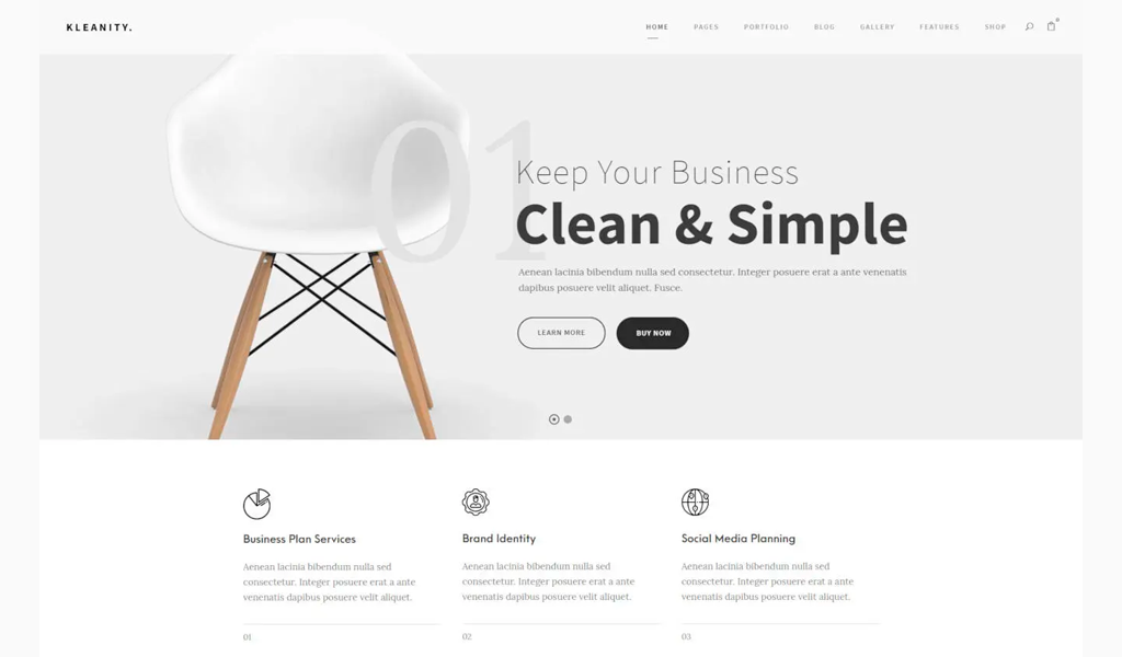
To improve brand recognition and user experience, it is recommended to place the logo to the left. There are a few things you should keep in mind when placing a business logo in this spot.
- The logo should be the right size. Too large logos will make your home page appear messy and unbalanced. The key to improving user experience is spatial awareness.
- Make sure your logo has transparent backgrounds. If you intend to place your logo over a section or block of color on your website, save your logo as a PNG file. A transparent background is required for the navigation bar and header areas of a website.
- It is best to have your logo in horizontal format. You can create multiple layouts for the same logo online with our logo design app. A horizontal or square logo can be chosen. This is mainly used for promotional products. Because the navigation bar and header area are also horizontal, website logos look better. It will also require less vertical space.
Footer
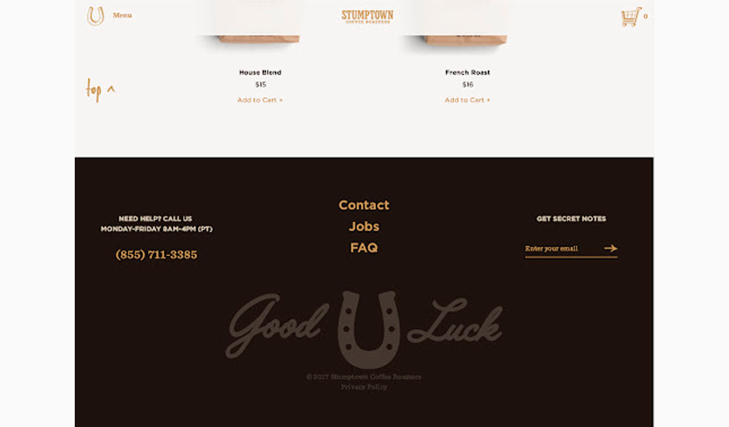
Information is central to a website’s footer. Consider how many times you visit a website’s footer to find contact information, sitemap, and company profiles. The footer will typically contain a list of subpages that provide more detailed information about the business.
A footer that is larger than the rest of your website will be more effective in incorporating branding elements. A footer for businesses with a large directory will often expand as you scroll through it. This expanded menu might even cover the entire page. Users could spend hours looking at the footer. Make sure you have your logo visible throughout the visit to keep your brand in mind.
Contact Page
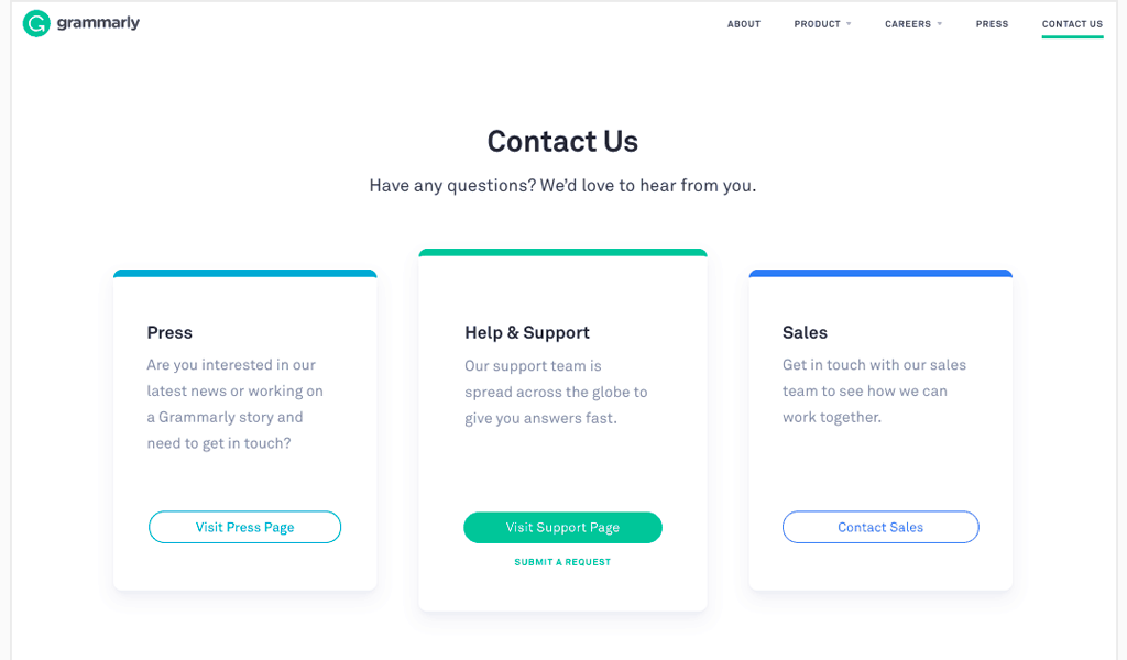
Add your contact information, including your phone number, email address and social media icons. If you have one, make sure to include the slogan and logo of the company. Customers should have the best experience possible on your contact page. This is where they can request service, purchase or inquire. Your brand and slogan should be prominently displayed on the most important pages of your website.
Splash Page

Are you thinking of including a splash page on your website? A splash page is a page that welcomes visitors to your site or gives important information. A splash page is not like a landing page. It’s focused on communicating a message and does not have a specific conversion goal.
Splash pages are used to identify sites with adult content such as alcohol and require that users verify their age before they can proceed. Artist or entertainment websites are other examples. They greet visitors with an interactive menu, multimedia or creative illustration. Splash pages are used by many restaurants, clothing shops, and startups to promote a product, collection, or service.
A splash page is a page that gets viewed before the header. Most designs center on the page with a focal point that is distinct so the visitor pays attention. Splash pages are great places to display your logo and connect with people once they arrive on your site.
Thank you or Confirmation Page
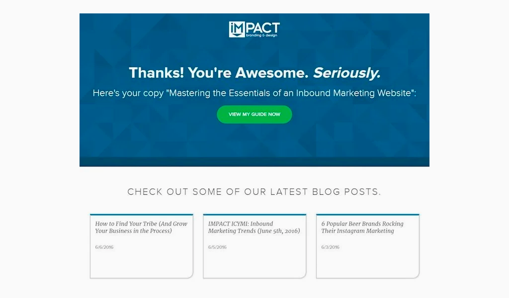
It is important that your customer informs you after they have made a purchase online. Many businesses will redirect customers to a confirmation page. These pages usually contain only a few words, such as “Thanks for contacting us. A representative will be with me shortly.” To provide immediate assistance, please call us at (999-999-9999). However, you can add some flair to your confirmation page by including your company logo. This will remind the customer about the business they support.
What NOT to Put a Website Logo
After looking at different homepage layouts, a group of participants was asked to remember the brand name. Only the location of the logo, which was to the right or left on the website’s homepage, was the only difference. When asked to remember the name of the brand, 39% of participants could recall the company name when the logo was placed to the left of the screen, as opposed to only 21% recalling the name when the logo was placed on the right side of the screen. Because website logos are traditionally placed on the left side of the screen, users expect them to be there. People read from left to right, so placing the company logo on the left ensures that users see the brand name first.
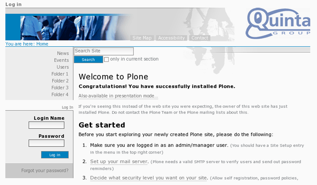
What about putting a business logo in the center, instead of to the left?
According to Nielsen Norman Group’s 2016 study of website logos placed in the center had a detrimental effect on user experience. Users who interacted on websites with centered logos had difficulty navigating to the homepage from internal pages. However, users who interacted on websites with logos placed to the left of their screen had no problem returning to the homepage. Although it may appear modern and stylish, placing the company logo in the middle of the screen can hinder the user’s navigation experience.
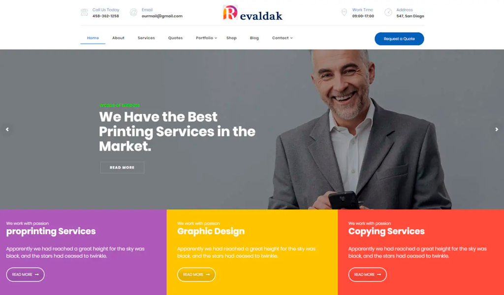
Overall, placing logos on the page’s right or center will have a negative impact on SEO. This can lead to higher bounce rates and drop-off rates, as well as a decrease of returning users.
Parting words
Approach website designs the same way you would decorate a home. What message are you trying to convey to visitors as they navigate through your website? What can you do with your logo to create an identity that is instantly associated with your brand? Your brandmark should be prominently displayed on your website. Next, make sure to include your logo in unusual places.
I’m a product and graphic designer with 10-years background. Writing about branding, logo creation and business.

