It is very difficult to imagine a life without social media platforms. To such an extent they took roots into our day-to-day routine. One of the most popular of them is Pinterest, where you can watch and post tutorials, art pieces, motivational pictures, and so on.
However, not only its content may be inspirational, but the Pinterest logo design itself. Once knowing more about it, you undoubtedly will begin generating new ideas, which can be no harm whether you are a graphic designer, an amateur, or a business in need of a branding identification sign.
Keep on reading to learn about its overwhelming history, meaning, evolution, font, and colors. Hope you find what you search for!
Table of Contents
Pinterest logo meaning
Since the media’s main idea was to provide people with the opportunity to share images, the Pinterest logo should have expressed it somehow. Plus, it had to be remarkable, easily recognizable, and be pleasant on-ear. The marked word consists of two combined together. ‘Pin’ stands for making an accent on one of the features supported by the application, ‘interest’ describes its versatility and capability to satisfy multiple purposes.
Pinterest logo history

Along with the network itself, the first Pinterest logo was born in 2010. It was a time when similar products started to appear, in addition to multiple already existing options on the market. Consequently, if the company was going to achieve any sort of success, the emblem had no right to fail.
Nevertheless, there were quite a few Pinterest symbols in history, they always looked trendy, laconic, noticeable, and performed in a modern style. The current icon turned out to be such, that does not allow a user to wonder wherefrom is the notification on his/her screen.
Nowadays the company is still prospering, and even ‘Pinterest logo png files’ is a popular search on the Internet.
Pinterest logo evolution
2010 – 2011
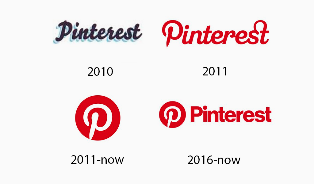
In the very first variation of the mark word, Pinterest font was a hand-drawn, layered script. Under the main black inscription, there sees through a navy blue one resembling a shadow, but in a light tone. All of the contours are repeated by the grayish frame.

2011 – Till now
In 2011 came to life an icon that remains a constituent of the present Pinterest logo vector. White, brush written, calligraphic ‘P’ is taken into a red circle.
2011 – 2016
From now on letters are painted red. The font is again script, all the characters are connected, except the ‘P’, which is outlined as in the previous emblem variation.
2016 – Till now
Add to an icon created in 2011 the ‘Pinterest’ inscription in bold, sans serif typeface, ta-dah the current Pinterest logo design is ready.
Pinterest logo font
Today’s Pinterest logo font is of a no-nonsense kind. The letters are bold and distinguishable. This moment not only creates attractive visuals but shows appreciation to the audiences as well. To read it would be easy both for youngsters and elderly people.
Pinterest logo colors
The brand designers are extremely scrupulous when making color decisions. Although red is the platform’s firm hue since 2011, a range of its shades has been tried on over the years in search of the most suitable one. It has to be bright, but not take away focus from the content shared.
Another requirement was that color needs to back up Pinterest logo meaning. People come here to share their and observe others’ ideas, fulfill talents, or just in order to spend leisure time. Therefore, the emblem and network itself should radiate positivity. It is often compared to a red balloon or Lego detail.
I’m a product and graphic designer with 10-years background. Writing about branding, logo creation and business.

