
Many companies are developing according to their founders’ personality and their preferences. There are but a few who start their business having no idea what they are dealing with or even hating to do so at all. Dougal Tompkins was fond of alpinism, hiking and mountain skiing. Healthy lifestyle and active leisure are major trends today. People don’t want to wear fanciful and clumsy clothes. Why wearing uncomfortable shoes if you can put sneakers on? And fashion designers try to adapt to new rules. That’s why you can see a popular North Face logo on many items. But did the company manage to become such a powerful player on outdoor-clothes market? Let’s find out!
Table of Contents
North Face logo & company creation
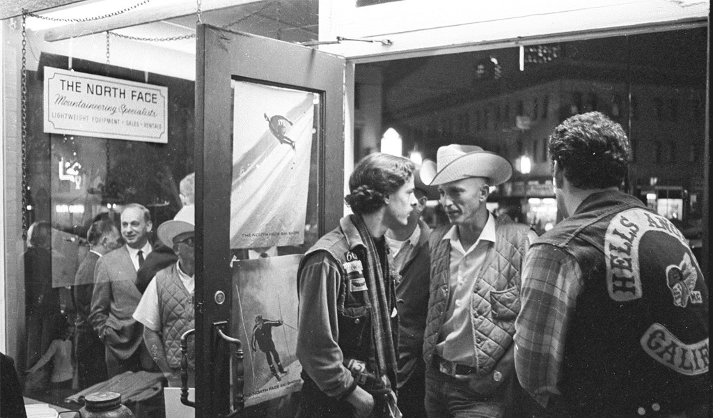
Before it became trendy to stay fit, getting some sports equipment had been arduous task to complete. Some people purchased something in army stores, but items there were designed for war purposes rather than hiking. So, some things had to be handcrafted. That’s why Douglas Tompkins was selling from mail-order catalogues at first. He opened his first store only in 1966.
North Face logo meaning
There were many disputes regarding brand name and The North Face faced most requirements. If you used to stroll only at the local park, the name would surely seem odd. But it’s not as any alpinist knows that climbing north face of the mountain is the hardest feat gain. Northern slopes are colder, less illuminated and you have to fight stronger winds there. Thus we might perceive that the North Face logo meaning implies protection from harmful environment.
Obviously the company had to add a proper depiction when it had developed enough.
North Face logo history
The North Face logo was designed in 1968. It depicts Half Dome mountain located in Yosemite park which is quite popular among tourists. Its northern slope seems to be created especially for North Face logo design. And that might just be the reason for a tremendous success of brand logo. Or maybe it is items quality after all. The company uses only quality and up-to-date materials and it results in higher protection.
North face logo evolution
A half cut mountain appears to be a great logo. Even rebranding isn’t required as of now. It literally challenges all the tourists, and there is even more challenge in its original colors. North Face is deliberately red, as it is a color of power, adrenaline and daring. However, there is white color variation for other backgrounds.
Want to make your own apparel logo? Explore clothing logo design ideas in our gallery.
North face logo font
North Face uses one of the most popular fonts and it is Helvetica Bold. They have slightly altered it for better combining purposes. And the font itself matches many depictions even without any modifications at all. In this particular case for example, three lines of letters seem to symbolize the mountain and its most dangerous slope. What is more, the company participates in many environment protection activities and develops natures preserving technologies.

SEO specialist, link builder, and blog editor at Turbologo. Writing insightful content about marketing, design, and branding. Sharing practical tips on building and promoting brands online.


