Do you like beautiful stories full of passion, freedom, adventures and discoveries? Here some clothes with Hollister logo on it. And who founded the brand? Long ago, there was John Hollister, a young man who had just graduated from Welsh university in 1920.
Table of Contents
Hollister logo history
John was passionate and rather talented with an ambition to see the whole world, yet his fate had other plans for him and was doomed to work at the office. And finally John severed the chains of fate and set off for a quest to India. He managed to set up clothes manufacturing there. But then, as any other patriot, he brought his business back to USA. And so California was the first to see Hollister logo. Sounds quite simple, isn’t it? And what if we tell you that this is just a beautiful story and there is something completely different behind the brand? And it’s true! People tend to trust brands with long history, especially when it comes to something ordinary like clothes. The only exception here are futuristic brands, engaged in high-technologies. But that’s not the case.
Well, Abercrombie & Fitch made up the story aiming at youths becoming their target group. And this isn’t that bad. And the story makes clear the meaning of Hollister symbol. Thus, it is an apt move in terms of marketing.
Hollister logo meaning
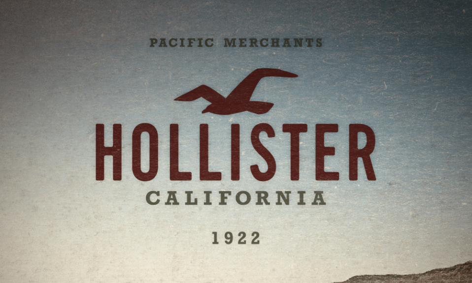
What is the bird in Hollister logo? If you think more about the story, about India, sea travels and other romantics, it becomes easy to guess the bird. Hollister logo depicts a flying sea-gull, which is symbol of dreamers and sailors. Magnificent California beaches, surfing, hot sand; all those things you can attract youths with are in the label. And it surely did the trick. Any teenager would buy clothes that suggest romantics, sea, beach and never ending summer.

The company was quick to widen their clothes functions. Initially the clothes with Hollister logo was meant for sports. But then they decided to make casual as well. Thus it became something comfortable, practical and contemporary.
And here is a funny twist. The very first company Hollister logo included 1922 date. It was meant to be the company foundation date (by a fictional founder on top of that!). However, customers refused to believe that too-big-lie. And so, they quickly removed numbers in order to avoid sales fall.
Hollister logo evolution
Evidently, it took many qualified specialists to manage the idea. Any mistake could ruin all the beginnings and repulse teenagers. How did they choose color for Hollister symbol? The gull in the logo is of maroon color as the color reminds of antique maps. The whole depiction is designed with striking resemblance to the old times in order to prove the brand history. The color itself reflects courage, power and slight sea sunset melancholy.
Want to make your own apparel logo? Explore clothing logo design ideas in our gallery.
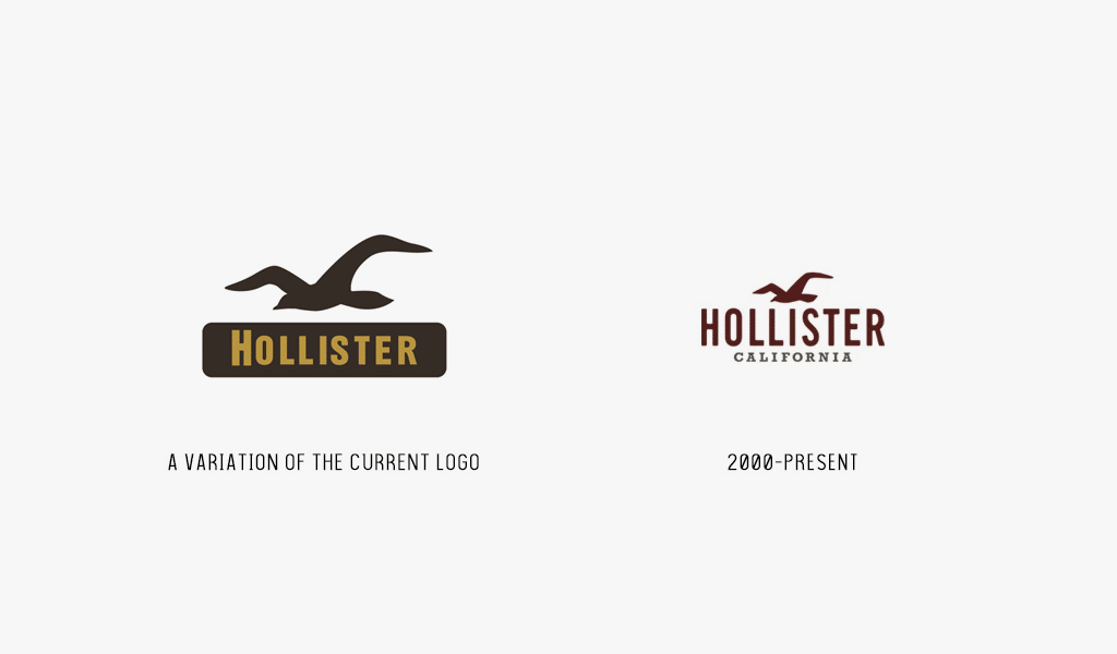
The brand constituents were finally brought together only in 2000. So, there was no noticeable rebranding yet. There were but a few alterations, like thicker lettering in initial Hollister logo. And the gull wasn’t that refined at first too.
Logo Font
“Hollister” is written under the gull, and there is finer “California” beneath all of that. All the details have been centered to keep balance. The companies often take some font and alter it so that the letters would face designing needs. And this case is no exception. Hollister logo font is Gothic Regular, which was released by The League of Moveable Type.

SEO specialist, link builder, and blog editor at Turbologo. Writing insightful content about marketing, design, and branding. Sharing practical tips on building and promoting brands online.

