
The denver broncos logo design history tells a story of transformation from the playful cartoon bronco in 1960 to the modern fierce icon. In this article, you will discover how each redesign reflects changes in the team’s identity and the pivotal moments that inspired these updates.
Table of Contents
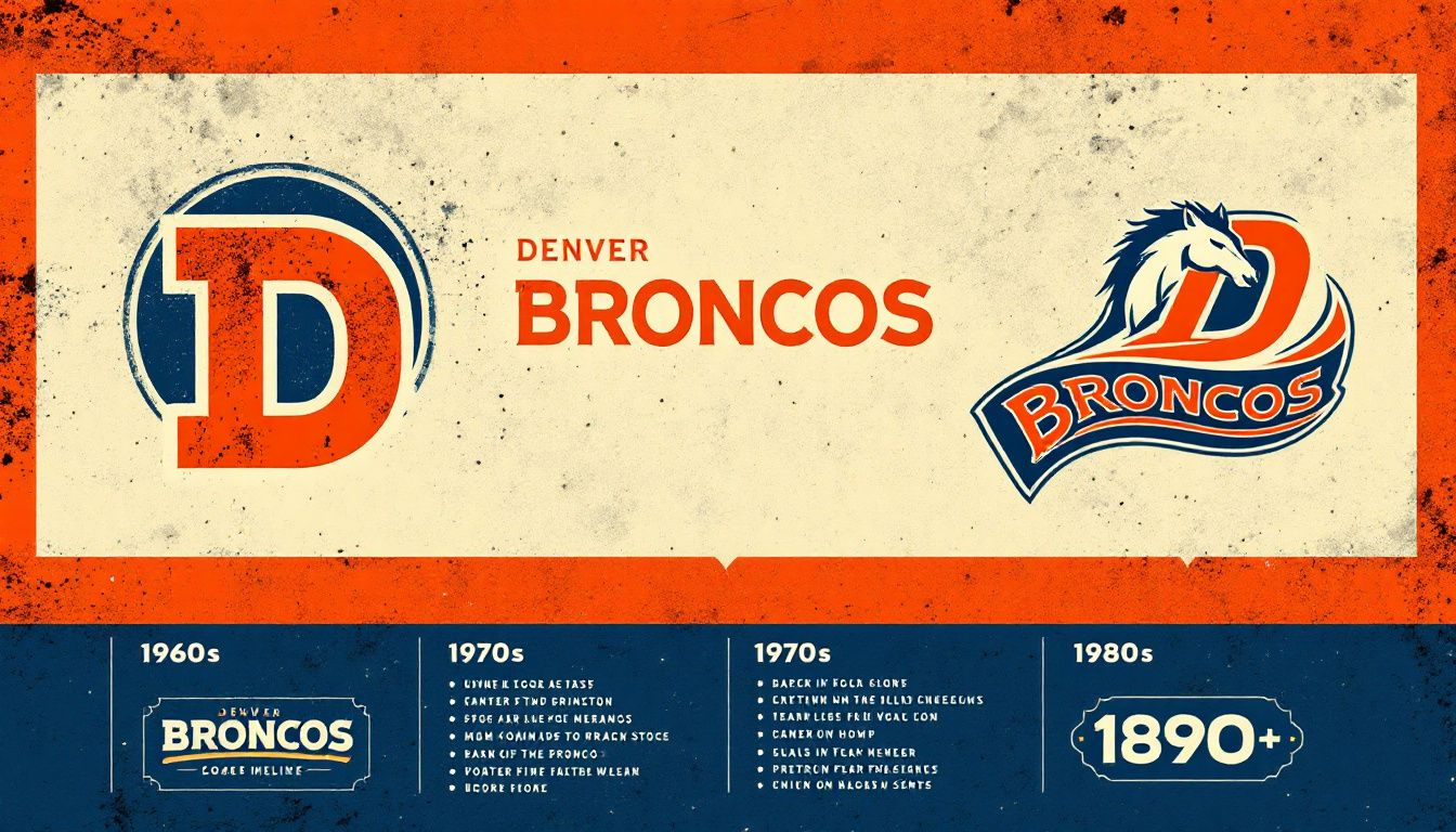
A Visual Journey Through Denver Broncos Logo Design History
The Denver Broncos, a name synonymous with excellence and resilience in American football, have a logo that echoes their storied past and dynamic present. Over the decades, the Denver Broncos logo has morphed through various designs, each iteration telling a part of the team’s evolving narrative.
From its inception in 1960, with a playful, cartoonish depiction, to the streamlined, fierce emblem we recognize today, the logo has been a visual chronicle of the team’s journey.
The original logo, designed by Edwin Taylor, marked the team’s entry into the professional football world, setting the stage for the Broncos’ identity in the American Football League. In 1962, Head Coach Jack Faulkner led the team to adopt the iconic orange and blue colors, marking a pivotal shift in their branding.
The recognizable ‘D’ logo, introduced in 1968, became a significant branding element, embedding itself in the hearts of fans and the annals of NFL history.
In 1997, the Broncos introduced a modernized emblem symbolizing speed and agility. The latest logo refreshed the team’s image and captured the Broncos’ competitive edge, aligning with their rise as a dominant NFL force.
This visual journey explores each significant chapter of the Denver Broncos logo history, highlighting how each design captured the essence of its era.
Logos in sports are more than just symbols; they are the visual representation of a team’s heritage, values, and aspirations.
The Denver Broncos logo, an emblem that has seen the team through triumphs and tribulations, stands as a testament to their enduring legacy.
Introduced in 1997, the current logo is not just a design but a narrative of evolution, reflecting the team’s journey from its humble beginnings to its present-day glory.
This exploration into the Denver Broncos logo history will unveil the stories behind each design, the vision of the designers, and the moments that defined each era.
From the playful cartoon bronco of the early 60s to the fierce and agile horse of today, each logo iteration has played a crucial role in shaping the team’s identity. Logos are often unveiled with great fanfare, sometimes during press conferences, symbolizing new beginnings and renewed hopes for the seasons ahead.
Readers will gain insights into how the Denver Broncos logo has evolved alongside the team, influenced by changes in leadership and pivotal moments in the team’s history. Through this lens, we will see how the logo has not only represented the team’s on-field performance but also its off-field ethos, uniting fans and players alike in their shared passion for football.
Origins of the Denver Broncos Logo
The Denver Broncos logo has been an integral part of the team’s identity since its establishment in 1960. The original logo, crafted by Edwin Taylor, featured a playful depiction of a bronco alongside a casual football player, capturing the spirit of the fledgling team. This design marked the Denver Broncos’ entry into the American Football League (AFL), establishing the foundation of the team’s visual identity.
In those early days, the Denver Broncos mascot and logo were crucial in creating a sense of identity and belonging among fans. The original logo, although simplistic, was central to establishing the team’s presence in the competitive world of professional football. The team’s progress mirrored its evolving branding, reflecting changes in strategy, performance, and leadership.
The transition to the now-iconic orange and blue colors began under Head Coach Jack Faulkner’s direction in 1962, a move that significantly influenced the team’s branding approach. This shift not only marked a new era for the Broncos but also set the stage for future logo redesigns that would align more closely with the team’s evolving identity and aspirations.
The original logo and subsequent changes were more than visual updates; they were symbolic of the team’s growth and resilience.
Evolution of the Logo Over the Decades
From the original cartoonish bronco to the modern, streamlined emblem, the logo’s evolution over the decades showcases the Broncos’ adaptability and relevance in the dynamic landscape of the NFL.
Examining these significant changes reveals what they represented for the team.
1960-1961: The Original Cartoon Bronco
The inaugural Denver Broncos logo, introduced in 1960, featured a playful depiction of a bronco alongside a casual football player. This design was emblematic of the team’s early years, capturing the lighthearted and spirited nature of the newly established franchise.
Despite its simplicity, this logo was significant in setting the tone for the team’s identity and connecting with fans.
While the original logo may seem quaint by today’s standards, it was a bold statement at the time. It differentiated the Broncos from other teams, establishing a unique visual identity that resonated with the fans and the broader community. This playful bronco became a beloved symbol, marking the beginning of the Denver Broncos’ journey in professional football.
1962-1969: Introducing Orange and Blue
In 1962, the Denver Broncos unveiled a redesigned logo that marked a significant departure from the original. This new logo depicted a football player taming an orange horse while holding an orange football, embodying a more aggressive and dynamic spirit. The choice of bright orange, navy blue, and white colors was a strategic move to create a more striking and memorable visual identity.
Introducing orange and blue revitalized the team’s image and set the stage for future branding strategies.
The new colors were featured prominently on the team’s jerseys, helmets, and other merchandise, including the alternate orange jersey and orange helmets, creating a cohesive and powerful brand presence.
This redesign was more than just a visual update; it was a declaration of the team’s ambitions and competitive spirit.
Under the direction of Head Coach Jack Faulkner, this period marked a new chapter in the Denver Broncos’ history. The aggressive depiction of the bronco and the bold use of color reflected the team’s determination to establish itself as a formidable force in the league.
The new logo and colors were instrumental in rallying fans and building a strong, unified identity for the team.
1969-1992: The Rearing Bronco
By 1969, the Denver Broncos logo underwent another significant transformation. The new design featured a capital ‘D’ in red with a white rearing bronco and a black outline, removing the rider and focusing solely on the powerful image of the bronco.
This design maintained the bright orange and dark blue colors from the previous logo, emphasizing continuity while introducing a more streamlined and impactful emblem.
The rearing bronco symbolized power and strength, aligning with the team’s growing competitiveness and aspirations.
This period saw the Broncos reaching new heights, with the logo becoming synonymous with the team’s resilience and fighting spirit.
This era was marked by significant achievements, including the team’s first playoff appearance and the emergence of legendary players like John Elway. The rearing bronco logo was a constant presence through these milestones, symbolizing the team’s strength and unity. It became an enduring symbol of the Broncos’ legacy, representing their journey from underdogs to contenders in the NFL.
1993-1996: Modernizing the Emblem

The early 1990s ushered in another phase of modernization for the Denver Broncos logo.
In 1993, the team introduced a more streamlined and refined version of the ‘D’ logo. This redesign aimed to give the logo a professional and contemporary look, aligning with the evolving aesthetics of the time.
The modifications included a smoother bronco design, a bright orange ‘D’, a dark blue background, and a removal of the steam strips emanating from the bronco.
The subtle yet impactful changes enhanced the logo’s visual appeal and versatility. The updated logo was a reflection of the team’s commitment to staying relevant and competitive, both on and off the field. It maintained the core elements that fans had come to love while introducing a fresh, modern twist.
1997-Present: The Current Logo
In 1997, the Denver Broncos unveiled a new logo that would come to define the team’s identity in the modern era. This redesign featured a stylized horse symbolizing speed and agility, with a bright orange mane and a dark blue outline.
The new logo was a significant departure from previous designs, emphasizing a more dynamic and fierce representation of the bronco.
The 1997 redesign was not just about aesthetics; it was about capturing the team’s spirit and ambitions. This logo has since become a beloved symbol among fans, representing the team’s resilience and competitive edge.
The introduction of this new logo coincided with a period of great success for the Broncos, including back-to-back Super Bowl victories.
Key Trends in Denver Broncos Logo Design
The Denver Broncos logo design has evolved significantly over the decades, reflecting broader trends in branding and aesthetics. One of the most notable trends is the move towards simplification and modernization. Early logos, such as the original cartoon bronco, were more playful and detailed, while later designs embraced a more streamlined and professional look.
Another key trend has been the consistent use of color. Since adopting the orange stripes and blue color scheme in 1962, these colors have become a hallmark of the team’s identity.
The strategic use of these colors has helped create a strong, recognizable brand that stands out in the National Football League (NFL). The consistent color palette has reinforced the brand’s identity and made the logo instantly recognizable among fans and opponents alike.
The Denver Broncos logo has consistently embodied the team’s spirit and values. Whether it’s the strength and power symbolized by the rearing bronco or the speed and agility represented by the current logo, each design has reflected the team’s commitment to excellence and competitive spirit.
These trends highlight the importance of the logo in uniting fans and creating a shared sense of belonging.
The Role of Color in the Denver Broncos Logo
Color has played a crucial role in the Denver Broncos logo history, serving as a powerful tool for branding and identity.
First introduced in 1962, the team’s signature orange and blue colors marked a significant shift from the original brown and yellow uniforms. This change was directed by Head Coach Jack Faulkner, who believed that brighter colors would create a more striking and memorable visual identity.
The consistent use of orange and blue has been a key element in the Broncos’ branding strategy. These colors are not only visually appealing but also evoke a sense of energy and dynamism, aligning with the team’s competitive spirit.
The bright orange jersey, in particular, has become iconic, symbolizing the Broncos’ bold and aggressive style of play.
Over the years, the Denver Broncos logo has leveraged these colors to reinforce the team’s identity and connect with fans. Through the primary logo, alternate uniforms, or special edition jerseys, the consistent use of orange and blue has created a cohesive and powerful brand presence.
This enduring color scheme has become synonymous with the Broncos, embodying their legacy and aspirations.
Notable Designers and Their Contributions
The Denver Broncos logo has seen contributions from several notable designers over the years. The original logo, introduced in 1960, was designed by Edwin Taylor, who played a pivotal role in establishing the team’s visual identity. His design set the foundation for the Broncos’ branding, capturing the spirit of the new team in a playful and approachable manner.
In 1997, the Broncos underwent a major redesign, with the new logo being a collaborative effort involving Nike representatives Todd Van Horn, Ken Black, and David Odusanya. This team of designers brought a fresh perspective to the logo, creating a modern and dynamic emblem that resonated with the team’s evolving identity.
Their work resulted in the stylized horse logo that symbolizes speed, agility, and power, aligning perfectly with the Broncos’ competitive spirit.
These designers’ contributions have been instrumental in shaping the Denver Broncos logo into what it is today. Their creative vision and innovative approach have helped the team maintain a strong and recognizable brand, ensuring that the logo remains a beloved symbol for fans and a powerful representation of the team’s legacy.
The Impact of the Logo on Team Identity
The Denver Broncos logo has had a profound impact on the team’s identity, serving as a visual representation of their values and aspirations. From the early days of the playful cartoon bronco to the fierce and dynamic horse of today, each logo iteration has embodied the team’s competitive spirit and resilience.
The logo’s evolution reflects the Broncos’ journey from underdogs to NFL powerhouses, capturing the essence of their growth and success.
The 1962 redesign, which introduced a more aggressive and dynamic depiction of the bronco, was a turning point in the team’s branding. This logo helped establish a strong and unified identity, rallying fans and creating a sense of belonging. The iconic ‘D’ logo, introduced in 1968, further reinforced this identity, becoming a beloved symbol that remains popular on merchandise today.
The current logo, adopted in 1997, continues to play a crucial role in shaping the team’s identity. Its fierce and untamed design symbolizes the Broncos’ determination and connection to Colorado’s ranching heritage. The logo serves as a connection point for fans, enhancing their emotional investment in the team’s success and creating a shared sense of pride and loyalty.
Iconic Moments Featuring the Logo
The Denver Broncos logo has been at the center of many iconic moments in the team’s history, symbolizing triumph and resilience. One of the most memorable moments came during Super Bowl XXXII, when the Broncos won their first Super Bowl. The logo was prominently featured as Terrell Davis’ decisive touchdown clinched the victory, marking a significant milestone for the team.
John Elway’s legendary helicopter play in the same game epitomized the Broncos’ determination and fighting spirit, further cementing the quarterback John Elway logo’s significance.
This iconic moment showcased the team’s resilience and will to win, reinforcing the logo’s association with strength and excellence.
Elway’s rushing touchdown in Super Bowl XXXIII not only sealed another victory but also marked the perfect end to his illustrious career, enhancing the legacy of the Denver Broncos logo.
The logo was also a symbol of unity and pride during the Broncos’ Super Bowl 50 win, where the defense, led by Von Miller, played a pivotal role. Miller’s critical strip-sack was a defining moment, showcasing the power and determination represented by the emblem. These iconic moments, featuring the Denver Broncos logo, have become cherished memories for fans, encapsulating the excitement and pride of supporting this storied franchise.
Summary
The journey through the Denver Broncos logo history reveals a rich tapestry of design evolution, each iteration reflecting the team’s growth and aspirations.
Key trends in the logo’s design, such as simplification and modernization, have ensured that the Broncos remain relevant and competitive in the ever-evolving landscape of the NFL. Notable designers, including Edwin Taylor and the team from Nike, have left an indelible mark on the logo, contributing to its enduring legacy.
As we reflect on the iconic moments and the impact of the logo on the team’s identity, it becomes clear that the Denver Broncos logo is more than just a visual element. It is a powerful symbol of unity, pride, and excellence, representing the team’s journey and the unwavering support of its fans.
The logo’s evolution is a testament to the Broncos’ commitment to excellence, both on and off the field.
Frequently Asked Questions
The original Denver Broncos logo, introduced in 1960, prominently featured a playful bronco alongside a casual football player, created by Edwin Taylor. This early design reflects the team’s spirited identity.
The Denver Broncos adopted their iconic orange and blue colors in 1962, a decision made under the direction of Head Coach Jack Faulkner.
In 1997, the Broncos unveiled a modernized logo that showcased a stylized horse, emphasizing speed and agility, highlighted by a bright orange mane and framed with a dark blue outline.
The 1997 Denver Broncos logo was designed by a team from Nike, specifically Todd Van Horn, Ken Black, and David Odusanya. Their collective efforts contributed significantly to the team’s visual identity.
The Denver Broncos logo has profoundly shaped the team’s identity by encapsulating their competitive spirit and fostering a sense of unity among fans, leading to a strong and recognizable brand.

SEO specialist, link builder, and blog editor at Turbologo. Writing insightful content about marketing, design, and branding. Sharing practical tips on building and promoting brands online.


