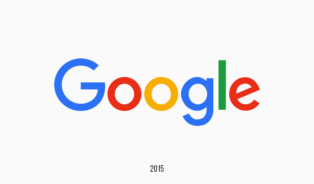
The Google logo features a playful yet intentional color palette: blue, red, yellow, and green. These colors aren’t random — they reflect Google’s core values of innovation, simplicity, and inclusiveness. Understanding this palette gives insight into how color psychology is used in branding.
Table of Contents
Google logo History
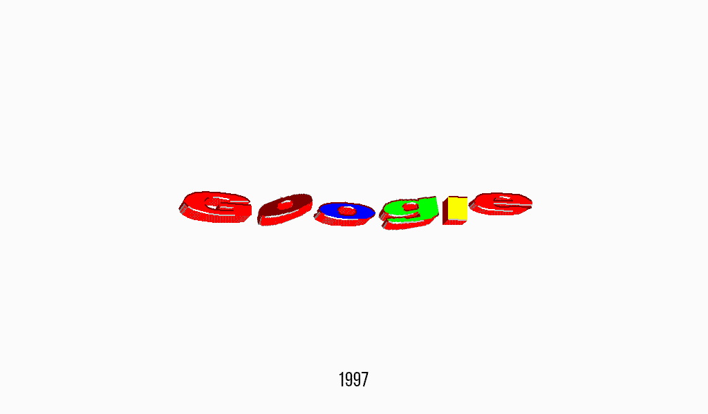
The history of original google logo creation begins with the misspelling of Google. The idea was to name a company “Googol”, and the word itself means 10 raised to the 100th power. As we can see in millions of search results, the name describes the company just fine. And so, misspelled word has become a point of the company.
As it turned out, the first logo design was designed by the founders of the company for free. It looked awful, to say the least, devoid of meaning and style. The first logo history started in 1996.
Thank goodness, this fail variation didn’t last long. Larry Page and Sergei Brin asked Ruth Kedar, a design teacher, who invented a new Google logo. It truly was a brainstorm! Ruth came up with options, trying to define the idea, but all of them were rejected. Maybe Ruth’s problem was that she tried to endow the logo with too many senses. The options were ranging from a point-blank to a magnifier, but no option was good enough. The solution, however, was quite obvious.
Google logo font
Font for Google logo was based upon Catull – an old font of serif type. The type is known for being vintage and possessing a story behind itself, and that manifested it as an intergenerational search engine. And once Ruth added color to the font – all the previous options became obsolete. This Google logo, with suitable colors and symbolic implication, reflects well the company’s core ideals and comfort brought by search technologies.
Why These Colors Work for Google
Google deliberately uses three primary colors — blue, red, and yellow — then breaks the pattern with a secondary color: green. This subtle disruption symbolizes Google’s unconventional thinking and commitment to innovation. Each color evokes a distinct emotion and helps communicate Google’s mission: to make information accessible to everyone.
Google Logo Colors and Their HEX Codes
- Blue – #4285F4: Trust, professionalism, and stability.
- Red – #EA4335: Energy, excitement, and boldness.
- Yellow – #FBBC05: Creativity, optimism, and warmth.
- Green – #34A853: Growth, uniqueness, and freshness.
How Google’s Colors Compare to Other Tech Brands
| Brand | Colors | Style | Symbolism |
|---|---|---|---|
| Blue, Red, Yellow, Green | Playful, minimalist | Diversity, accessibility, creativity | |
| Microsoft | Blue, Red, Yellow, Green | Structured, corporate | Balance, system, professionalism |
| Meta | Blue | Modern, tech-focused | Connectivity, trust, calmness |
| Apple | Monochrome (Black, White, Gray) | Elegant, premium | Innovation, luxury, clarity |
Try Google’s Colors in Your Logo — enter HEX codes and see how your brand looks with them! Create a Logo Now
Google Logo evolution
In contrast to most companies, who seldom change their logo, Google is always ready to try something new. How come? It is all thanks to the company’s unique ability. The logo is always the first thing to see when you run your browser, every morning and evening. So, Google doesn’t have to care about rebranding adverts. They just change their logo and the whole world is aware of it the next moment. Given the situation, you can alter your logo in any manner you see fit!
History of Google Doodle
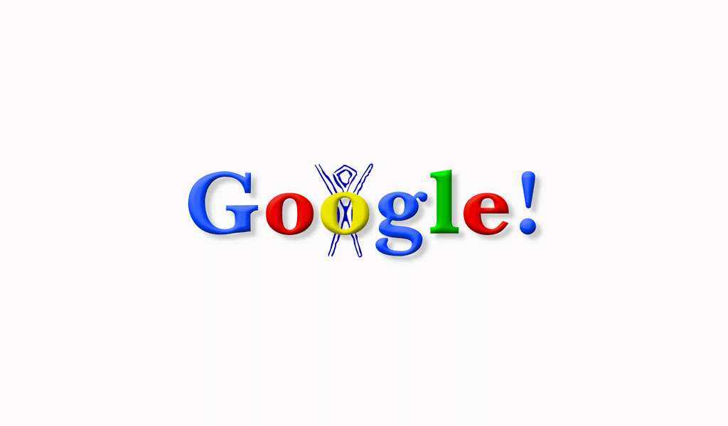
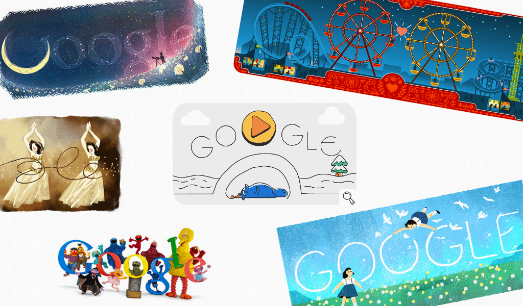
The thing was noticed when the Burning Man fest logo had been added up to Google’s in 1998. Users and officials liked the idea and little by little became an institution. These witty Doodles started to appear more frequently, and finally, they were given a funny animation. Goggle today is even ready to alter its logo for every single user! Such a super-individual approach it is! If you have your personal Google account filled, and you visit Google on your birthday – you’ll get your personal Doodle. One might consider a petty picture insignificant, but for many others, it’s a good reason to like the company.
History of Google logo
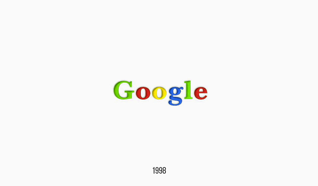
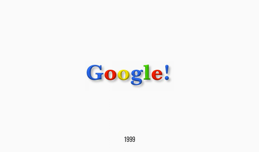
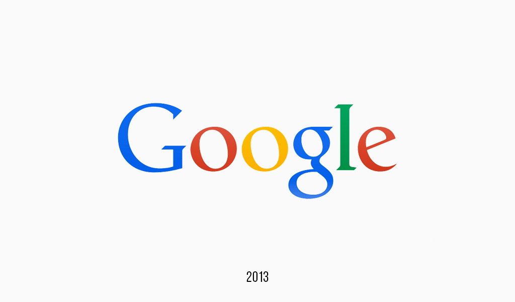
Google’s logo was altered a bit in the upcoming years. Though the main ideas still were there. A simple inscription became even simpler. First, shadows under the letters were removed, and then letter volume disappeared, dictating flat-design trends. However, the overall lightness of the logo and its vividness and allurement was preserved. A rainbow color combination was quite original, provided it ignored the color circle rules, as rules as such exist only to be skillfully broken.
It is worth mentioning that a virtual logo, in contrast to printed on bags or boxes, has many advantages. First of all, it can be animated. For example, using Google helper, you might notice the logo bursting into dots, imitating voice equalizer. All these small things are not to be neglected, as in the world of modern techs you simply can’t afford to ignore trends!
Google logo meaning
The hidden meaning of the Google logotype is messaged with bright colors, not crazy font or symbols. Bright colors in lettering symbolize that they do not play by the rules and know how to joy and have some fun.
Google Logo – Frequently Asked Questions
What are the colors used in the Google logo?
Blue, red, yellow, and green — each representing a specific emotional quality like trust, energy, and creativity.
Why did Google choose primary and secondary colors?
To break the rules intentionally and reflect creativity — the green disrupts the pattern of primaries.
What font does the Google logo use?
Since 2015, it uses Product Sans — a geometric, sans-serif typeface designed for clarity and friendliness.
What does the Google logo symbolize?
Simplicity, playfulness, and a user-friendly approach to technology and information.
How has the Google logo evolved over time?
From serif with drop shadows (1998) to flat sans-serif (2015) — aligning with modern digital branding trends.
Is there a hidden meaning in the Google logo?
The nonconforming green letter “L” reflects Google’s mission to innovate and defy expectations.
Can I use Google’s colors or font in my own logo?
No — but you can be inspired by their strategy. Use tools like Turbologo to create your own unique design.

SEO specialist, link builder, and blog editor at Turbologo. Writing insightful content about marketing, design, and branding. Sharing practical tips on building and promoting brands online.

