
It’s hard to imagine that Coca Cola once was struggling to compete against various companies on the market. It seems impossible to invent a carbonated beverage of the same quality. However, a certain beverage worthy of taking Coca Cola place was contrived in 20s. It was called Lithiated Lemon-Lime Soda and it quickly became extremely popular. It even was called uncola. And can possibly imply that it was Sprite. However, the first soda to rival Coca Cola was bearing 7up logo. And today we are going to tell you its story.
Lock, Stock and 7up
Despite an excellent taste, the new product failed at the market due to its name. Would you buy something that is called “Bib-Label Lithiated Lemon-Lime Soda”? You are supposed to drink it after all. The customers clearly were cautious with that thing. The drink creator, Griggs, finally realized that it takes a good naming to sell his beverage. He decided to simplify the name, but still took some time to develop a new logo design.
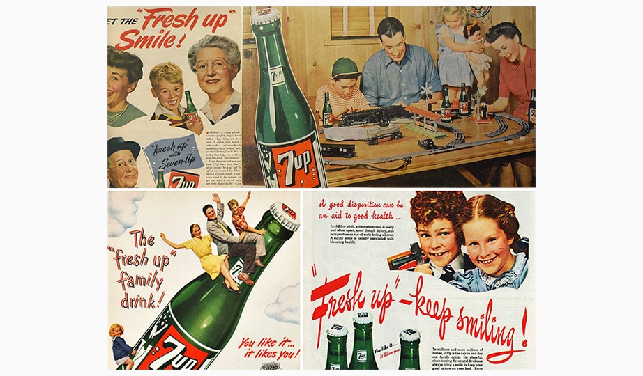
There are many rumors regarding origins of the name, ranging from lithium atomic number to Snow-white and the seven dwarfs. However, the name comes from 7up card game. A trump-card brings seven points to a winner. The new naming was accepted and the soda drink was too. Glass bottles were selling like hot cakes. Aluminium cans were adopted in 60s. The thing is that their capacity was 7 ounces. And it’s not just a coincidence!
A beginning of 7up logo history
The uncola identics wasn’t much different from current one. As fonts were changing, the meaning of 7up logo remained the same. There weren’t any hidden meanings however, it was only the name and nothing more. A background pattern all over can was comprised of bubbles.
Somewhat later, they added a red spot mascot. They say it symbolizes beverage creator’s red eyes. It is said he was an albino, but we can’t tell for sure as we have only black and white photos. Anyway, the spot took its place in 7up logo. There even is a game about the adventures of… the red spot. And was very popular back then.
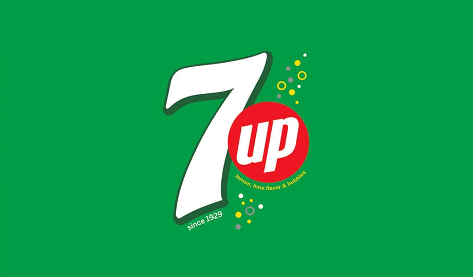
7up logo evolution
A combination of green background, white inscription and red spot remained in every adopted rebranding. One of the most palatable variations was designed in 90s. Sales were high those days and it was this logo variation that we all remember well even today. It featured black outlining and dynamics. Also, Helvetica Neue Cond Heavy Oblique is one of the most famous fonts in 7up logo.
Want to make your own drink logo? Explore food logo design ideas in our gallery.
Millennium evologo featured a green outlining and traditional white inscription. “Up” has been moved into the red spot. Designers have made it more informative with no additional alterations. As you can see, there always is room for improvement, and you don’t have to make your depiction bigger. What’s more the company has adopted another rebranding recently. This time it has been vintage designed. Critics have generally accepted the design, though they haven’t noticed something extraordinary about the logo.

SEO specialist, link builder, and blog editor at Turbologo. Writing insightful content about marketing, design, and branding. Sharing practical tips on building and promoting brands online.


