Just what it takes to cover an entire country with phone network? Well, you would need but money and determination to do so nowadays. And what’s about 19th century, when it wasn’t as easy? You would need at least two phones and they aren’t invented yet.
Bell Company, which was founded by the phone inventor, was capable of fulfilling the task. They managed to remain monopolists for quite a time. The company’s name altered many time of course, as various merges and dissolutions were taking place. Nowadays, a creation of Bell Company called Verizon Wireless follows its path and continues to serve the cause of the founder!
Table of Contents
Verizon wireless logo & company history
The story bean in 1996, when Bell Atlantic and South Bell decided to merge. Their merge also included a mobile company and that’s where “Verizon” comes from. The first logo history started in 2000.
Verizon wireless logo meaning
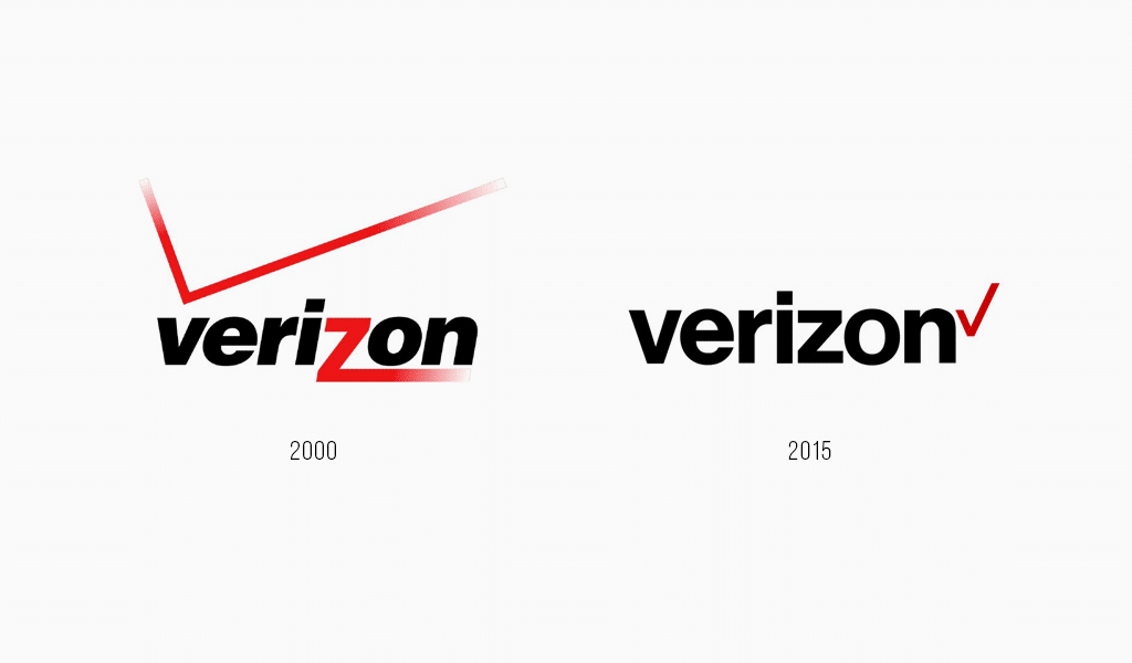
And what does that word in a logo mean? It is actually a neologism invented by the founder. It is comprised of Latin “Veritas” and English “Horizon”. An old logo was typed in italics and an overall design wasn’t good enough. “Z” was turned into huge blazing stroke fading into black. At the top there was a huge tick which was supposed to break symmetry. Many critics were founding the logo absurd and caricatured! And it’s just the case when customers see your branding regularly.
Verizon wireless logo evolution
2015 has become a verge of change. It was then that the company abandoned its old “Never Settle” slogan. The time of change has come and a new “Better Matters” slogan has been adopted. Alterations also have touched upon the old “Verizon” logo. The new version of it has turned into far more pleasant and attractive one.
Verizon wireless logo font
The logo use Helvetica typeface. The font remained black, bold and trimmed with no notches. They removed italics but haven’t altered “Z”. The blazing red tick was moved left. Thanks to all the changes, the logo finally retained harmony! It reveals that picture aligning is a very important feature. It is hard to notice at the first glance, but unleveled depictions are unpleasant to subconsciousness. The thing is that small details are actually the most important part of any logo.
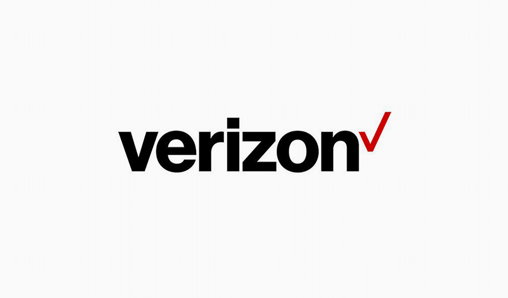
However, some critics haven’t liked the new logo variation. They imply that such a logo could easily be drawn by a 4 year old child. And they have a point really. The logo has improved significantly, yet it truly lacks in terms of quality.

SEO specialist, link builder, and blog editor at Turbologo. Writing insightful content about marketing, design, and branding. Sharing practical tips on building and promoting brands online.

