When I first began analyzing brand strategies, I realized how often entrepreneurs misjudge the importance of types of logos. A logo is not just a decorative image – it’s a strategic asset that influences brand perception and memorability.
Table of Contents
Why Understanding Logo Types Matters

A logo is the foundation of a brand’s visual identity. It’s the first thing customers see on packaging, websites, and ads. The wrong type of logo can create confusion and dilute brand trust. Knowing the strengths of mascot logos, lettermarks, and other formats helps you make better design choices.
For example, a playful mascot logo can make a consumer brand approachable and fun, while a clean logo lettermark suits corporate and tech businesses that value professionalism and clarity.
What Is a Logo?
A logo is a visual marker of your brand identity. It can be a single word, a combination of symbols, or a dynamic shape. Each design tells a story about your values and style.
For a deeper look at how color impacts branding, check out my article on psychology of color.
Main Types of Logo Design
There are several key types of logo design, each with distinct characteristics.
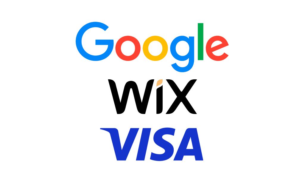
Wordmark Logos (Logotypes)
A wordmark logo focuses entirely on the company name, using typography as its core element. Examples include Google, Coca-Cola, and Visa.
When to use a wordmark:
- For brands with short, catchy names.
- When typography alone can reflect the brand’s style.
- If you need a scalable design for any format.
Expert Tip:
Typography can become a symbol in itself. The Coca-Cola wordmark, for instance, is instantly recognizable because of its unique script style.
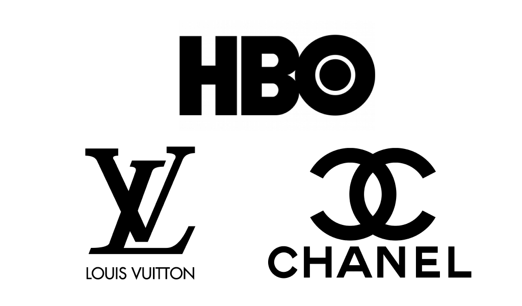
Lettermark Logos (Monograms)
A lettermark is built on the initials of a company name. This approach works best for businesses with longer titles. Examples include IBM, HBO, and NASA.
Advantages:
- Compact and adaptable across digital and print media.
- Adds a professional, minimalistic tone.
- Works well when paired with strong typography.
Learn more about choosing the right symbols in my logo symbols article.
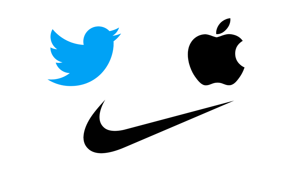
Pictorial Marks (Logo Symbols)
A pictorial mark is an image or icon representing the brand. Examples: Apple, Twitter, Target.
Why choose a pictorial mark:
- Builds instant visual associations.
- Great for global audiences since symbols transcend language.
- Ideal for brands with clear visual metaphors.
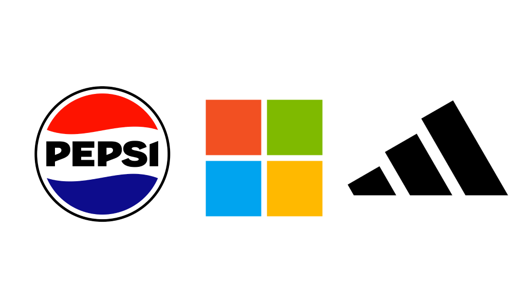
Abstract Logos
An abstract mark uses geometric shapes or patterns instead of literal images. Think of Pepsi, Adidas, or Nike.
When to pick an abstract logo:
- If you want to stand out with a unique look.
- For modern, tech, or innovative brands.
- To create flexibility in multi-platform design.
Emblem Logos
An emblem combines text and graphics within a single form, often resembling a badge or seal. Examples: Starbucks, Harley-Davidson, BMW.
Key traits:
- Convey heritage, prestige, and authority.
- Popular among schools, sports teams, and premium brands.
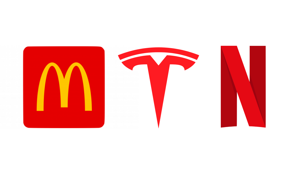
Mascot Logos
A mascot logo features a character or illustration representing the brand. Examples: KFC, Pringles, Pillsbury Doughboy.
Benefits:
- Builds emotional connections with customers.
- Perfect for family-oriented or playful brands.
- Ideal for storytelling in advertising.
Combination Logos
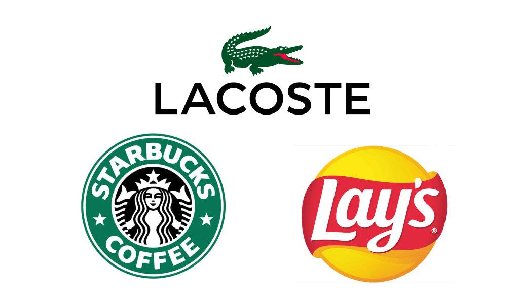
A combination logo merges text with symbols, mascots, or abstract marks. Examples: Burger King, Doritos, Lacoste.
Why it works:
- Combines text clarity with visual appeal.
- Flexible for apps, packaging, and online platforms.
Dynamic Logos (New Trend)
Dynamic logos can adapt colors, shapes, or elements while remaining recognizable. Google Doodles are a classic example.
When to consider this style:
- For digital-first or creative industries.
- When you want to reflect seasonal or thematic changes.
- To showcase brand versatility.
How to Choose the Right Type of Logo
Your logo options depend on brand values, audience, and industry. Below is a quick reference:
| Logo Type | Best For | Examples |
|---|---|---|
| Wordmark | Short, catchy names | Google, Visa |
| Lettermark | Corporate, B2B brands | IBM, HBO |
| Pictorial Mark | Visual identity focus | Apple, Twitter |
| Abstract Mark | Creative, modern look | Adidas, Pepsi |
| Emblem | Traditional companies | Starbucks, BMW |
| Mascot Logo | Fun and engaging brands | KFC, Pringles |
| Combination | Flexible branding | Burger King |
| Dynamic | Tech and media brands | Google Doodles |
Case Studies: Famous Brands and Their Logo Choices
Looking at how leading companies use different types of logo design gives practical insights into why certain logo styles work better than others.
Case 1: Google – The Power of Wordmarks
Google’s iconic wordmark relies on typography yet remains instantly recognizable worldwide. Its clean sans-serif font communicates simplicity and trust, while the vibrant color palette reflects creativity and diversity. This shows that a type logo doesn’t require elaborate symbols to stand out – strong typography combined with strategic color psychology is enough.
Case 2: Apple – A Pictorial Mark That Defines Innovation
Apple’s bitten apple symbol is one of the most famous examples of a logo globally. It started as a detailed illustration but evolved into a sleek, minimalist icon. This transition proves that simplicity and a clear concept often have more impact than complex designs.
Case 3: KFC – Building Emotional Bonds with Mascot Logos
The smiling face of Colonel Sanders has made KFC’s mascot logo synonymous with trust and comfort food. Mascot logos work well when a brand aims to create a personal, friendly connection with its audience. The character tells the brand’s story and represents its values.
When Different Logo Styles Fail
Not every type of logo succeeds. Overcomplicated logo options can lead to visual clutter and weak recognition. Startups often pick different logos without a clear strategy, which confuses customers. A minimalist approach, such as a logo lettermark, is often better for tech or SaaS companies.
Expert Tip:
A logo should communicate a brand message in 2–3 seconds. If it takes longer for someone to understand, the design is too complex.
How to Create a Logo That Works
- Start with research: Study competitors’ logo types to see what works in your industry.
- Define your brand values: A law firm might benefit from an emblem logo, while a tech startup may need an abstract or type of logos that emphasize innovation.
- Experiment with variations: Use tools like Turbologo to test different logo styles before making a decision.
- Test for versatility: Check how your logo types look in black and white, on mobile screens, and in print.
Logo Styles and Color Combinations
Colors are critical for logo recognition. For example:
- Red and Yellow (McDonald’s, KFC): Energetic and appetizing.
- Blue and White (IBM, Twitter): Trust and stability.
- Black and White (Nike, Adidas): Minimalist and premium.
For details on how color affects branding, read my article on psychology of color.
Advanced Logo Trends
In 2025, brands are moving toward dynamic logos and AI-driven personalization. A single logo can change its form or colors for seasonal events while remaining recognizable. Turbologo includes AI features to help users explore these different types of logo approaches.
Logo Formats and Technical Aspects
Choosing the correct file format is as crucial as selecting the right logo style. A logo may look perfect on-screen but lose quality when printed if saved incorrectly.
- SVG: Best for scaling without loss of quality.
- PNG: Ideal for digital use with transparent backgrounds.
- EPS or PDF: Standard for printing.
For more details, check the logo file formats guide.
Building a Full Brand Identity
A professional logo is only the first step. Businesses need a consistent identity, which includes:
- A unified color palette.
- Branded social media templates.
- Business cards and packaging that match the chosen logo types.
Commercial Insert:
With Turbologo’s brand kit, you can instantly generate logos, business cards, and social banners, ensuring every design element speaks the same visual language.
Common Mistakes in Logo Design
- Using too many colors: Creates clutter and increases printing costs.
- Copying famous logos: Harms credibility and poses legal risks.
- Poor typography: A mismatched font can ruin even a strong type of logo concept.
- Ignoring scalability: Logos must look clear both at 16×16 pixels and on billboards.
Frequently Asked Questions
Q1: How many types of logos are there?
There are 7 main categories: wordmarks, lettermarks, pictorial marks, abstract marks, emblems, mascots, and combination logos. Dynamic logos are a modern extension of these styles.
Q2: Which logo type is best for small businesses?
Combination logos are versatile, as they combine text and symbols, working well in various formats.
Q3: Can I design a logo myself?
Yes. With AI-powered tools like Turbologo, you can create professional logo styles in minutes.
Q4: Are mascot logos effective for all industries?
Not always. Mascot logos suit entertainment, sports, and food brands but are less ideal for finance or legal services.
Conclusion
Understanding different types of logos helps you build a brand identity that connects with your audience. Whether you prefer a fun mascot logo or a clean logo lettermark, the right choice strengthens brand perception.
If you want to test various logo types, try the Turbologo logo maker and see how AI can simplify the process of creating different logo concepts.

SEO specialist, link builder, and blog editor at Turbologo. Writing insightful content about marketing, design, and branding. Sharing practical tips on building and promoting brands online.