There aren’t many Japanese car brands, so most of them are well known and desired. One of them has been designing and manufacturing cars for more than a century. It’s merely impossible to find a person ignorant to the brand on the globe. And today we are going to tell you about the Toyota logo, its history, and its meaning.
Table of Contents
Toyota Logo History
A long history of the brand dates back to the 19th century. Sakichi Toyoda invented a new kind of weaving loom. And it was a brand new kind of it as it featured an electric engine. Little by little, his company moved looming endeavors to ultramodern cars engineering, construction, and design. Sakichi’s son, Kiichiro Toyoda decided to invent something unseen before and unthinkable for the Japanese nation. He traveled abroad many times and saw all the inventions of the West and got his ideas from there.
Logo evolution
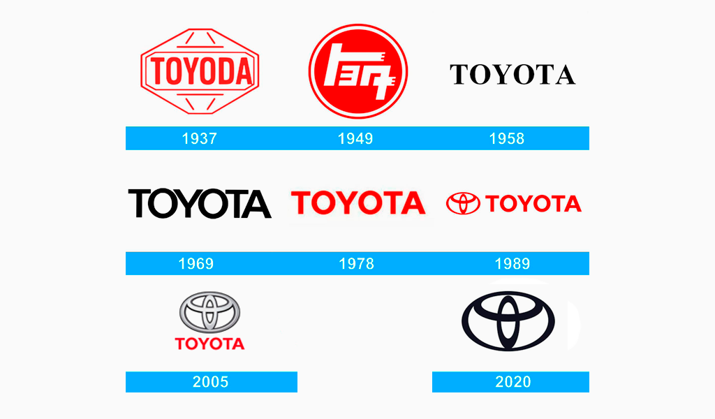
No wonder the company was named after its founder. And the surname was widespread back in the days. Many Japanese brands have similar names. But why do we spell Toyota, not Toyoda? Right before World War II, the company adopted a rebranding. And obviously, it included some logo changes too. Kiichiro replaced “D” with “T”. Why’s that? That’s because the Japanese consider number 8 a lucky one. And the new spelling contained exactly 8 lines.
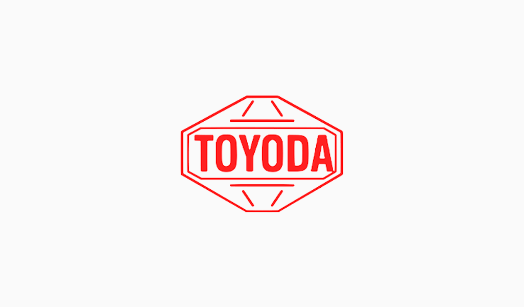
The first version of the original Toyota logo was as simplistic as possible. The naming was fitted into some kind of a rhombus. A font was semi-bold with no notches. All in all, the logo used to reflect the gist of the company. Namely, reliability and simplicity. However, the next Toyota logo version was far more creative compared to the first one.
The brand took its rightful place on the market back then and it went down into Toyota logo history. The new version looked impetuous and aggressive. Stylized Japanese writing was fitted into a vermilion circle. It greatly resembled the Japanese flag. As we know, the circle in it symbolizes the sun that might seem odd but that’s what they believe.

Toyota logo Font
As time went by, they had to make Toyota logo sterner and virile. Japanese designers prefer simple inscriptions as brand symbols. The naming alone was the only element in the logo for quite a long time.

So, what font was used for the Toyota logo inscription? It was the trendiest at the time font called Times New Roman and it didn’t irk customers yet. It was a simple and elegant decision. Next, they dropped old-fashioned notches. The letters became thicker and spacing was reduced and angled to imply speed and velocity. Nowadays, the Toyota logo boasts a semi-bold font slightly resembling Sole Sans Extended.
Toyota logo meaning
And what does the Toyota logo stand for and what is its meaning? Well, first of all, it’s worth mentioning that a logo means far more for a car brand than for most of the other ones. Chrome shields on the hood are valued greatly by car owners. It’s an ostentation thing. That’s why designers were having a tough time developing something really cool. As a result, they’ve managed to create an item that any gentleman would die for.
An unforgettable oval appeared in the Toyota logo at the end of the 80s. It has been changed yet and we believe that to be a good thing. The car industry benefits greatly from recognizability and traditionalism. The insignia is comprised of a big oval that is partially overlapped with a pair of smaller ellipses. The smaller ellipses form a capital “T”. Such a straight move makes the simplistic logo truly unforgettable.
By the way, there is a different version of the Toyota logo meaning. An ellipse entering another ellipse is designed to remind of a thread coming through the needle’s eye. Perhaps, it’s a tribute to the company’s past. Toyota used to produce weaving looms in the past after all. Anyway, whatever it means, there are dozens of ideas you can derive from the logo. A wide volume of the ovals implies a vast space. It’s as if new horizons are on the verge of crossing and you would need a car to do so.
So, the Toyota emblem is a combination from the three overlapping Ellipses. These Ellipses symbolize the unification of Toyota customers’ hearts and the hearts of Toyota products. The background space symbolizes infinity in Toyota’s technological progress and opportunities.
I’m a product and graphic designer with 10-years background. Writing about branding, logo creation and business.


