In addition to the widespread use of black or white, logos using a single-color are also popular. In the world of modern graphic design and branding, such simple logos have become a symbol of clear communication. Despite their minimalism, they possess an amazing ability to convey powerful messages and create a lasting impression.
Table of Contents
Single-color logo advantages
Single-color logos have a special place in the design world. They have a significant advantage in terms of creating a clear and memorable image. Using a single-color helps focus attention on the essential elements of the design, making the logo clearer and easier to understand. Here are a few features and benefits of a single-color logo for a business.

Simplicity and purity of design
A single-color logo can be extremely simple and clean. This allows the brand to stand out and be remembered, even if it doesn’t have complex designs or a color palette. In a world where people are exposed to a huge amount of visual information every day, simplicity in logo design helps a brand stand out. A minimal amount of detail allows the target audience to instantly recognize and remember the logo.
How to make a logo with AI – read in our blog
Savings on printing and production
A one-color logo is usually cheaper to produce, especially when considering printing on merchandise, packaging or documents. This can be especially useful for small businesses with limited budgets.

Versatility and adaptability
A single-color logo easily adapts to different contexts and platforms while maintaining its readability and customer recognition.
Regardless of whether the corporate identity is changing or a new advertising campaign is being developed, a single-color logo will always be a strategic choice for a successful brand.
Emotional appeal
When used correctly, a single-color logo can effectively convey the emotional aspects of a brand’s identity. For example, blue may be associated with reliability and professionalism, while green may be associated with nature and ecology.
How to Design a Single-Color Logo Embracing Simplicity

Creating a monochrome simple logo requires careful attention to ensure that the ultimate result is not only visually pleasing but also effectively communicates the brand’s core values. Above all, it is important to keep simplicity and minimalism in mind – a monochrome logo should be easy to read and instantly recognizable. Start by researching and analyzing your target audience and competitive landscape to understand which visual elements will be most relevant and effective.
Choosing the right option from multiple colors is the key: each color evokes certain emotions and associations, so it is important to choose the one that best reflects the brand’s philosophy and values. When developing the shape and structure of the logo, strive for geometric purity and balanced proportions. Keep in mind that the logo should scale well and be legible in both small and large sizes.
At the same time, avoid unnecessary elements and details that can complicate perception. To improve perception, you can use negative space, which will add depth and originality to the design. It is also important to test the logo on different backgrounds and media to ensure that it looks attractive and remains legible in any context.
Finally, don’t forget about durability – a single-color logo should remain relevant and recognizable for many years, so avoid temporary trends and focus on classic, time-tested solutions.
Common Mistakes to Avoid

To steer clear of typical blunders while designing a one-color logo, keep the following points in mind:
- Oversimplification: Avoid oversimplification, which can lead to the loss of the logo’s individuality and uniqueness. The logo should remain expressive and memorable, even when using a single-color. Don’t overdo it. A small inclusion in a barely noticeable place can affect the perception of the entire logo.
- Incorrect color selection: The color should match the brand’s values and image. For example, if the brand’s essence is associated with energy and dynamism, it is better to use bright and saturated colors, such as red or orange. Since you’re only going to use one color, the hue value speaks volumes, so be careful when choosing them.
- Ignoring color’s symbolic and cultural meanings: Colors may represent many things in different cultures. For instance, whereas in Asian cultures white is associated with sadness, in Western cultures it represents purity and tranquility. Think about these subtleties to prevent unfavorable responses.
- Lack of contrast: Make sure your single-color logo is clearly visible on a variety of backgrounds. If the logo’s color is too close to the background, it can get lost and become indistinguishable. Test the logo on different backgrounds and at different sizes to ensure it is legible.
Avoiding these pitfalls will allow you to create logos that are both aesthetically pleasing and successful in promoting your business.
Examples of Successful Monochrome Logos
Prominent monochrome logos showcase the power of simplicity in branding unlike complex logos. These logos prove how a single-color can create a memorable and impactful brand identity.
Nike: Nike “Swoosh” logo is a perfect example of the power of monochromatic design. This simple yet dynamic symbol is instantly recognizable and associated with movement and achievement.
Apple: The monochromatic Apple logo has become a symbol of innovation and timeless appeal. Its minimalist design underlines the brand values of austerity and efficiency.

Chanel: Chanel’s black and white minimalist logo embodies elegance and luxury. Its simple design and sophistication underscore the brand’s message in the fashion world.

WWF: The panda emblem for the World Wildlife Fund is a potent illustration of monochrome design. The brand’s personality of environmental stewardship and animal protection is clearly communicated by the easily recognizable black and white picture of the panda.

Making modern logo design with Turbologo
Creating a monochrome one-color logo can be simplified with the Turbologo online generator. This user-friendly tool allows you to quickly and easily design a professional logo without having any special design skills. To create a single-color logo on Turbologo, follow these steps. First, visit the site and register or sign in to your account. Then, select the category that best reflects your brand’s field of activity and enter your company name.
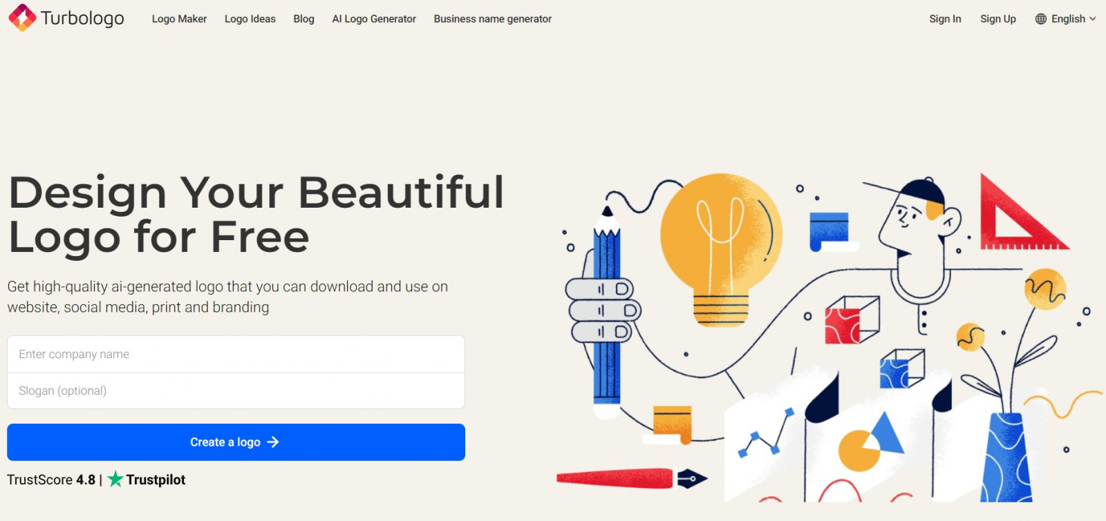
After that, proceed to choosing the logo style and specify your preferred color. Choose one color that best matches your brand and will evoke the desired associations in the audience. Next, choose an icon or symbol to be used in your logo, or skip this step if you want to create a text or abstract logo.
Finally, the generator will offer many design options according to the latest trends from which you can choose the most suitable one. You can make the necessary edits and improvements to the selected logo so that it fully meets your requirements and download the finished file in the preferable format. The entire design process requires no initial payment. Creating logos with Turbologo is fast, easy and accessible to everyone.
Conclusion
Single-color logos are a powerful branding tool that can help a business stand out in the market and create a lasting image. Their simplicity, familiarity and versatility make them an excellent choice for various types of brands and industries. Using a single-color logo can significantly reduce printing and production costs, as well as ensure easy reproduction on any media. You may effortlessly and quickly create a one-color logo that satisfies your needs and expectations by using an online tool such as Turbologo.

SEO specialist, link builder, and blog editor at Turbologo. Writing insightful content about marketing, design, and branding. Sharing practical tips on building and promoting brands online.


