
Be it markword or a badge, a branding sign is a necessary part of a successful marketing strategy. To gain inspiration for its creation, you might research the stories of already existing ones.
Ram logo design serves as a worldwide known identity for one of the oldest American trucks producing companies. Throughout time “Dodge Brothers Company” was outbid by Chrysler. The said circumstance started a new chapter in its symbol journey that lasts till now.
There arise multiple misunderstandings and bewilderment when it comes to the logo variations. Its history and evolution are vivid and kept in the continuous round of events. Its meaning is confusing. The selection of colors and font is interesting as well.
Being one of the famous and beautiful car emblems, those moments have to be made crystal clear. The reader of this article simply has no choice but to get to know all the crucial points about it.
Table of Contents
Ram logo meaning

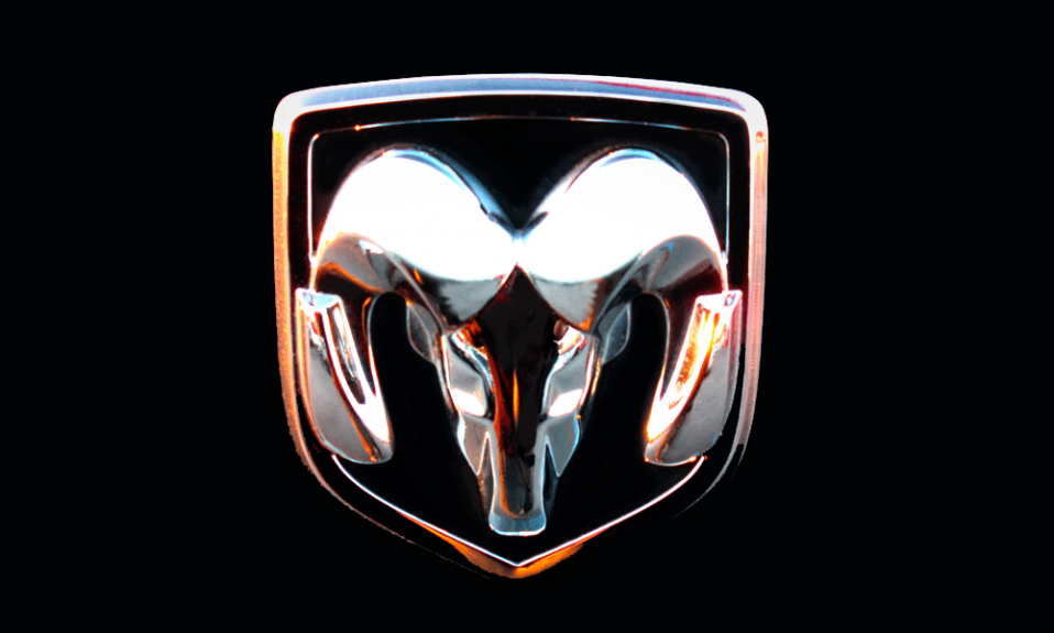
There exist three possible explanations of the Dodge Ram logo. They are not contrary, yet very different.
The first idea is pretty obvious. The ram’s head represents the qualities of the mammal itself: powerful and forceful. Thus, it is perceived likewise by the public.
Another meaning of it might be tied to the horoscope sign – Aries. Bravery, honesty, fearlessness, pride, and high ambitions are its characteristics.
Also, fans frequently compare Ram emblem to the uterus.
Ram Logo History and Evolution
The harbinger of Ram logo has been designed back in 1920 by Avard Tennyson Fairbanks, the respected sculptor in America. He was invited to take part in the hood ornament project. The precise requirements to the task have never been given, which obliged the author to use his imagination flow and keenness of wit to the highest extent.
It took a few days of multiple tries for Fairbanks to come up with a future Dodge Ram symbol outline. Artist’s customers doubted this car hood design. Anyway, eventually, the concept was approved. There are years (even decades) to come until it becomes a well-known Ram truck logo.
Ram Logo Design Evolution
1900, is the year of founding the enterprise. The very first car was launched in 1914. Since then, a number of transformations have been brought in, which greatly affected the Dodge logo history as well. Also, it is principal to make allowance for changing hands and political conditions.
Overall, the brand applied 8 emblem variations. The design described in the previous section started to function as a Dodge logo only in 1993.
Note! Such an amount might seem huge. However, the search for the most suitable option can happen to be a path of long duration and many attempts.
In 2009 Fiat superseded Chrysler. From now on Dodge and Ram symbols are separated. Belonging to the same provider yet creating cars for dissimilar reasons. Dodge is responsible for SUVs and minivans, Ram supplies people with ragged trucks.
Ram logo font
If talking of Dodge Ram symbol, the used typeface is a simple, semi-bold, sans-serif, monospaced display. The letters are a little widened from their neutral state. In previous variants the “DODGE” characters were slightly angled to the right, currently, they stand straight.
The font of the Ram emblem showcases another visual decision. The letters are more thickened and the element of non-finished lines, that creates blank space between its ends, is absent.
On the whole, they differ, but, still, touching points remain evident.
Ram logo colors
The color palette of Dodge Rams head is maintained in laconic hues. Here you may observe black, white, and shades achieved by mixing those two; plus, metallic effect.

SEO specialist, link builder, and blog editor at Turbologo. Writing insightful content about marketing, design, and branding. Sharing practical tips on building and promoting brands online.


