Curious about how the PlayStation logo has changed over time and what each version represents? In this article, we dive into the evolution of PlayStation logo history meaning, examining its design history and uncovering the significance of each iteration since its launch in 1994.
- The PlayStation logo has evolved significantly since its 1994 introduction, reflecting technological advancements and market trends while retaining core branding elements.
- Designed by Manabu Sakamoto, the original logo’s vibrant color scheme and interlocking initials symbolized unity among gamers and marked a shift to 3D graphics in gaming.
- The current PlayStation logo emphasizes minimalism with a bold typeface, maintaining brand recognition and adapting to contemporary design while fostering trust in the gaming community.
Table of Contents
PlayStation Logo History
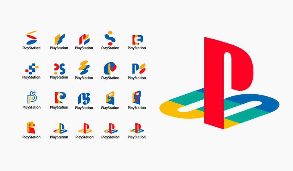
The PlayStation logo has become an iconic symbol representing gaming creativity and evolution.
The PlayStation logo stands as not just a brand mark but a cultural phenomenon that has transformed the gaming industry. Since its introduction, it has set significant standards in professional logo design, influencing branding across industries. The logo was crafted to embody technological sophistication and unity among gamers, a vision consistently upheld through its various iterations.
The evolution of the PlayStation logo reflects advancements in gaming technology and the expanding gaming community. The final design emerged after numerous prototypes, showcasing the meticulous effort in creating the perfect emblem. The original logo was crafted to resonate with a growing, diverse gaming audience, symbolizing the shift to 3D graphics in the fifth generation of consoles.
Designed by Manabu Sakamoto, the first PlayStation logo featured interlocking initials to symbolize convergence. The retro color scheme—a red ‘P’ and an ‘S’ transitioning through yellow, green, and blue—was intended to highlight the dynamic and vibrant nature of the PlayStation brand.
This logo has since become a universal symbol, transcending language and geographical barriers, and connecting gamers worldwide.
PlayStation Logo Meaning
The PlayStation logo is a recognizable symbol of the brand, reflecting its dedication to its original mission and principles. Sony’s branding strategy has focused on maintaining a consistent product line with major tweaks and upgrades, ensuring the logo remains relevant and recognizable over time. This consistency has fostered trust and strong brand recognition among consumers.
A key aspect of the PlayStation logo’s success is its ability to evolve with market trends while retaining its core elements. This evolution reflects both technological advancements and the expanding expectations of the gaming community. By balancing its heritage with future aspirations, the PlayStation logo remains a powerful emblem in the gaming world.
The Birth of an Icon: PlayStation Logo 1994

The original PlayStation logo, introduced in 1994, has become an iconic symbol of gaming creativity and evolution. Designed by Manabu Sakamoto, it was the result of extensive trial and error after numerous prototypes. The design aimed to emphasize the shift to 3D graphics during the fifth generation of console gaming—a revolutionary change at the time—and is often referred to as the original Sony PlayStation logo.
The PlayStation logo’s retro color scheme, featuring a red ‘P’ and an ‘S’ that transitions through yellow, green, and blue, was not just a stylistic choice but a representation of the brand’s dynamic and vibrant nature. This bold use of color helped the logo stand out in an era dominated by more subdued designs, making it one of the most memorable symbols in gaming history.
The interlocking initials ‘P’ and ‘S’ in the logo symbolized convergence and unity among gamers, a core value of Sony Interactive Entertainment. This design choice was meant to resonate with a growing, diverse gaming audience, establishing a strong foundation for the PlayStation brand. Over the years, the logo has become a universal symbol, transcending language and geographical barriers, and connecting gamers worldwide.
In 2009, Sony Interactive Entertainment introduced a redesigned PlayStation logo that embraced modern design trends. This new logo adopted a monochrome aesthetic, simplifying the color palette to align with contemporary branding standards. The shift to a refined and minimalist design preserved the geometric proportions of the original, ensuring continuity and strong brand recognition.
The updated logo was well received by fans, further solidifying PlayStation’s status in the gaming market. By adopting a more understated look, the design strategically aligned with PlayStation’s reputation as a premium gaming brand. This transition marked a significant step in the logo’s evolution, reflecting the brand’s growth and adaptability.
Current PlayStation Logo: Simplicity and Elegance
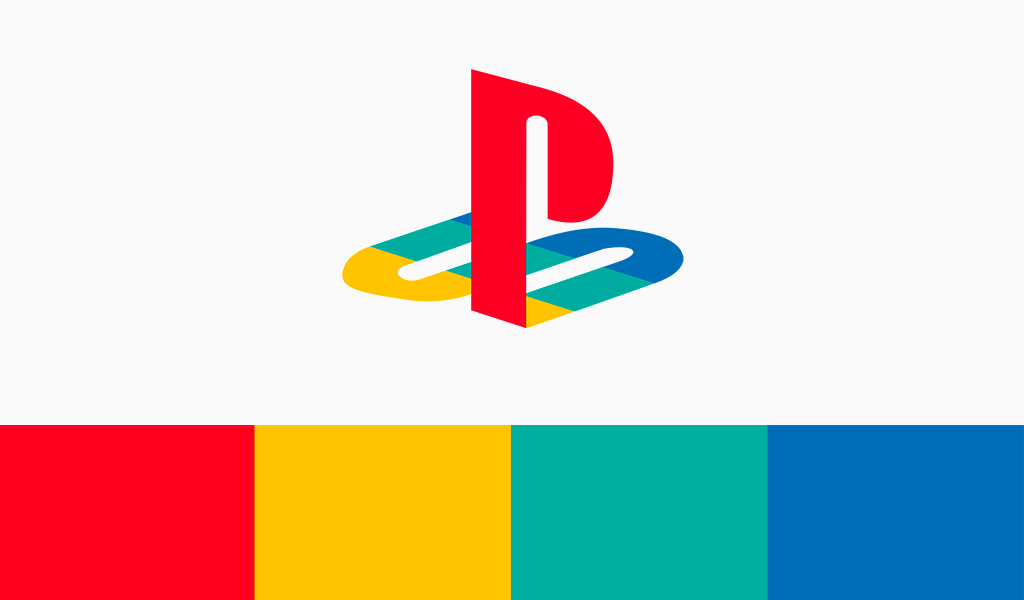
A red ‘P’ is prominently displayed against a background ‘S,’ which is decomposed into various shades, showcasing the designers’ skillfulness and artistic depth. Typically, the logo is placed on a white background, though a transparent version of the PlayStation logo is also available.
The current version of the logo is entirely monochromatic, with all colors removed as a tribute to modern design trends. Having four colors in a logo is now considered overly posh and outdated. Regardless of how well the colors might complement each other, such designs are often viewed as dull and out of fashion in today’s branding standards.
The current PlayStation logo is defined by its black-and-white color scheme, emphasizing minimalism. This design reflects a modern aesthetic that resonates with today’s consumers. The consistency in the logo’s design over the years has helped foster trust and strong brand recognition among consumers.
One of the main features of the PlayStation logo that has remained consistent is its distinctive 3D look and typeface. The current update introduced a bolder font, a vibrant blue color, and a more geometric PS symbol, enhancing its iconic status. This striking silhouette art has become a key element of the logo, ensuring it stays recognizable and memorable.
The PlayStation 5 logo embodies simplicity and tradition, aligning with contemporary design trends while retaining its core branding elements. This balance of innovation and consistency has allowed the PlayStation logo to maintain its relevance and iconic status in the gaming industry.
Symbolism in PlayStation Logo Design
The PlayStation logo’s design is rich with symbolism, particularly in the interplay of the letters ‘P’ and ‘S’, which symbolize unity and shared experiences among gamers. This interlocking design represents the convergence and connection that PlayStation strives to foster within its community.
The PlayStation controller features four iconic buttons, each with its own meaning. The triangle, represented in green, signifies the player’s viewpoint, while the square, in pink, symbolizes menus or documents. The circle and cross buttons represent affirmative and negative actions, with circle indicating ‘yes’ and cross indicating ‘no’.
These symbols have become an integral part of the gaming experience, further embedding the PlayStation brand in the minds of gamers.
PlayStation’s Journey Through Generations
The journey of the PlayStation logo through different console generations mirrors the advancements in technology and design trends of its time. Each iteration reflects significant milestones in gaming history, showcasing the brand’s evolution and commitment to innovation. From the original PlayStation to the latest PS5, the logo has undergone subtle refinements while retaining its iconic foundation, ensuring ongoing brand recognition.
PlayStation Logo Evolution
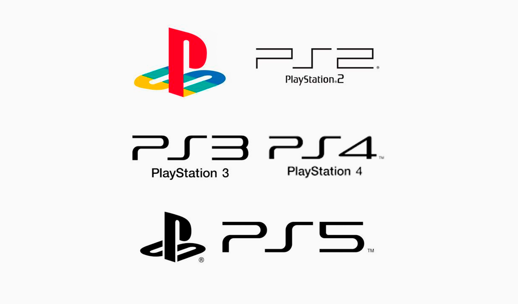
This journey demonstrates how the PlayStation logo has adapted to evolving technologies and player expectations, maintaining its relevance and iconic status. The following subsections will explore the specific changes and innovations introduced with each console generation.
PlayStation 2 Logo: A New Era
The PlayStation 2 logo, introduced in 2000, marked a new era for the PlayStation brand. Designed by Teiyu Goto, it featured a streamlined and modern design compared to its predecessor. The gradient blue symbol represented the console’s enhanced capabilities, reflecting the technological advancements of the time.
This design was more than just aesthetics—it signaled the PlayStation 2’s leap in performance and features. The logo’s modern look and feel helped position the PlayStation 2 as a leading gaming platform, appealing to both loyal fans and new gamers.
PlayStation 3 Logo: Monochrome Sophistication
In 2006, the PlayStation 3 logo was introduced, featuring a sleek, monochrome design. Led by designer Teiyu Goto, the team aimed to create a logo that was adaptable to various contexts, reflecting a shift towards modernity and sophistication. The uniform black design symbolized a move towards a mature and refined aesthetic, aligning with the console’s advanced features and capabilities.
This monochrome sophistication helped the PlayStation 3 stand out in a competitive market, reinforcing its position as a premium gaming console. The logo’s sleek design was well-received, further cementing the PlayStation brand’s reputation for innovation and quality.
PlayStation 4 and 5 Logos: Consistency in Innovation
The PlayStation 4 and PlayStation 5 logos have upheld the tradition of consistency in innovation. Introduced in 2013, the PS4 logo embraced a modern and minimalist aesthetic, retaining the core branding elements of its predecessors. This design ensured the PlayStation brand remained recognizable while aligning with contemporary design trends.
The PlayStation 5 logo, while similar to the PS4’s, incorporates a more futuristic and innovative feel. This subtle evolution underscores PlayStation’s dedication to brand continuity while pushing the boundaries of design and technology. This consistent yet forward-thinking approach has solidified PlayStation as one of the leading gaming platforms worldwide.
PlayStation’s Historical Ties with Nintendo
The history of PlayStation is deeply tied to its initial collaboration with Nintendo. In 1988, Sony and Nintendo partnered to create a CD-ROM attachment for the Super Nintendo. However, the partnership fell apart in 1991 when Nintendo unexpectedly chose to work with Philips instead. This pivotal moment pushed Sony to develop its own gaming console, marking the birth of the PlayStation.
Ken Kutaragi, instrumental in developing the PlayStation, had previously worked on the Super Nintendo hardware. This collaboration and subsequent fallout heavily influenced Sony’s direction, ultimately leading to the creation of the PlayStation console and its iconic logo.
The PlayStation logo was crafted to resonate with a rapidly growing and diverse gaming audience, establishing a strong foundation for the brand.
The Impact of PlayStation Logo on Gaming Culture
The PlayStation logo has had a profound impact on gaming culture, evolving into a universal symbol that transcends language and geographical barriers. Recognized as both a brand and a cultural phenomenon, the logo has transformed the gaming landscape, extending its influence beyond gaming into streetwear and mainstream fashion, solidifying its status as an iconic emblem.
Cultural Impact on Gaming and Branding
The PlayStation logo represents gaming creativity and evolution, fostering a sense of community among gamers worldwide. Its enduring presence has made it one of the most recognizable logos, influencing the gaming industry and culture globally. Its integration into various cultural domains, including fashion, highlights its lasting significance and the profound impact it has had on gaming culture.
Fun Facts About the PlayStation Logo
- Fashion Influence: The logo’s distinct ’90s aesthetic has become a recurring trend in fashion, appearing on t-shirts, sneakers, and more. Today, the PlayStation logo is prevalent among major clothing retailers, underscoring its cultural impact beyond gaming.
- Historical Prototype: The original SNES PlayStation prototype, a relic from Sony and Nintendo’s early collaboration, sold for $360,000 at auction. This underscores the historical significance and value of the logo and its origin story.
- Controller Design: The PlayStation controller, featuring the iconic Triangle, Circle, Cross, and Square buttons, was designed to enhance navigation in 3D gaming environments. Its core design elements have remained consistent across iterations, making it one of the most recognizable gaming accessories.
Logo Evolution and Legacy
From the original colorful, interlocking design by Manabu Sakamoto to the current sleek, minimalist emblem, the PlayStation logo has evolved in step with the brand’s growth and technological advancements. Each iteration preserves the core elements that ensure its instant recognizability and iconic status. This journey mirrors the advancements in gaming technology and the expanding gaming community, keeping the logo relevant and beloved by fans.
Summary
The PlayStation logo transcends its role as a mere brand mark, standing as a symbol of gaming creativity, unity, and innovation. Its influence is seen not only in the gaming industry but also in fashion and everyday culture. As PlayStation continues to evolve, its logo remains a beacon of excellence and progress, ensuring its iconic status for generations to come.

SEO specialist, link builder, and blog editor at Turbologo. Writing insightful content about marketing, design, and branding. Sharing practical tips on building and promoting brands online.

