Podcasts can cover a variety of topics, from yoga to an overview of innovative technologies. Even though podcasts are audio products, their marketing also includes visual expression. And the logo can be called one of its most important elements. The logo for a podcast should attract attention, create the desired image. You need to create something that reflects your theme and keeps your audience interested.
Create your own logo with Turbologo logo maker. It takes less than 5 minutes and no design skills needed.
Go to Logo MakerDesigning the perfect podcast logo is a complex and demanding task. However, everything is possible if you know the basic principles of this process. In this article, you will learn how to create a logo for podcasts that will attract attention and bring success.
Table of Contents
The Importance of a Podcast Logo

Some users are of the opinion that visuals are not that important for podcasts and do not attach due importance to them. But as practice shows, this is a big mistake.
Why having a good podcast logo is critical:
- This is your “face”, which forms the first impression of listeners who come to you for the first time.
- Increased audience loyalty.
- Required for publishing podcasts on most major platforms.
- This marketing tool can be used for multiple brand products at once.
- Plays a key role in building a personal brand and gaining recognition.
- With a unique and attractive logo, you can expand your audience.
Understanding Your Podcast Brand
The logo will be the foundation of your podcast brand. That is why, you will need, first of all, to determine its identity. So you can design exactly the logo that you need.
The first step to defining an identity is to tell the story of the podcast. It is at the heart of any personal product created for a wide audience.
A podcast mission statement is a short paragraph that defines the following:
- What do you do?
- Why are you doing this?
- Who are you doing this for?
In addition, in the second paragraph, you need to express your vision for your podcast and its future. This short text says the following:
- How do you see your podcast in a few years?
- What social problems do you solve?
- What changes do you want to bring to people and the community?
The reason why you must define a mission and a vision is simple. Most likely, when creating a logo, you want it to last as long as possible. Naturally, sometime in the distant future, you can rebrand, but it’s best to make yourself a strong logo from the very beginning.
Key Elements of a Standout Podcast Logo
There are several important criteria that a good podcast logo must meet.
- First of all, the logo must be unique. This will allow you to stand out from your competitors and avoid problems related to copyright infringement.
- Also, it is important that the logo is memorable. The ideal option is when the emblem is fixed in the mind of the listener at first sight. As a reference, you can consider the well-known “apple” of Steve Jobs, the “tick” of the famous sports brand and the inscription Coca-Cola.
- Another important point is that the logo should correlate with the topic of the podcast. But, it is worth remembering that the logo is not quite a sign or a business card. Too visual representation (like a lotus flower, if your podcast is about yoga) can seem banal.
- At the same time, the logo should be simple. First of all, because simple forms are easier to read, analyze and remember. They do not need to be further simplified for use at small sizes (which is the case when it comes to a logo for a podcast).
- And to make your logo even more interesting for the audience, add a hidden meaning to it. There is a story behind many famous and not so famous logos. Sometimes a part of this story is reflected in the logo. This will definitely be a plus for your podcast.
- Any modern logo is not what it looks like. This is how and where it is used. It can be both an “illustration”, and a “photo” and even “some kind of doodles”. The main thing is that he was in place and on time.
Step-by-Step Guide to Designing a Podcast Logo

So, in one of the previous chapters, we talked about how to define the mission and vision of the brand. After you have done this, you can start rendering the logo.
Step one. Logo examples
For starters, it’s worth going in search of inspiration. Look at the logos of your competitors. Find options that you really enjoy. Download them and take notes. By the way, it will be useful to save some logos that you do not like.
Step two. Types of logos
When looking for inspiration, you will notice that all logos have different shapes and styles. They can be divided into several main categories:
- Verbal. These logos are among the most common. Basically, it captures the main idea of the podcast with a beautiful design and font. Text can be uniquely formatted by highlighting certain letters. A distinctive feature of such logos is the absence of visual elements.
- Letters. The letter logo is based on the initials of the podcast name. This type is ideal if the name is too long.
- Combined. This type of logo is the most popular and widespread. Its design includes a title, a visual part, and a text sign or symbol.
- Symbols. In such logos, usually, the shape is closely related to the visual design and the title of the podcast. All this forms a neat composition.
Step three. Visual style
Take notes as you look at other logos. They will help you figure out exactly what the logo is for your podcast. You may be able to immediately identify the desired visual style.
Sometimes, black and white logos look more appropriate than gradient color options. Mark all these things in your notes.
Step four. Shape, color and font
As a rule, the logo is located inside a certain figure or has a special shape itself. The most commonly used circle, square, oval or rectangle. Less often – a shield, a rhombus or a brand.
It is important to choose the right form, as it has a strong effect on the subconscious of the viewer. For example, circles are associated with integrity, a sense of completion, while squares and rectangles are associated with security.
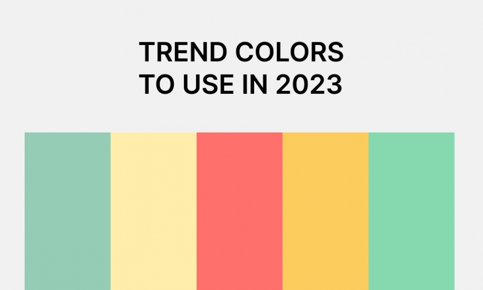
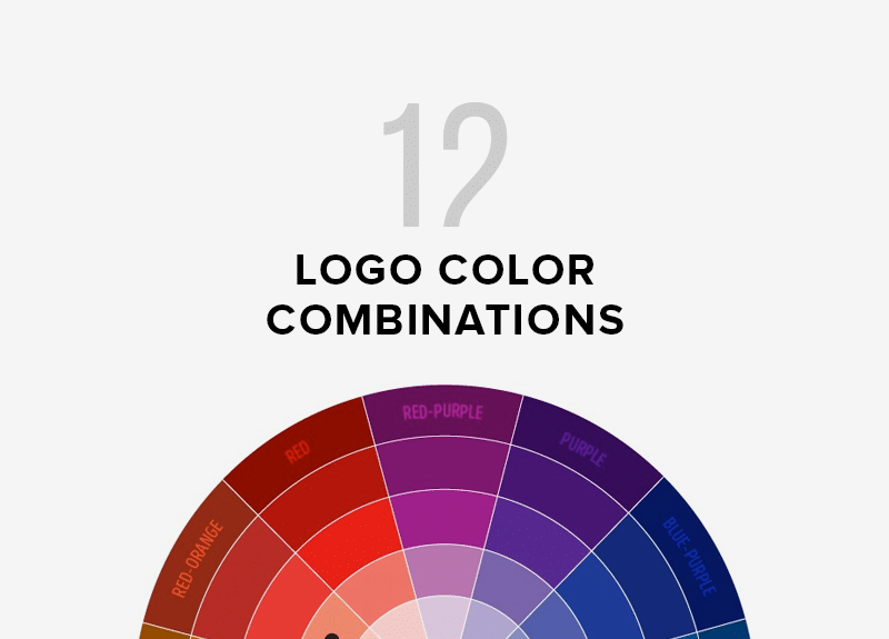
Color is just as important a part of logo design as shape. Before choosing a color scheme, decide what the message of your podcast is. Try to create a black and white logo first, and then add colors to it if necessary.
The font used in your logo should fully reflect the brand message. If you want to appear reliable and strong, you shouldn’t use a handwritten sans-serif font. Instead, choose a serif font with a strong base.
Step five. Creation of a logo
It’s time to get down to business. To keep the logo balanced, keep in mind the hierarchy of the elements you want to add. Also important are such principles as size and distance. The resulting logo should be legible even at a small size.
If you want to quickly create a logo, we recommend using an online logo generator (for example, Turbologo).
Do’s and Don’ts When Designing a Podcast Logo
In order for the resulting logo to be really high-quality, be sure to consider the rules of successful design. We will tell you what you can and cannot do in the process of designing a logo for a podcast.
What can be done?
- Create a clear and distinct logo. The podcast logo is presented to viewers in a small size. Therefore, it is important that it be clear and concise. Only in this way will the listeners be able to immediately see and remember it.
- Use visual metaphors. It would be nice if you could express the theme of your podcast through your logo design. So potential listeners will immediately understand what you are doing. Moreover, a visual metaphor does not have to be conceptual (the icon of a pill, if a podcast is on a medical topic). For example, Amazon uses an arrow, which not only means that packages are delivered quickly, but also symbolizes a smile. And she, in turn, shows that customers will be satisfied with the service.
- Consider brand colors. If your podcast will be part of your personal brand, it’s worth developing a common brand color palette. But don’t be scared, it’s not that hard. Most often, only four or five shades are taken as the main colors of the brand. They will be used in all marketing materials.
What can’t be done?
- Small parts. When designing a logo, it’s easy to get hung up on small details. What if the icon looks better if you move it up? Maybe shrink the text? Or improve the design? So you will perform the task indefinitely. There is no need to pay too much attention to such trifles. If you suddenly find that you are constantly refining the logo and cannot reach the final result, take a break. You can ask someone for an outside opinion.
- Copying. Your podcast logo must be unique. In no case do not copy the logos of competitors. You can only use them for inspiration. Remember that you must be unique and not someone else’s parody.
- Complex design. A good logo cannot be overloaded. Strive for as simple a design as possible. Most modern logos are simple and this makes them more recognizable.
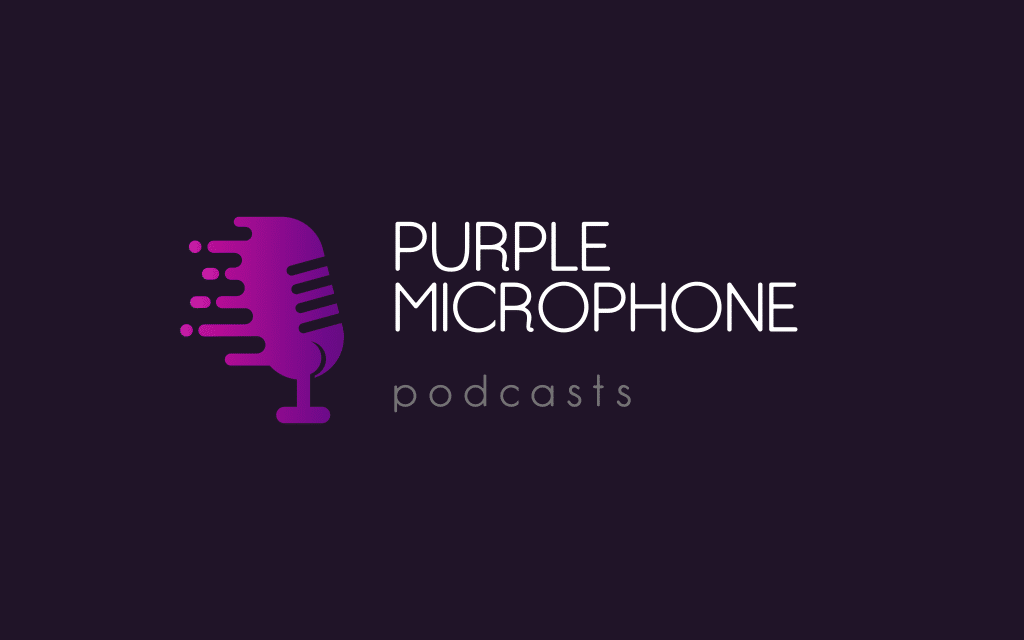
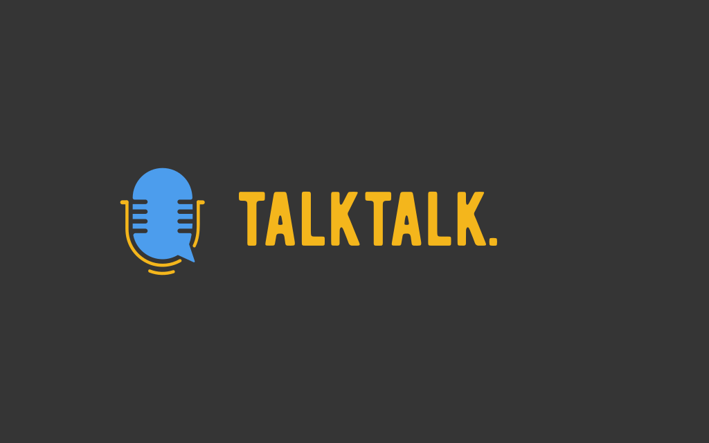
Examples of Effective Podcast Logos
Conclusion
So we’ve covered how to create the perfect logo for your podcast. We hope that our tips will help you achieve success in promoting your personal brand. Good luck!
I’m a product and graphic designer with 10-years background. Writing about branding, logo creation and business.

