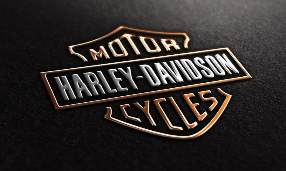
Harley-Davidson brand is tremendously popular around the world. It is hard to find someone who hasn’t heard of it. If you hear a talk about bikers or American bikes – the first thing to remember always is Harley-Davidson logo image. This sign became known to almost every person on our planet in 110 years, and of course it is just the beginning. Some officials say that Harley-Davidson logo tattoo is second popular with only “Mother” coming before it.
So, what are the reasons for a company becoming as popular as someone willing to perpetuate it on his own body? Let’s find out.
Beginning of brand story
The company was founded in 1903 by William S. Harley and Arthur and Walter Davidson brothers. The event took place in a dull barn in Milwaukie, Wisconsin, USA. The company began to produce ordinary bikes with air-cooling engines.
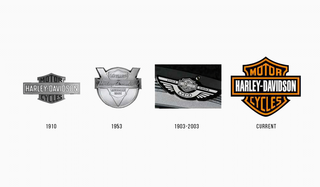
The first logo variation, which has then become a basis for a new one, was called “Bar and Shield” and painted on barn doors. Arthur Davidson’s aunt did so, painting the words red. Unfortunately, it is unknown who has transformed it into vintage Harley-Davidson logo, transferring those words into sign on paper. But it was this very sign that stayed with the company for years to come. Judging from bikers’ love for the first logo, it was quite successful.
However, it isn’t the only variation of the logo, though it is considered to be one and only. In 1909, the company made a breakthrough, representing a brand-new bike. It possessed an innovative two cylinder engine, with “V” shaped cylinder arrangement. It was the famous V-Twin engine, which contributed greatly to success of the company. Later on, this engine and “V” ticks were perpetuated in the honor of company’s 50th anniversary.
Harley-Davidson logo font
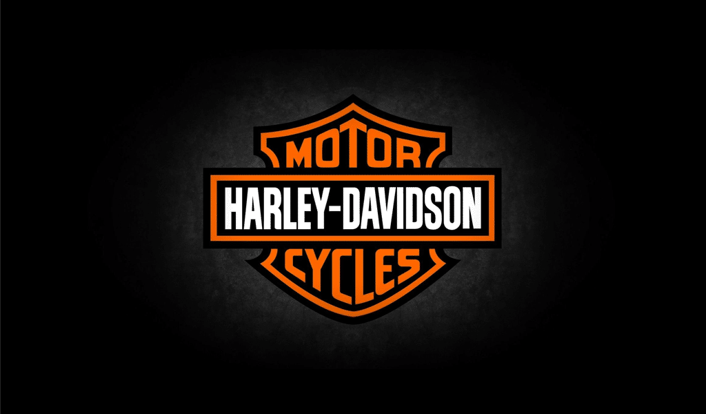
One of the most popular and frequent fonts in worldwide marketing is Helvetica. Many brands use the font in their designs and it comes in huge variety nowadays. And one of the varieties was used creating an old Harley- Davidson logo. Sheer cut, clear verges tell of temper and aggression. But let’s not forget that the colors were perfectly combined too. The colors of Harley-Davidson logo are black, orange and white and they manifest brand reliability and bikers’ coolness as well. That is why various merches and goods under this brand are so popular.
In the end, it is worth mentioning that Harley-Davidson logo was changed several times. Regardless of the fact that the current logo is more 100 years old, there was more simple variation of the logo comprised of “V” ticks. There also was the one with a four-rayed star on a sight, but it didn’t last long too. Sometimes the first means the best!

SEO specialist, link builder, and blog editor at Turbologo. Writing insightful content about marketing, design, and branding. Sharing practical tips on building and promoting brands online.

