
Sometimes it seems that the world wholly belongs to mega-corporations. And it is right to some extent. Every part of market has its giants. On the other hand, the world has never been closer to needs of every tiny manufacturer. Who could have thought that borders between business levels will grow that thin. Even a tiny company in China is able to send its production to any place in the world. It isn’t expensive anymore. And you don’t have to wait for long months to receive your package from China. Nevertheless, we have to thank mega-corporations for that. And FedEx express delivery, with internationally well-known logo, is the most responsible here. Today we’ll tell you about their story of success.
Table of Contents
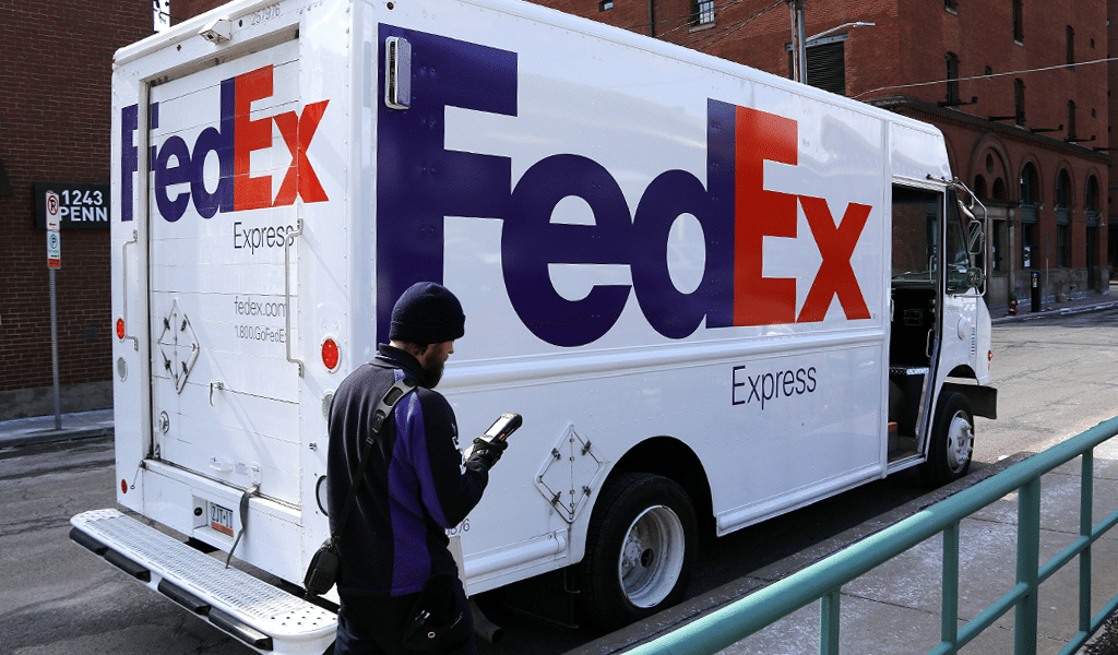
FedEx logo history & evolution
As many other companies FedEx entered market using the first and only logo. However, 20 years of the company’s development didn’t go in vain and they finally presented a new, well-balanced image in 1994. The company had no idea what kind of logo is necessary, so the choice was a hard one. More than 200 variations were scrutinized only to be rejected. Though some have passed the test and became ideas for the final logo variations.
At some point, designers decided to show speed as it is the most important quality of federal express delivery service. But how can you depict something you can’t see? Designers truly have to solve puzzles like this sometimes.
Secret rebranding
An image change was discussed behind closed doors. And it is a rational behavior, as public reaction could affect a result which is not even ready yet.
And then some arrows came as a bliss. The arrows were supposed to show direction and add a lightning speed to the logo. And finally, they decided to leave a gap between lower part of “E” and “X” and design it as an arrow.
Following FedEx logo path it is easy to make your own logo nowadays. But usage of negative spacing was a tremendous breakthrough back then.
FedEx logo meaning
The FedEx logo has a hidden sence, it is reflected in complicated optical illusions – a thin white arrow between letters E and X. As a result FedEx logo means speed, perseverance, strive for perfection and an accuracy. Arrows, hidden by the means of it, were accepted as the best logo variation.
FedEx logo colors & font
An inscription development was based upon Univers 67 types, with its Bold Condensed and Futura Bold fonts. Though they had to be altered significantly to conceal the arrows. The choice of colors isn’t accidental too, as combination of orange and purple stresses speed. Also, the combination is an allusion to previous FedEx symbols.
It is worth mentioning that the company’s divisions, such as “FedEx freight” possess their own logo variation. “Ex” part of the name is colored differently for every division. As for the arrows, designers have somehow managed to hide them even into an Arab writing!

SEO specialist, link builder, and blog editor at Turbologo. Writing insightful content about marketing, design, and branding. Sharing practical tips on building and promoting brands online.


