
Every business – til it has intentions to prosper, of course – requires a recognizable symbol. It is an inevitable part of a great marketing strategy. The question arises, what should it be? To figure out this one and get help in manifesting new ideas, it is highly recommended to conduct research of the already existing on the market.
Cobra Kai logo design serves as a moving force and a spreading element of a famous action series. As much as any other successful branding sign, it works for the company. In consequence, its popularity is developing and releases grow. To prove the fact, you can look at the numbers of views or searches of the Cobra Kai logo png images.
Below you will find information about its meaning, history, evolution, font, and colors. Enjoy the reading!
Table of Contents
Cobra kai logo meaning
Cobra Kai logo consists of two words. The first stands for a big poisonous snake species, the second translates as an ‘organization’ from Japanese. Combining them, we get a Grand Snake Organization.
Also, there is an opinion that the name of the emblem was inspired by Steven G. Abbate’s martial arts school of the same name, existing in 1971.
Cobra kai logo history
The project was showcased in 2018 and along with it was born a Cobra Kai symbol. It is a story of Karate practicing, using it as an instrument for personal growth, and fights. It fascinates individuals from all aging groups, but especially youngsters. The logo represents the included in martial arts training routing features: bravery, heroism, and persistence.

Today the series has been released in 4 seasons and has several logotype variations. They do not differ beyond recognition, paying respect to the original one.
Be it as might be, the plot does not happen to be as original as the emblem. It takes roots in The Karate Kid movie.
Cobra kai logo evolution
2018
Designed for the first season, the original Cobra Kai logo was executed in muted red color. The letters were handwritten with the help of the thick brush, sans-serif, italics. The ‘i’ icon resembles 1 in Roman numerals.
2019 – 2021
In 2019, the second season was about to be overviewed. Thus, the symbol with ‘Cobra Kai’ inscription had to be either changed or transformed. The color was replaced by a darker shade than before. The ‘i’ here is outlined as number two.
2021
In the variant created for season 3, the logo appears in a brighter tone of red. And, accordingly, as the very last character, 3 is situated.
Since in Roman numerals the 4 in no way resembles Latin ‘i’ letter, the first option comes to the scene once more. Yet, now it is black.
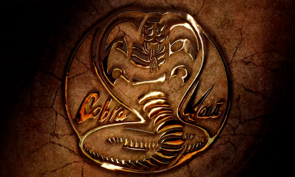
Roundel
Another symbol variation is performed as an ornamented black circle. The so-called Cobra Kai snake logo showcases an awesome animal itself, which strikes between the ‘Cobra’ and ‘Kai’. Those two are painted red. Plus, there is a motto on the edges. It says ‘Strike first. Strike hard. No mercy’. The yellow color prevails on the image.

Cobra kai logo font
Cobra Kai font reminds of hieroglyphs, which makes sense: karate is a Japanese kind of activity. The brush-drawn characters radiate a ninja vibe. Such a choice is likely to be not a coincidence, it is frequently utilized in adventures described in manga comics, Naruto for instance.
If talking about the roundel, the typeface here is a classic bold sans-serif one.
Cobra kai logo colors
In Cobra Kai logos eye-catching hues that reinforce danger are applied. Multiple shades of scarlet, bright yellow, and black. Also, we cannot ignore the fact of the blood is red, which might mean mental and physical strife.
I’m a product and graphic designer with 10-years background. Writing about branding, logo creation and business.


