
What is the difference between a band logo and a business logo?
While company logos tend to be sleek and minimalistic, band logos provide a unique opportunity to get creative. You have the freedom to experiment with typefaces and color.
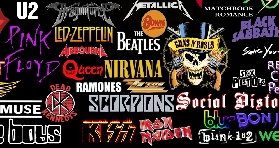
These famous logos will give you inspiration and help you get started on your next logo design project.
We’ll first show you some of the most iconic band logos to show how bold and experimental design can make brands-and bands-pop.
Table of Contents
The Greatest Band Logos of All Time
The best band logos are not always professional, unlike company logos. They are bold, provocative, and psychedelic. This is a reflection of 70’s progressive and 60’s rock.
The Rolling Stones
The English rock band’s “Hot Lips” logo is perhaps the most iconic band logo in all of rock history. This logo is both a representation of Kali, the Hindu goddess of energy and portrayed with a largemouth.
AC/DC
Although the AC/DC logo’s design isn’t particularly original, it makes up for it with the uniqueness of the band name and the meaning it holds.
This logo was created by Bob Defrin, Gerard Huerta and first appeared after the fourth album. The logo clearly refers to electricity. It includes the abbreviations of alternating current or direct current. This is made more apparent by the lightning bolt that divides them.
The Doors
American rock band’s logo features a bold, geometric font with mirroring double O’s. The logo screams the 1960s. O’s are divided down the middle, resembling pills. While the small, but vital “THE” is written backward slantingly in psychedelic font.
Queen
The Queen logo, a recognizable symbol designed by Freddie himself became as iconic and well-known as his front teeth. It was also used on the band’s first album.
The logo is just as extravagant and detailed as a royal crest. It tries to group symbols including the Zodiac signs of band members (namely Leo, Cancer and Virgo). This makes it one of the most iconic band logos, and we can thank Freddie Mercury, the frontman of this band.
The letter “Q” and a crown are the center of the composition. Two lions flank them, with two fairies below them, and a flaming crocodile sitting on top of the letter Q. The logo’s iconic look is completed by a majestic phoenix.
Kiss
Although it may seem simple at first, this logo was created by Ace Frehley and has become a symbol of the band’s global success.
Furthermore, the lightning bolts that are used at the end “KISS” instead of the letters S resemble the Nazi SS troop emblem, making it one of the most controversial logos of the 70s.
The Monkees
The Monkees, an American pop and rock band, used a guitar-shaped logotype as their band logo. The text’s distinctive curvature gives it a psychedelic vibe, and the heart-shaped tuning key keys speak of love and peace.
Bon Jovi
Bon Jovi’s emblem logo represents one of the most popular musical themes–the pain of heartbreak. Combining the bloody dagger and heart evokes sensitivity, as well as gothic undertones.
Nirvana
Given the tragic fate of many grunge rock singers (Kurt Cobain in particular), it seems strange that Nirvana’s logo features a dead or drunk smiley face.
Its creepy image is juxtaposed with its cartoonish, playful style which makes a predominant ironic statement.
People who don’t know Nirvana’s logo design but are familiar with their songs will be pleased to learn that many people have seen it before and didn’t realize what it was.
Red Hot Chili Peppers
The logo of American rock band Red Hot Chili Peppers has, at its focal point, an eight-pronged asterisk, known as the “Star of Affinity,” that is said to represent both the cardinal directions and the chaos and choices in one’s life. The band’s passion and dominance are symbolized by the logo’s bold shapes, red, black and white color palette.
Yes
The band’s bright logo can be represented in many bright colors, including the yellow and red pictured here. The logo’s organic, curved lines and versatility in color are visual representations of the band’s style: Progressive rock.
Eagles
The Eagles were talented songwriters and exceptional designers who created Hotel California.
Other than a few small comments, such as the fact that the “S” in eagles looks like a 5 and that the first letter “A” looks almost like a Christmas tree which confuses the eyes, this logo was very progressive for its time (backin the 70s) due to its tribal-looking vibe.
Sex Pistols
The English punk rock band, English Punk Rock, was made up of energetic young men who couldn’t be “put into place” like the letters in their logo. They are rebellious, and they live to cause trouble. The logo is so fitting for Sex Pistols that Jamie Reid deserves a standing ovation.
It also lends credence to the rebellious punk spirit, which is still evident in many merchandise that carry it.
Ramones
Arturo Vega was the creative director and designer of the band. He successfully added many symbols that were important to them, such as a baseball bat, arrows and a provocative slogan “Hey! Ho! Let’s go! Let’s go!
To indicate American authenticity, he also replaced the olive branch with an Apple tree branch and changed the description of “President of The United States” to include the names of the members.
New York Dolls
One of the earliest punk rock bands was The New York Dolls. The band’s influence on glam metal can be seen in the logo’s glamourous script and microphone imagery, which are often displayed in pink.
Aerosmith
The logo of the rock band is all about freedom. The central icon seems to be moving, and spreading its wings. The circle around the letter A resembles anarchy symbol.
Crass
This British punk rock band wanted its fans to be challenged by their logo, which displayed them as a storm of contradictions.
The logo includes the Christian cross, nazi swastika and Union Jack. It also contains the Ouroboros (a snake that bites its own tale), which is a symbol for self-destruction as well as the eternal cycle.
The Beatles
Although the logo of The Beatles is simple in comparison to their fame and popularity it is timeless and highly effective. The famous drop-T design was originally created by instrument retailer Ivor Arbiter in 1963 and was a perfect fit against the face of Ringo’s drums.
Radiohead
Radiohead’s logo, a deeply disturbing grinning bear, has been wildly popular since its first appearance on Kid A (2000).
This bear smiles in perfect symmetry. Its contours are just circles and lines. Yet, it is powerful and creepy all at once.
Panic! At the Disco
Panic! The new logo of Panic! This may be true, however.
The internet public came up with a variety of theories, triggered by the numerous occult symbols on it.
The top is the all-seeing eye, with the Star of Ishtar on the left and the crescent Moon on the right. In the background, a large hazard sign holds it all together. We see what you did, Panic! At the Disco.
The Who
This logo depicts a bull’s eye target with an arrow coming out of the “O”. It is cartoonish, simple, and lovely to look at. It is therefore not surprising that it has been featured on thousands of badges and t-shirts, even though it was not published in the same group.
The Worst Band Logos In History
Band logos are often some of the most effective examples of logo design. However, not all logos make it to the top.
Band logos often fail because they aren’t well executed or clear.
These less-than-great logos can inspire you to design your own logo.
Borknagar
Although bands are able to use complex logos in general, Borknagar’s complex logo design is a big question mark. difficult to decipher.
Phish
Phish’s band logo falls a little flat; its rainbow gradient fill is a little too reminiscent of second-grade WordArt, and the logo seems to read “His” at first glance.
Tokio Hotel
This logo for Tokio Hotel is too fragmented. It includes the Japanese-inspired “T”, the angel wings and the paint splatters.
Death
Although this is a unique design approach, it’s difficult to read the logo of this band.
Staind
The prominence of the primary vowel, “A”, is not apparent. The logo is hard to read and harsh due to the deliberate misspelling of the name.
Helloween
The name of the band sounds almost like the title to a B horror movie, but the jack-o’-lantern visual adds a level of cheesiness.
Klaxons
The logo of English band Klaxons attempts to be bold by looking like a poorly drawn logo in Paint. But, it only looks like a badly drawn logo…in Paint.
Dave Matthews Band
Although the original image clearly represents the brand, the symbol of a headless dancer is hard to relate to and has little relevance to the band.
Gay Dad
The logo of this band, which is essentially a copy the pedestrian symbol, is dull and inspiriting.
A-ha
Although it is not clear what motivated designers to combine italic and Roman lettering, they could have chosen a more creative approach to representing the band’s name.
Party Cannon
Although the death metal band’s font is bright and colorful, it’s deliberately ironic. However, its resemblance with the Toys “R” Us Logo appears irrelevant and uninspired.
Tool
Although it is clear that the logo was meant to be provocative and humorous, the public did not respond in the same way.
They were forced to replace the phallocentric logo with a more calligraphic, less provocative version.
The latest seventh edition, which dates back to 2006, has very little to offer in terms of esthetics. This version does not include the controversial “centerpiece”, but the “tool” inscription can be easily confused with “fool.”
WHAM!
Wham’s logo is reminiscent of the 1980s. However, the plain typeface and gradient fill are not suitable for modern logos.
The Knack
Although The Knack’s logo looks easy on the eyes, it isn’t something that stands out.
Stickman by Pearl Jam
The most well-known of Pearl Jam’s designs was the “Stickman”, which appeared on their 1991 single Alive. It probably depicts Eddie Vedder as a childish doodle. This logo is not the standard logo design but originality does not excuse it.
311
311’s logo lacks both images and words. It is dull and forgettable.
Sushi Roll
Sushi Roll, a Chicago-based band that depicts the letter S as lightning bolts and has missed an opportunity for a logo with more meaning.
In custody
After you have learned the basics of creating a band logo take a look at these top examples to get ideas for your own design.
You can use color and experiment with typefaces to create a logo that is inspired by bands. As you start to design your logo, look for a balance between complex logo design and readability.
Musicians use their creativity to communicate their values, speak truthfully, and build relationships with their audiences. Your logo design can be creative.
I’m a product and graphic designer with 10-years background. Writing about branding, logo creation and business.


