Twitter was created more than 12 years ago and the company made it to the top 10 social networks that are out there nowadays. Twitter as it once was called has grown and redesigned a lot over the years. Now the network has more than 330 million monthly active users.
The total registered users on Twitter are estimated to be 1.3 billion. We can find the little blue bird on the websites of serious and global companies, on CVs, and on the phones of ordinary users. The company is an outstanding example of a strong brand identity. They are well-known in any place in the world.
Let’s go through the logo style changes that Twitter has gone through over time. If you are someone willing to build a social media empire that is something that you want to get your inspiration from.
Twitter Logo history & evolution
Do they owe the success to their famous logo? Before their official launch the twitter logo looked like this: Would you have imagined? But luckily they changed everything before they showed the service to the world.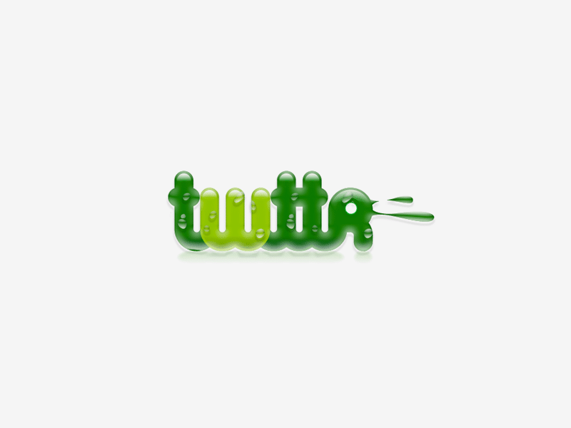
The first logo you remember was the one created by graphic designer Linda Gavin for the official launch of Twitter in 2005. She was given a day to create the logo that lasted for several years. The style was born then. The main thing about their style today is the simplicity and people love it. The tendency to simplify can be seen in the name, the logo, even the web site. It was in 2006.
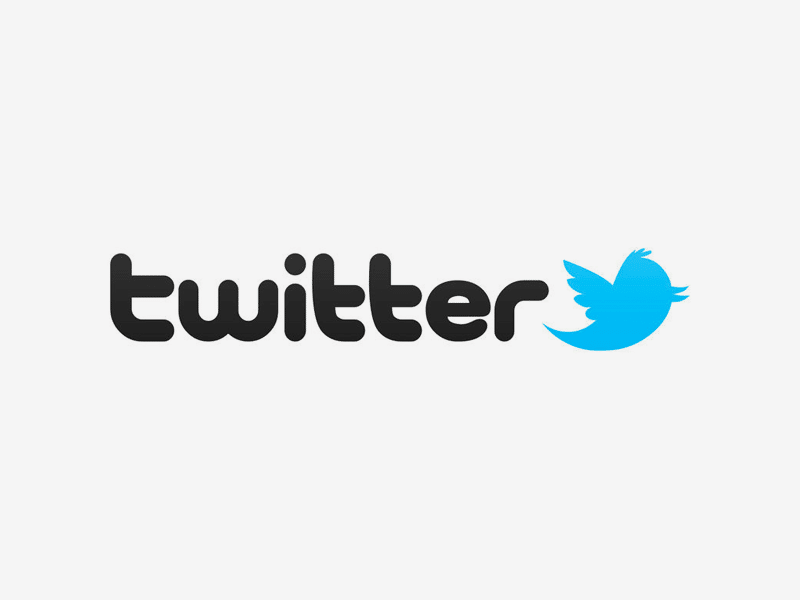
About 4 years later, in 2010, the company decided to invent something that could reflect twitter nature. The text logo was no longer enough. They created the bird as a representation of what a tweet feels like: the posts are quick and short, and all of this sounds like something a bird would do. And the bird looked like a symbolic representation of the services Twitter offered. This bird is a bit more intricate than the next one, it had a bit of plumage and the second wing in the background.
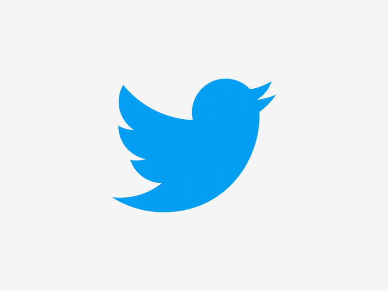
In 2012 the company decided to make some changes once again. They became so famous that the name in the logo was of no need anymore. The change they did then was simply deleting the letters from the logo. The concept of the bird itself didn’t become a lot more different, but it got rid of the plumage and the wing was shaped by three overlapping circles. They made it larger and changed the color to darker blue thus made it more pleasant to look at for a wider audience. The symbol of the company was established and people would recognize Twitter just by seeing the bird.
Twitter logo meaning – Why the Twitter Bird Works
It is of no question that the logo has played a huge role in the success of Twitter. Such a loyal customer base is a dream of any company: hundreds of people come and twit every day. The twitter bird is as simple as the concept of the platform is. This might be one of the reasons for its success. It’s important to choose a symbol that will represent the exact idea that your company brings to the world.
The bird on the logo resembles the mountain bluebird common to North American mountain fauna. This bird symbolizes freedom, eternity and creativity and it reflects brand’s essence.
The Twitter logo use Pico Alphabet Black Font.

SEO specialist, link builder, and blog editor at Turbologo. Writing insightful content about marketing, design, and branding. Sharing practical tips on building and promoting brands online.

