
“TikTok is a globally popular video hosting service supported on iOS and Android platforms. The resource provides the opportunity to publish short, unusually edited and originally augmented with various decorating elements videos. Currently, the application works in 38 languages.
To improve the app, the company uses artificial intelligence to select the most interesting content for users.
Table of Contents
History of the Tik Tok app

TikTok was originally developed by the Chinese firm ByteDance. It specialized in Internet technology and was called Douyin. Its founder and leader was Zhang Yiming.
This video hosting company went live in the fall of 2016. It was a successful project, the fame of which began to spread rapidly outside of the Middle Kingdom.
Noticing the trend and following the trends, ByteDance refined the app’s features, added functionality, and improved the design. They then renamed it “TikTok” and released it to the international market. At the end of 2017, the company acquired the social network “musical.ly”. In mid-2018, it was merged with TikTok.
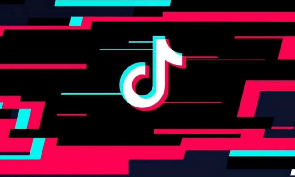
What does the Tik Tok logo look like
The Tik Tok app logo is uncomplicated: it is because of its simplicity and ease that it is so quickly remembered.
It is represented by a combined logo (i.e. combining both graphic and textual components). It consists of a schematic representation of a note (according to other sources, the letter “d” representing one of the sounds of music) and an inscription. The name of the application is to the right of the picture. The graphic symbol has an unusual coloring: it resembles a 3D filter. The letter “o” in the inscription is made in the same style.
The first Tik Tok logo
Since its inception, the Tik Tok logo hasn’t changed much. The 2016 emblem consisted only of a graphic element – a stylized note letter “d”.
Who created the Tik Tok logo
The name of the author of the Tik Tok logo is unknown. However, the creator of the mark shared the story of how he came up with the idea for the logo design. He was once at a concert where it was dark and the loud sounds made the image vibrate.
“The black background makes the accents stand out perfectly, the soft angles convey the life of the music,”
thought the logo’s author
Thus came the idea of depicting the logo as a note with a black base and colored edges.
History of Tik Tok logo changes
The Tik Tok logo has not changed drastically over the life of the brand. However, there have been minor rebrandings nonetheless.
2017
2017 – the brand mark of the service has been supplemented with a lettering with the name. It is located below the symbol. The font is simple, flat, without serifs. The name “Tik Tok” is divided into two words.
2018
In 2018, the Tik Tok word font has changed slightly. It becomes more chopped up. In addition, if before there was a distinct gap between the text elements, now it is almost absent.
The lettering is also slightly changed. In the original version it was completely black and white. And in 2018, a color accent was made on the letter “o” (superimposition of blue and red shades, as in the main part of the symbol). Thanks to this design solution, the composition looks whole and logically complete.
How to draw a tick current logo? – It’s not hard! You need a little practice and the ability to own graphic editors (for example, Adobe Photoshop).
Conclusion
The Tik Tok logo exists inseparably together with the product (application) itself – it promotes and advertises itself and it, reaching a larger and larger audience every day. The company’s versatile and stylish logo is the result of a brilliant marketing policy.
FAQs on TikTok Logo Design Evolution and Branding Impact
The creator of the Tik Tok logo wished to remain anonymous.
The first version of the Tik Tok sign was developed in 2016.
The Tik Tok logo depicts a musical note. The choice of such a symbol is due to the specifics of the application: the ability to shoot and watch videos with music in the background. There is also a version that the logo depicts the letter “d”, as the original name of the brand is Douyin.
As the creator of the logo tells us, the idea for the symbol and the coloring of the sign came to him at a concert. And the chosen neon shades symbolized the vibrancy of sound and colors.
I’m a product and graphic designer with 10-years background. Writing about branding, logo creation and business.


