A fashion brand logo serves as more than simply a representation; it is also the face, the identity, and a component of branding strategies that greatly influence how customers view the business. The biggest in the world of fashion brands, Zara, is a shining illustration of how a company may change with the seasons without losing its identity and remains instantly recognizable.
Table of Contents
How the brand name and the first Zara logo appeared
Let’s go back to the opening of the first store for a moment, as that’s when the Spanish fashion brand got its name.
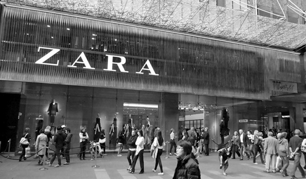
The name Zara arose due to a coincidence. The Amancio family planned to name the store Zorba – in honor of their favorite character and the film of the same name, Zorba the Greek. However, it was not possible to obtain the rights to such a name, and molds for casting letters had already been made.
Therefore, they had to create a new word for a future global fashion brand.
It was Zara, translated from Persian as “gold”. Amancio decided that the word was eloquent, easy to remember and pronounce. All set for becoming the name of a famous brand. And Amancio’s entrepreneurial flair did not fail — their brand’s personality became unique, recognizable, and achieved global success.
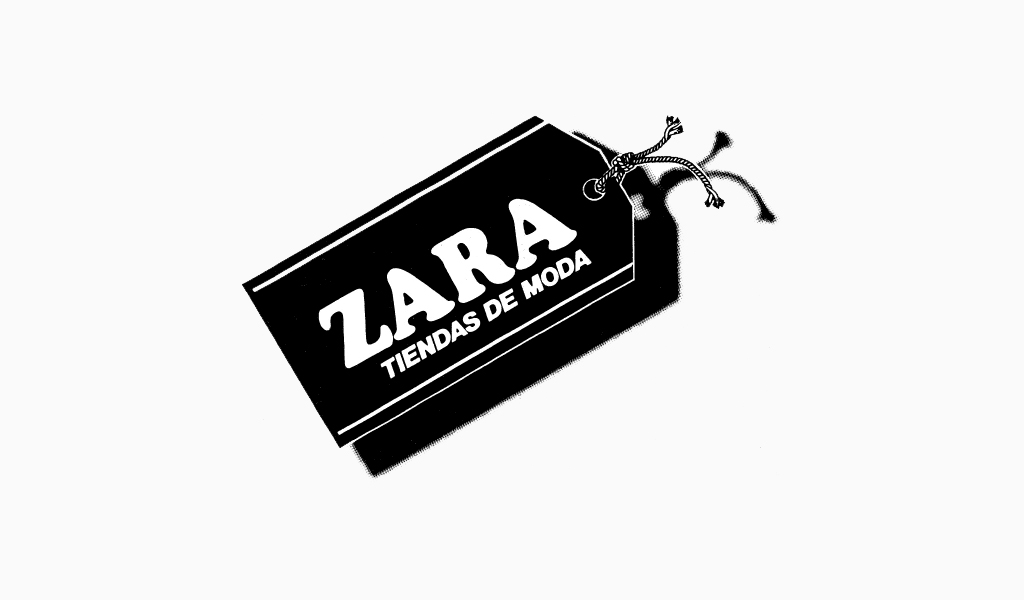
During this time, the first logo of the brand was created. It was a monochrome wordmark logo: black letters on a white background. A restrained, clean serif font, all capitals, bold and well balanced.
Further evolution of the visual identity
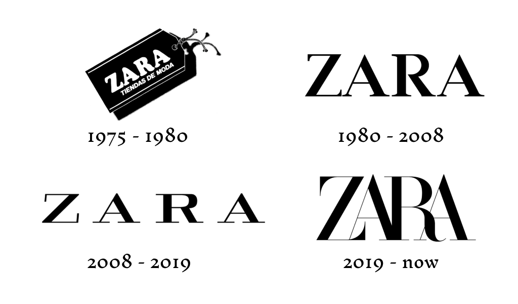
The 2008 version was created to make the logo suitable for print materials, digital media, labels, and internal tags. The style and mood of the sign were preserved, but the kerning was increased, and the letters became wider and shorter. Overall, the redesign received accolades as indicating the craftsmanship, seriousness and timelessness of the brand.
How to make a quality rebranding – read in our article.
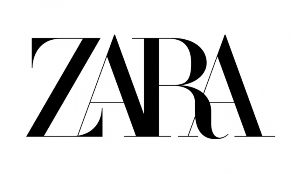
And now you see the scandalous redesign from 2019. The monochrome palette of the brand’s logo has been preserved, but the font has become completely different. It is non-standard, stretched out, with conical letters overlapping each other and intertwining at the bottom. The leg of the letter R is twisted and extended.
This new fashion logo was designed by Baron & Baron. Critics say it is difficult to read and will look bad on labels. There were even forecasts about the evolution of the logo.
Overview of rebranding 2019
ZARA’s latest logo update in 2019 has sparked a lot of discussion among designers and marketers. The new logo, designed by Baron & Baron, stands out with its tapered and interlocking letters.
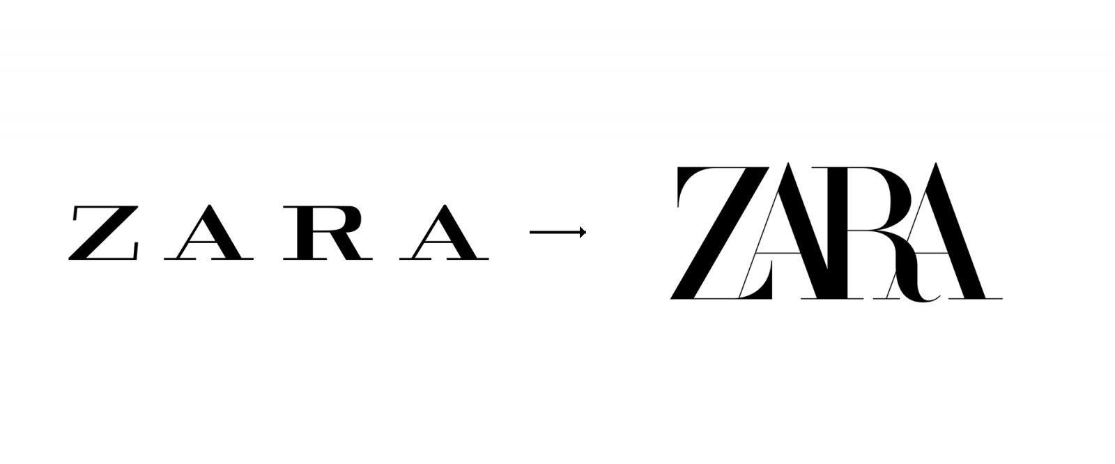
Consider the rebranding in two aspects: a reflection of the brand’s positioning and compliance with general trends. The general trend is simplification. It’s clearly not here.
What is the ZARA brand about? About accessible fashion. From the catwalk to the counter, bypassing the big names of fashion designers. This is reflected in the previous memorable logo – edgy and accessible.
The new one resembles the general style of prêt-à-porter – complicated, unclear, but probably cool. And targeting this segment, although extremely logical, raises questions.
Previously, ZARA were kind of communists from the fashion world: they expropriated ideas from bourgeois fashion designers, making fashion accessible to everyone.
Now they have joined the mainstream instead of fighting it.
Features of the updated graphic design
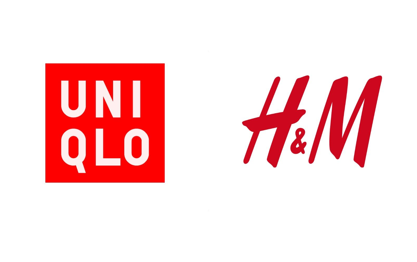
On the one hand, the rebranding may be an attempt to stand out from the clutter occupied by the more affordable clothing brand logos of H&M and UNIQLO.
On the other hand, it was an ill-conceived attempt “to make it at least somehow happen.” But sometimes it is precisely such illogical and ill-considered decisions that sometimes turn out to be successful. Ultimately, this can save materials when producing signs.
Zara's logo has been updated in the best traditions of metamodernism: it looks like the same letters and style, but at the same time everything is radically different.
The meaning has also changed. While the brand used to look more traditional, stable, measured, and static, it is now dynamic, flexible, more individual, and keeps up with the times. It is absolutely logical if the letters change their location in the near future, because… the logo became “alive” and individual, preserving the character and shape of the main elements (letters). The logo tells us that “all the best has been preserved, but at the same time the brand has changed radically. ”
The impact of a logo on brand strategy
An important part of Zara’s branding strategy is the logo.
Read more about brand strategy and apply it to your company.
It enhances the emotional bond between the brand and the audience in addition to building the brand identity. Fashion and affordability are important to new generations of consumers, and Zara has effectively drawn their attention with recognizable yet creative sleek and modern design features. The logo’s graphic depiction conveys the brand’s essential ideals, which are worldwide, trendy, and approachable. This highlights Zara’s ability to not just follow but also create trends, keeping them at the avangard of the fashion industry.
Marketing meaning of the brand’s identity
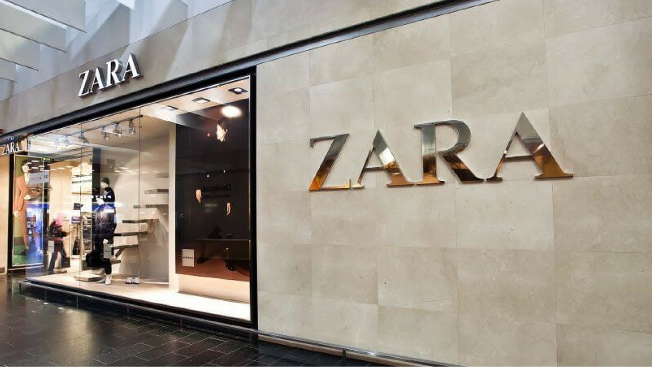
The Zara logo is a potent marketing tool in a world when initial impressions of products are frequently formed based on visual perception. It not only raises customer awareness of the brand but also supports the upkeep of a positive brand perception. The logo is utilized in all forms of communication, from shop design to social media advertising, to provide a unified visual statement that fosters client loyalty. This demonstrates how a strong logo can complement a business’s overall image and strategic objectives as a crucial component of an effective marketing plan.
Timeless Stylish Appearance
An example of a timeless design that embraces contemporary trends while retaining traditional elements is the Zara logo. It is identifiable and well-liked by a large audience because of its blend of contemporary and traditional styles. A key component of marketing strategy is the logo’s adaptability to a variety of media, including billboards, internet advertising, and clothing labels, all thanks to its elegance and simplicity.
Conclusion
The Zara logo serves as more than just a picture. It is a reflection of the mission, history, and philosophy of the brand’s commitment. Every time Zara updates its monogram logo, it not only shows its dedication to quality and innovation but also reaffirms its standing in the high-fashion industry and builds client loyalty. Today, in the digital age, fashion enthusiasts do not need to hire a graphic designer to obtain a new look. Try the Turbologo logo generator with its huge selection of design elements and create something unique.

SEO specialist, link builder, and blog editor at Turbologo. Writing insightful content about marketing, design, and branding. Sharing practical tips on building and promoting brands online.

