Subway, as opposed to other fast food restaurants, caters most for a healthy food. And it is quite successful in doing so. You can’t find fries on their menu, as Subway considers it to be the most harmful junk-food ever. And with the exception of bread, rich in sugar and some fat sauces, food in Subway is alright. It is this approach to food that they have put into branding and logo. That’s why we’ll tell you a bit more about Subway logo and its evolution.
Table of Contents
Subway logo history
Do you know that the initial name of the restaurant had nothing to do with tube? The first variation was “Pete’s Super Submarines”, named after one of the cofounders. And those protruded and elongated sandwiches were the submarines. However, the first name was confusing customers, as they believed that the café serves pizza. That is how the name turned into “Subway” and the first Subway logo appeared.
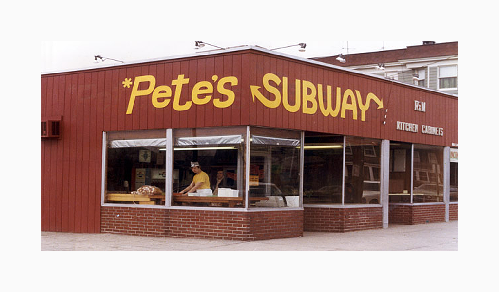
In the beginning the logo was white and yellow. A background could be dark or transparent, depending on situation. Font is brand new and it features two original pointers for “S” and “Y” letters. These arrows symbolize switches of a tube, adding up to the establishment image.
The first Subway logo was designed in 1965.
Subway logo evolution
The design was in use until 2002. It was altered and new Subway logo looked just like a fast-food logo should have looked like. The letters were stretching upwards and were outlined by a thick green stripes. It is with this logo Subway took the top position in fast-food restaurant rating.
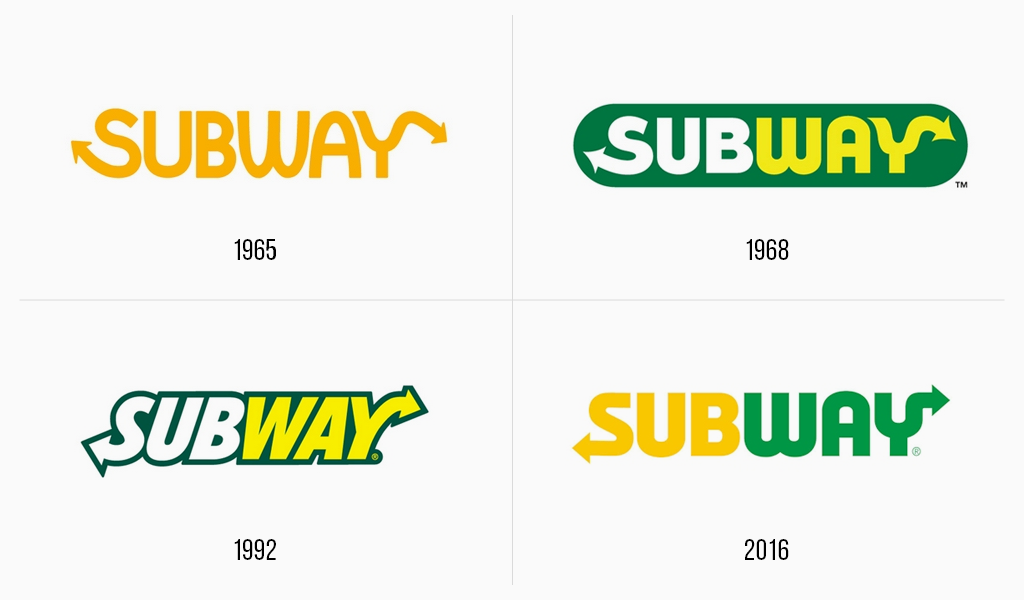
The old Subway logo was quite successful for many years and it could easily be downloaded in vector format. According to marketers, however, it doesn’t face today’s needs. The time has for a change again.
Thick outlining isn’t trendy today, and they decided to remove it. The inscription incline also sunk into oblivion. And combination of green and yellow has become the company’s stylish trait. A new Subway logo is written in these colors. The type was also changed a bit, becoming more roundish and massive. And the arrows are still there, so that customers couldn’t get lost.
New Subway logo meaning
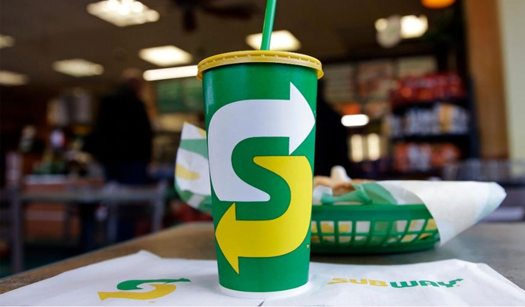
Nevertheless, many customers say the logo was ruined by all those alterations. But it is hard to go against current trends, isn’t it? At least the new logo is looking up-to-date. Perhaps, Subway is risking losing its popularity because most part of the company is out of fast-food business. Subway is only selling franchises now. Not all the franchisers are equally good at the business. However, new Subway trade mark is sure to be noticed.

Shortened Subway logo variation is comprised of two pointers of yellow and green colors. Another trendy move is usage of negative spacing. The moving pointers form a hidden “S” between them. We are curious where this pursuit of trends will lead the company!
The Subway logo has a visualized meaning – arrows pointing in the S and in the Y letters of the logo symbolized the entrance and the exit from Subway, so you can have a food on the way.
Subway logo font
The Subway logo is featured a Helvetica font.

SEO specialist, link builder, and blog editor at Turbologo. Writing insightful content about marketing, design, and branding. Sharing practical tips on building and promoting brands online.


