It was the 25th of May when the first Star Wars logo debuted alongside the groundbreaking saga. The fact that a single film changed the entire industry and left an indelible mark on the world is truly remarkable. From that moment, Star Wars logos place in pop culture history was cemented.
George Lucas was the first to utilize original computer graphics, Dolby Surround Technology, and digital video resolution. But what is the secret of such unbelievable success, and how does the Star Wars franchise continue to build on this legacy? Let’s find out.
Table of Contents
Original Star Wars Logo history
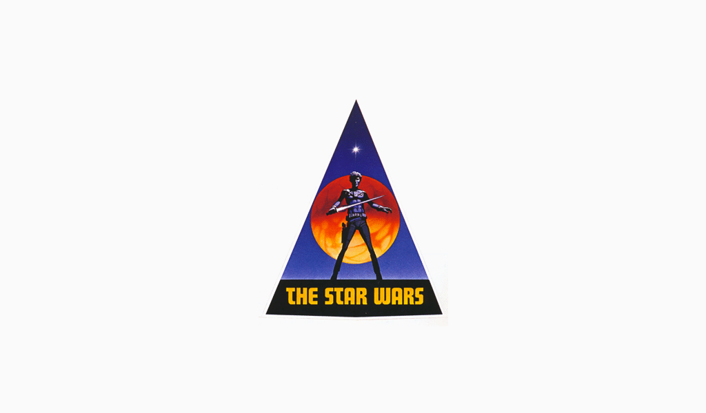
20th-century science fiction has its own unique charm, filled with dreams of space far, far away, unexplored planets, and thrilling adventures, all accompanied by a certain sense of naivety. This spirit is beautifully captured in the original Star Wars logo, which invites viewers to escape the dull reality of everyday life and immerse themselves in a galaxy of endless possibilities.
The Star Wars emblem, introduced in 1977, was the third version and quickly became one of the most iconic symbols in cinema history. Its design has influenced generations of fans and creators, paving the way for iterations like the sequel trilogy logos, which brought a modern twist while staying true to the essence of the franchise. Each Star Wars story, whether part of the original saga or the sequels, carries the weight of this legendary design legacy, proving the timeless appeal of the emblematic logo.
Star Wars Logo evolution
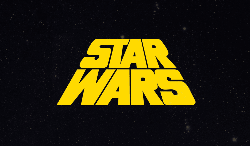
The Star Wars franchise is built on a foundation of innovative design. A triangle is a great solution for a logo style as it symbolizes stability and reliability. Additionally, the triangle’s protruding and pointed design makes it more visually attractive. What’s more, you can easily incorporate a circle or sphere into the triangle; in our case, it is represented by a crimson planet, evoking the sense of breathtaking adventures reminiscent of Star Wars.
At the top of the Star Wars font, there is a medium-sized but bright star—a romantic and inviting symbol that references iconic imagery from the Star Wars universe. The bright, bold lettering further enhances the logo design, making it both modern and timeless. As you can see, this colorful yet simple geometric composition perfectly embodies the principle that simplicity often surpasses fancifulness.
The original logo catered for much of the success the film franchise achieved. The marketing brilliance behind this own logo ensured that it became an enduring emblem of adventure, rebellion, and hope.
Star wars logo font
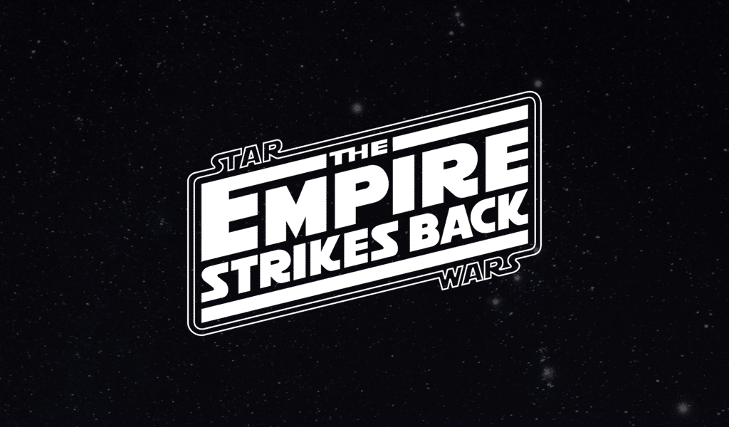
Futura Display font was initially chosen for Star Wars logo, but it was then altered to Precis. After that, George Lucas considered all the given options to be inappropriate for his design. A significant part of the story is told about the Empire, an enemy of all that is good. The Empire is governed by iron fist and seeds its ideology, much like Nazi Germany. It might just be the reason for George Lucas to decide making the logo somewhat Nazi-like. And he commanded his designers just that.
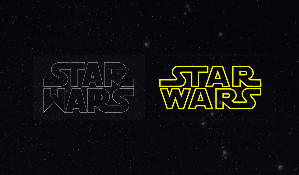
Helevtica Black font was chosen for a new variation of the logo. Designers spent much time making it facing Lucas’ needs. “W” in “Wars” is deliberately sharp, pointy and intimidating. The letter was designed a bit later, and original Star Wars logo suffered little changes.
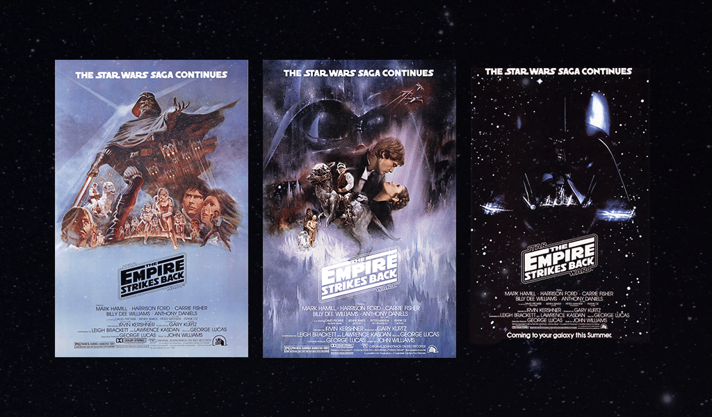
And how is the franchise doing nowadays?
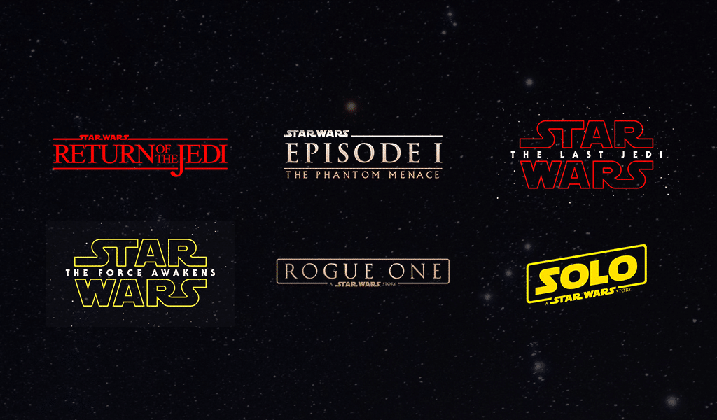
One might debate Star Wars artistic value, yet its financial value is out of question. You can hardly find a kid, who wasn’t keeping asking its parents for a pencil-case, a school bag or a toy with Star Wars logo on it. Of course, there are many adults who purchase goods with that merch or go to movie. An approximate transaction is about 10 billion a year.
And all of it is just a simple and unpretentious story. By the way, accept for the logo there many other visual solutions in Star Wars. Ones might ask how to draw the Star Wars logo, as the effect of creeping subtitles struck the hearts of many.
Logo meaning
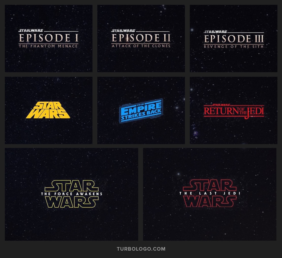
Star wars logo colors are deep yellow on a black background. It is that very case when people have remembered it well and they won’t confuse it for something else, as there is a brilliant story of success behind the Star Wars logo.

SEO specialist, link builder, and blog editor at Turbologo. Writing insightful content about marketing, design, and branding. Sharing practical tips on building and promoting brands online.

