The world changes rapidly. Common energy sources are getting obsolete. Many
countries are striving for harnessing solar energy. They install solar panels everywhere
nowadays, especially along the railroad. A probable exception here is agriculture areas, yet a barn roof is a perfect place for another solar panel, isn’t it? And a global result of the technology is carbon dioxide emission reduction and almost free energy source for
everyone!
The recyclable and renewable energy business is deemed to be extremely profitable
these days. Small wonder that solar energy became cheaper than coal energy in tropical
countries for the first time in written world history. But what is the difference between solar energy company branding and all the traditional energy companies? Our current article is going to instruct you on how to generate a solar energy icon image using a logo maker.
How to Avoid Common Solar Logo Design Pitfalls
The color pattern is one of the most important steps toward effective branding. Many
designers follow the way of least resistance, choosing yellow as the main background color. The idea is a simple one. Yellow is just the color we use to depict sunny weather. And the color combination seems to be contrasting too. A sky blue panel with a yellow or
orange sun logo in it is sure to leave an impression and make you remember the logo and the company behind it.

As you have guessed, things are a bit tricky still. And you are right to assume that.
This idea of using blue for the sky and yellow for the sun as well as combining them in a logo is obvious and lots of designers have already used it. Try comparing some of such
companies’ logos to ascertain the similarity of their logos. They are like eggs in a basket,
incubated by the same chicken—designer. No client is able to memorize all differences
between them, thus confusing them.
And so a solar energy logo creation becomes a non-trivial objective indeed. And it
seems there are no other design ideas here, except for the sun and sky. Should we really give up and give way to the most obvious and simple designs? No way!
Where can you find design inspiration?

First of all, there are no laws forcing you to ecstatically combine the sun and a
panel. And the sun symbol has one hug advantage too. It’s older than any other word or
symbol. People used to draw the sun even when there were no languages at all. So, a
variability of sun depictioning is huge.
People will always recognize the sun, even if there is no sun at all. You are free to
choose any manner of sun depiction in your solar energy company logo. Any yellowish
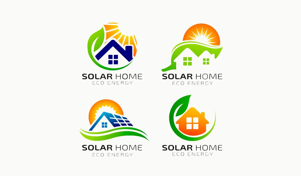
circle implies the sun actually. And don’t forget to add some symbols for a house,
coziness, industry or electricity to represent the gist of the solar energy logo. Happiness also comes in handy here, just like any other depiction of the flora and fauna of our planet.
Keep generating ideas. Don’t confine yourself by resorting to the previously
described color pattern. The yellow sun in the blue sky is great, but there also is some
green grass beneath it all. It could a plausible solution to use only warm colors in your solar energy logo. What’s more, red color is often associated with the sun as it’s a color of energy too. And why I shouldn’t use cold colors, you might ask. No reasons for this, really. Just keep in mind that strict, cold colors are used to stress precision, correctness, rigidity and other similar, “serious” notions in a logo.
Solar energy logo examples
I’m a product and graphic designer with 10-years background. Writing about branding, logo creation and business.

