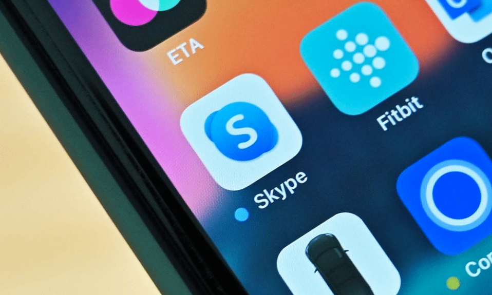
There are many companies which not only changed the world, but also made it better through various means. Some inventions are remembered as they are appreciated and highly valued. Inventing another Facebook clone isn’t nearly as easy as redeeming part of everyday bills. As you might already have guessed, we’re going to talk about Skype today. It is Skype logo that reduces or perhaps nullifies our phone bills! From now on, it is possible to call anyone you like wherever he or she might be. Sometimes the program may perform poorly, but this is small price for all the possibilities Skype provides, isn’t it?
Create your own logo with Turbologo logo maker. It takes less than 5 minutes and no design skills needed.
Go to Logo MakerTable of Contents
Skype logo design history
Unlike major IT companies, Skype was founded only in 2003, in the same year logo history started. Thanks to intuitive interface and data security it has quickly took its rightful place on the market. Skype creators didn’t wait long before selling their owning rights to eBay in 2005. Having received proper funding the program has developed even more.
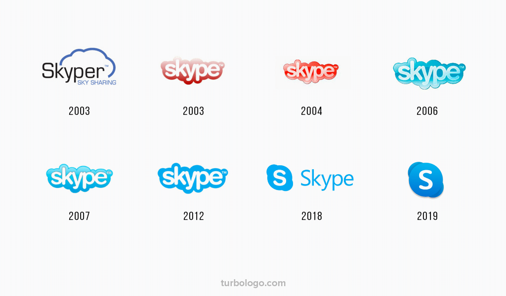
So, what was the first logo looking like? The design surely was based on speech bubbles which one might find in comics. They chose Arial Rounded MT Bold type as a major one as it had fitted perfectly bubbles which formed cloud. The cloud was reduced to “C” shaped into another bubble and became a nice desktop icon. It wasn’t until this happening that blue color was approved as main color in Skype design.
Brand evolution
The program remained under eBay until 2011. Having overcome rivals such as Cisco and Google, Microsoft purchased eBay and Skype along with it. It is still debatable whether it was worth it, given that Skype main functions are absolutely free. However, Microsoft gained access to paid telephony and video calls. And that might just be what Microsoft was after.
Skype logo meaning
Skype logo had to be evolved of course and it took place twice already. They decided to keep the bubble cloud in 2012 as it was a symbol of reliable and convenient communication. However, the logo was reduced to initial “C” even in full version in 2017. And blue color is still standing for serene development and understanding. And being combined with white it symbolizes harmony and hope.
Skype logo font
Latest Skype version includes slightly altered font. It looks much like an original Helvetica yet possessing some imperceptible lightness.
Blog editor and content marketing specialist at Turbologo. Writing about Marketing and design. Victoria’s articles contain useful tips on how to build a brand and promote it online.

