The Shell oil company logo is more than just an image; it is a symbol of the corporation’s global presence, history and values. In the form of a recognizable Shell, it has become an icon of stability and trust in the oil and gas industry. In this article, we will analyze how the logo was created, its key changes and how it reflects the company’s growth and innovation today. Understanding the meaning of Shell logo provides valuable insight into how the company maintains its identity in an ever-changing world.
Table of Contents
Old Shell logo review
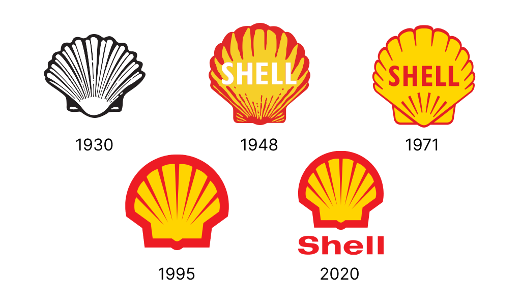
The history of the Shell logo begins with the company’s founding in 1897 by the Samuel brothers. The name “Shell” was chosen in honor of the family business selling seashells. Already in 1930, the first logo was designed, a simple black and white shell. Despite its modesty, this symbol became a reflection of the company’s early growth. The simple design served as an easy tool for mass reproduction and distribution, which was important at the start of global development.
Shell logo evolution: key moments
In 1904, the logo was first infused with color. The vibrant red and yellow hues highlighted the company’s vitality and dynamism, reinforcing its strong connections with Spain, where it maintained a significant trading presence. These colors enabled the brand to distinguish itself from competitors, imparting a new level of expressiveness to the logo and enhancing its role in Shell’s brand identity and global market presence.
1930s: Streamlined Design and Brand Identity

In the 1930s, the logo design became more minimalist. The stylised name became simpler, making it more versatile and adaptable to different formats, especially as the logo for Shell gas stations. These changes were dictated by the expansion of the business and the need for the brand to be present in different countries and on different media.
1948: A new era of design

A key moment in the history of the Shell logo came in 1948, when designer Raymond Loewy proposed a modern, more symmetrical and harmonious design. This updated vintage Shell logo reflected dependability and professionalism, which was essential for restoring customer trust in the post-war era. Raymond Loewy is also known for his designs for brands such as Coca-Cola and Exxon.
1971: Minimalism and clarity
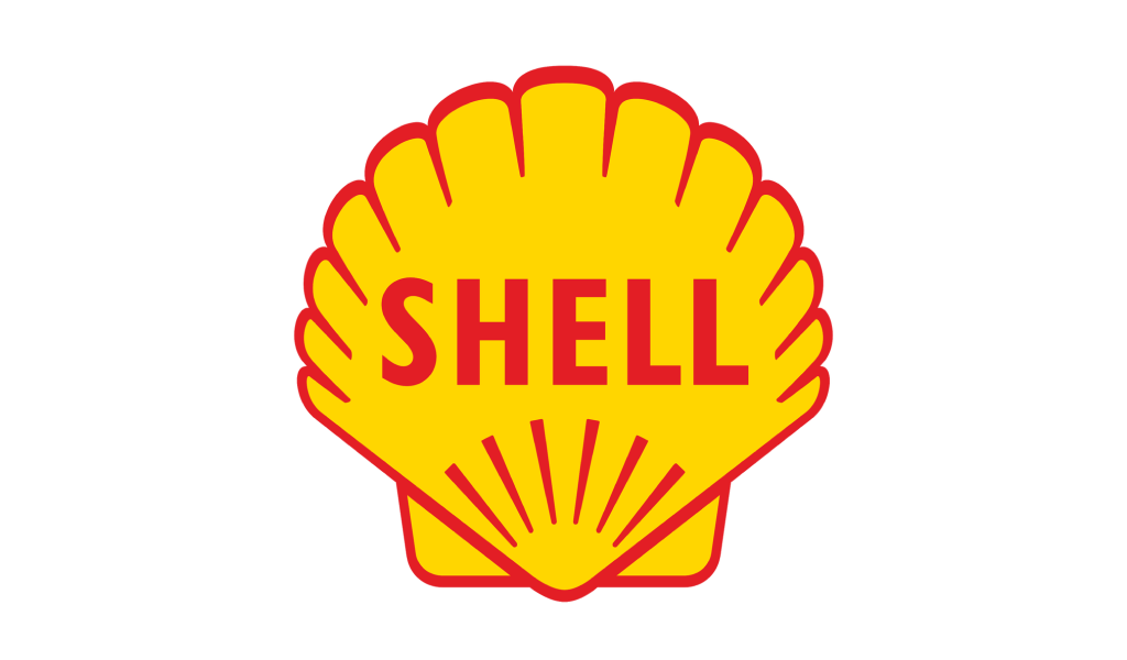
In 1971, the Shell oil symbol was again revised, making it even more concise. Clear lines and rich colors emphasized the company’s technological innovations and its desire for simplicity. This update became a symbol of a new round of development for Shell in the face of increasing competition.
1995: Adaptation to the digital age

With the advent of the digital age in 1995, the Shell logo was modernized to PNG format for use in the online space. Gradients and shadows were added, making it more attractive and modern on computer and mobile screens.
2020: A logo for a new time

The latest Shell transparent logo version, presented in 2020, retained the core elements, but became flatter, in line with modern design trends. The vibrant red and yellow colors make the logo stand out and stay relevant, conveying an innovative vibe.
Shell logo Font
The font previously used in the logo played an important role in creating a coherent image of the company. The modern font, simple and clear, emphasized the professionalism and technological focus of the brand. Its conciseness perfectly matches the minimalist design, ensuring harmony between the Shell slogan and visual parts of the logo.
Symbolism in the Modern Shell Logo
The Shell company logo in its current form is a stylized shell that combines energy, innovation and global presence. The red symbolizes strength and activity, while the yellow conveys optimism and warmth. This simple and recognizable design makes the logo one of the most successful and universal in the world.
Conclusion
The Shell logos have become an indispensable part of the company’s success. Throughout its history they contributed to innovation and global ambitions. The evolution of the logo shows how the oil giant adapts to change without losing its identity. Shell will continue to use its logo as a powerful communication tool, following trends and attracting the attention of customers around the world.

SEO specialist, link builder, and blog editor at Turbologo. Writing insightful content about marketing, design, and branding. Sharing practical tips on building and promoting brands online.


