
Many readers, being serious and business-like people will say that they certainly heard something about Nintendo Company. But they are likely to have no idea about its background. However, it is impossible to know nothing about Mario, a heroic plumber, fighting walking mushrooms for a princess’s honor. And it is one of the most popular games in the world.
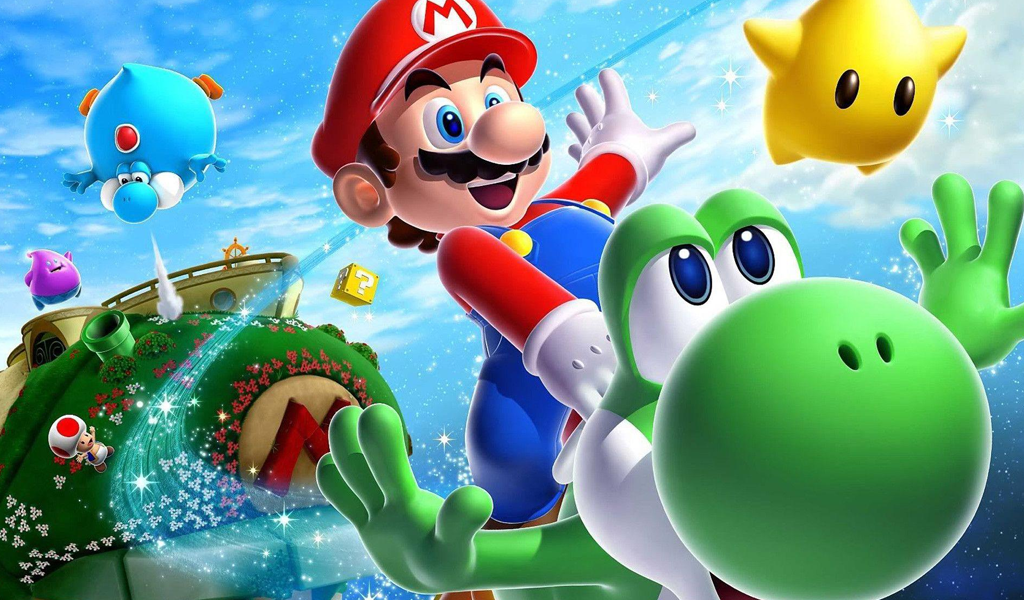
Table of Contents
Nintendo logo history
It is Mario who made Nintendo world-famous. The story of company, however, began in 1889, in the same year first Nintendo logo was introduced. Initially, the Japanese company specialized in playing cards. And its name as we know it was adopted only in 1907. Sometimes businessmen think they just can’t change their business sphere. Nevertheless, Nintendo proves that you can move from producing cards to electronics and turn into Mega Corporation with milliards of income a year.
Evolution of Nintendo logo
Company initial design was rather ordinary. The first variation of Nintendo logo was something trivial. Two red triangles located on top part of the logo and three blue hieroglyphs on a white background looked really dull. A typical Japanese minimalism it was. An export label was only a handwritten “Nintendo” inscription, the first and the last letters of which were decorated by abundant ringlets.
Much later, in 60s the label was altered. And it looked more modern as the stylish trends of those years required. The new Nintendo logo reminded some expensive car insignia. And then they decided to stress “N” and a search of a perfect designing solution continued up until 70s. Maybe the problem was that the company had to act in two different cultures – Japanese and American. Given the situation it took a significantly longer time for any stylistic solution to be adopted.
Other Nintendo logos meaning
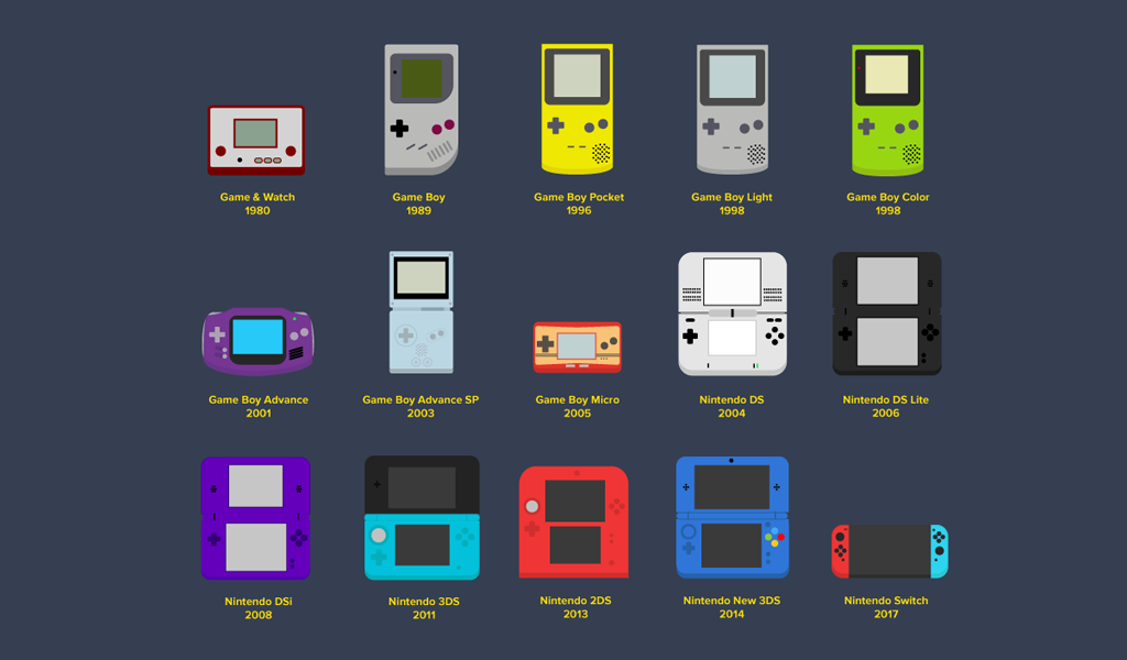
A special label was designed for one of their most brilliant projects, a gaming console. The label wasn’t extremely original though. It was an impetuous inscription in red. There was a tiny billet at the bottom with “Entertainment System” written in tiny font.
Another popular product – the latest console is also endowed with its special label. However, Nintendo switch logo possesses far more interesting design. The sign resembles the console with two buttons. And it also resembles Yin-Yang somehow and is slightly asymmetric. Though it can hardly be noticed, designers think it’s a good solution. Artist David Hellman implies the logo looks more harmonized and balanced thanks to asymmetry.
If you want to create a logo similar to Nintendo, you won’t have to work hard. You can download a vector logo for free and try some techniques finalizing it. If you will develop a logo based on an existing one, sooner or later you will create something unlike the initial model.
The meaning of the logo is a translation of the phrase from Japanese – most common translation today is “Leave luck/fate to heaven”.
Nintendo logo font
The logo is featured a font very similar to Pretendo.

SEO specialist, link builder, and blog editor at Turbologo. Writing insightful content about marketing, design, and branding. Sharing practical tips on building and promoting brands online.


