There are different opinions regarding the exact date of basketball becoming both widespread and popular. The game itself was invented two centuries ago. PE teacher James Naismith came up with the idea in 1891. Ordinary lessons were simply too boring, and he decided to make studying more dynamic as it was physical education actually. Having hung baskets on the opposed, he told his students to through balls in them.
Soon the game became tremendously popular. Basketball teams were forming one after the other and soon, the game was known around the whole USA. Those teams were forming leagues, though many of them were created only to disappear soon. However, today article is about the one that is cherished by millions fans around the world. We’ll tell you about NBA and finally reveal just who is depicted on its label.
Table of Contents
A beginning of NBA logo history & evolution
NBA today is a professional male league, and its players are payed as sport kings, no less. The league was formed in 1946. It was comprised of 11 teams back then, and now it can boast having 30. “Boston Celtiks”, “Chicago Bulls”, “Los-Angeles Lakers” and many others are famous not only among basketball fans, but also around common folks.
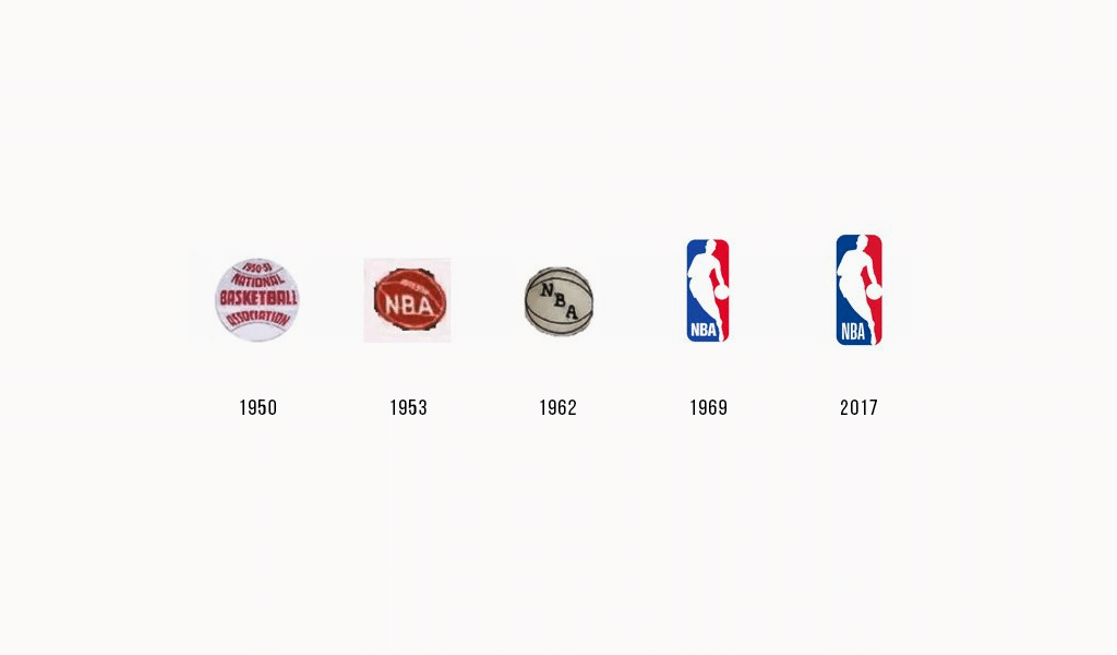
The first NBA emblem was something ordinary, but it was accepted by everyone and it was taking its place for 30 years to come. The league was named “National Basketball Association” on 3rd of August, 1949, and it keeps that name nowadays. The amount of teams in NBA changed many times as there were team parting ways, moves to another cities, etc. Instead of breaking apart teams, new ones were created and NBA was walking steadily toward a turning point in 60s. It was then when a new player entered the game, aiming at replacing the league. It was American Basketball Association, or ABA and it was formed in 1967.
Struggling to remain
It is this event affected a creation of a new NBA logo, the one we know today. NBA governing body was troubled by this new rival and decided to initiate a complete rebranding. A new logo, striking and intense as it is, was supposed to become a rebranding star. Every single person around should have known what league enlists the best players. New NBA logo should have demonstrate its status of sport leader, and basketball being the most popular game in America.
The one, who took the mission of rebranding was Alan Siegil, a top professional in the field of design and branding. It was he, who designed a world-wide known NBA logo in 1971. As for the competition and a struggle to remain, the result of those is rather spectacular. NBA and ABA united in 1976, and it made the league far stronger than ever, and the audience could now enjoy even more impressive and absorbing championship.
And who is that man on the NBA logo?
A mission of creating a new logo was an arduous one. Alan had created a successful silhouette logo for baseball league a year before. Baseball was more popular sport than basketball back then and basketball industry really lacked inspiration. Alan knew well that he is bound to create something as effective as the baseball league logo. And so, he looked through hundreds or perhaps thousands of basketball photos, and finally found a photo of Jerry West.
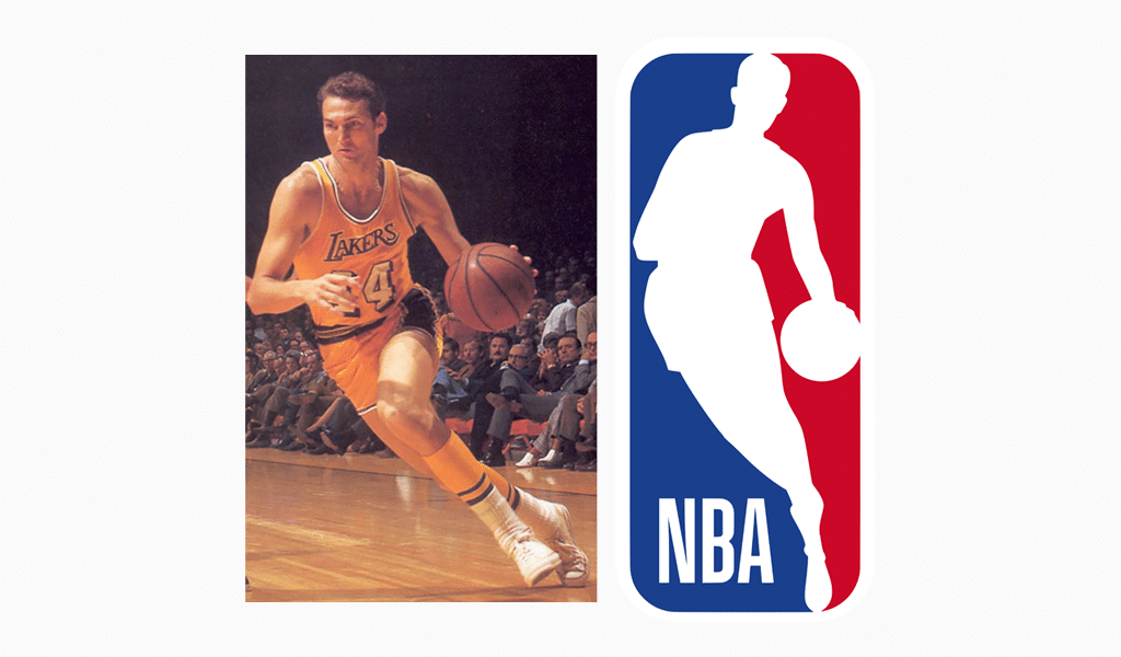
The photo was perfect for a new NBA logo. Basketball is all about high jumps, tall players and an upward movement. So, a vertical, dynamic and tall silhouette of “Lakers” player fitted the new logo just fine. An NBA champion, Jerry West, was often regarded as the most valuable player. And except for his sport achievements, his constitution was perfect for becoming both NBA and basketball emblem.
Alan came up with at least 50 logo variations, but Jerry West emblem prevailed over others. NBA logo color choice was determined by an idea of making the game truly national one. And that meant that the colors were to correspond with colors of the American flag. NBA started to use this emblem in 1971. Today NBA logo brings the league about $3 billion a year.
NBA Logo Meaning
So, the NBA Logo was inspired by a particular photo of Lakers basketball player – Jerry West. This depict set against three colors’ mix background, namely a combination of red, white and blue. This color scheme appealed to the patriotism of the viewers.
NBA marketing regulations
NBA runs a strict policy team logo designing. For example, you absolutely must have a ball on your logo. There were some indulgencies previously. You could have had a basket ring alone on your logo, but now any team has no choice but to follow strict branding rules.
It holds true for the uniform. Formerly, the rules were a color of sneakers should correspond to a color of a uniform. However, Michael Jordan decided to break this rule and made a contract with Nike. Michael came to play wearing bright red and black sneakers and was charge a 5.000 dollars fine for doing so. He also was told he is to pay the fine each time he enters the wearing inappropriate shoes. Nevertheless, Nike started to pay fines instead of Michael. What’s more, the situation boosted Nike sneakers sales. It is an excellent example of non-standard advertising. Not only is it important to make a creative logo, but also to PR it properly as well.
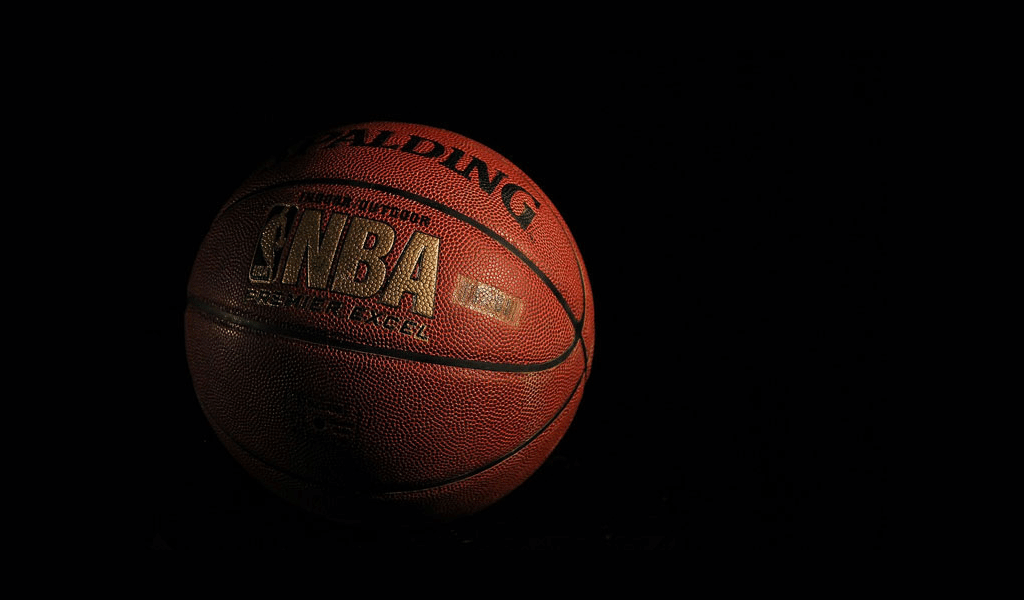
To make it clear to everyone that this is an American brand, the NBA games were assigned 3 colors of the flag: red, white and blue. For almost 20 years, the emblem has been simple and recognizable, it is a ball with the inscription NBA.
Reviewing old photos of the magazine, Alan Siegel is a branding marketer. I was inspired by a photo of player NBA Jerry West with a ball in his hand. The vertical pose embodied grace, strength and dynamics. That’s how the NBA logo appeared. The logo depicts the famous Los Angeles Lakers defender Jerry West. NBA champion. The player number 44 has never been recognized as the most valuable player of the finals.
The well-known logo for every NBA sports fan officially became the emblem of the powerful basketball league of the world in 1971. Fans and players liked the unique design.
The NBA logo has not changed for 20 years, it was a ball with the inscription NBA. But in the late 60s, the basketball league changed its logo. Now the logo is placed on sportswear, shoes and balls. The logo is recognizable all over the world.

SEO specialist, link builder, and blog editor at Turbologo. Writing insightful content about marketing, design, and branding. Sharing practical tips on building and promoting brands online.

