We all are well acquainted with such a mark as a logo that is usually used in order to present some type of company or production. Nevertheless, it is not the only way to apply it. For example, it concerns movies and series too. Naruto logo design happens to be one of the worldwide favorites of those. It is hard to find an individual who would not recognize it.
Create your own logo with Turbologo logo maker. It takes less than 5 minutes and no design skills needed.
Go to Logo MakerMore than five hundred episodes start with the same symbol. Of course, at some point viewers might get annoyed and start to skip it, yet there are many fans to whom it is the dearest and necessary part of the film.
The text below covers the following sections about it:
- meaning;
- history;
- evolution;
- font;
- and colors.
Now, let us take you to examine the journey of the popular anime identification sign. Hope you find it useful and entertaining!
Table of Contents
Naruto logo meaning
The Naruto logo originated from the manga comics of the same name. The overwhelming text and illustrations created by Masashi Kishimoto in 1995 were a total breakthrough, so it was decided to promote a cartoon based on it.
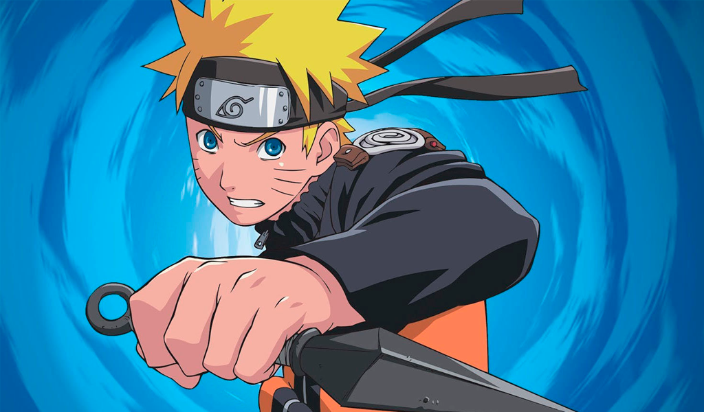
Naruto is the name of the main character: funny and sometimes foolish, but on the other hand, a brave and purposeful boy. His best-loved dish is ramen, ‘narutomaki’ is a sort of fish cake included in it.
Naruto logo history
As well as the anime series, its logo came to life in 2002. It was colorful and noticeable. You may find several variations of the design, yet, as the matter of fact, never ever it has been changed.
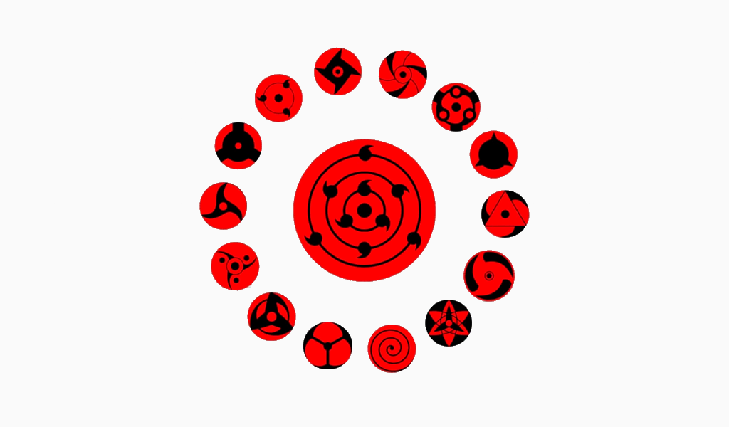
In addition, the story itself is filled with multiple remarkable symbols. Signs of Akatsuki, Uzumaki, or Uchiha clan, nine-tailed beast outlines, and those identifications of different villages are also frequently considered as alternatives to the Naruto name logo. Plus, the film has a sequel called ‘Boruto’, which in any way is associated with its predecessor.
In such a way, the production company provided itself with an opportunity to be in sight and not become boring. Even though Naruto’s adventures are long over, the fuss about it does not seem to die away any time soon.
Naruto logo evolution
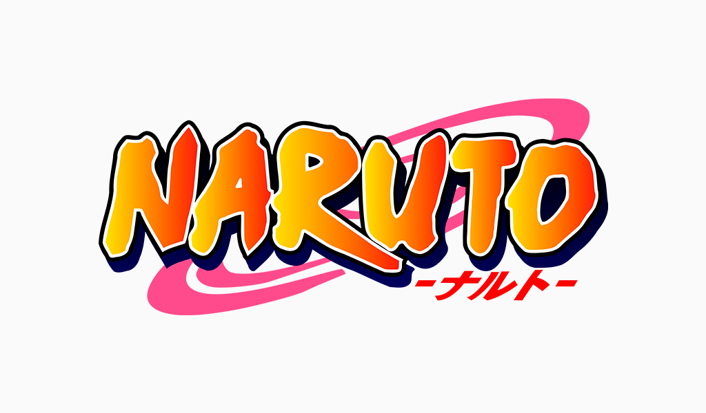
The logo is very bright and consists of orange, pink, red, and blue hues. The Naruto letters and hieroglyphs are performed with the help of a thick brush in the best ancient traditions of Asia. In the background pink circles are situated. Blue inscription reads ‘shippuuden’, which stands for ‘hurricane chronicles’.
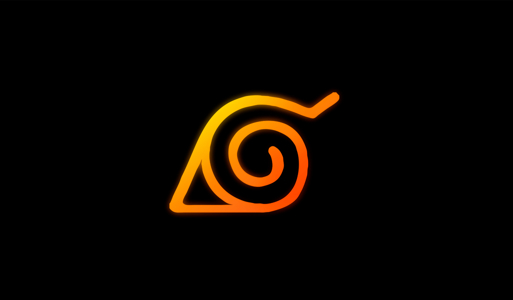
Another possible Naruto logo variation is the Konoha symbol. It is designed as a laconic spiral with a short line on the edge and a triangle-like element on the opposite side.
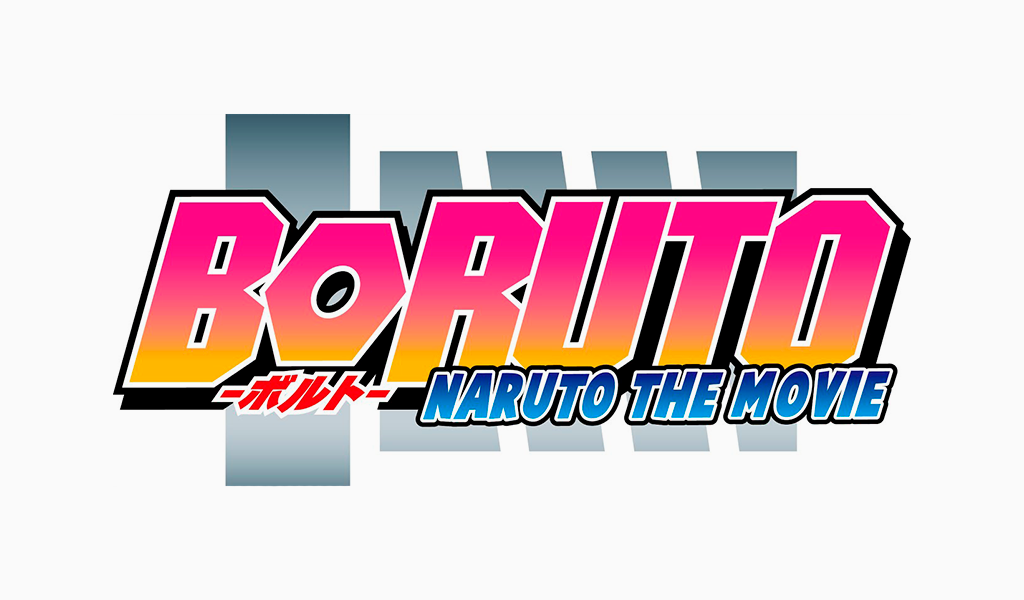
The Boruto logo appears in a more modern style. Bold, sans-serif, the geometric typeface is painted in pink and orange gradient. ‘Naruto next generation’ inscription placed underneath. All of this is layered on 5 gray asymmetrical lines.
Naruto logo font
As aforementioned, the Naruto logo font is a brush-drawn one. The characters are offhand and confident. This feature coincides with ninja thematic. On the web, the unique typeface is easy to find by the title of ‘Ninja Naruto Font’.
Naruto logo colors
The key color of the logo was not selected by chance. It also contains a piece of meaning.
In Naruto’s body, the Kurama beast was sealed. Since it was a huge fox with nine tails, the orange tones come into play. Plus, the crucial moment is that Kurama has been a wild, angry, and intractable creature. In order to demonstrate ferocity and inconceivable power, a fiery shade has been chosen.
Blog editor and content marketing specialist at Turbologo. Writing about Marketing and design. Victoria’s articles contain useful tips on how to build a brand and promote it online.


