Microsoft brand isn’t only a culture phenomenon or a trendy element of contemporary world. The brand is part of our life and part of mankind history as well. And we have been writing it together for the some decades already. And each of us has damned this brand and its creator at least for once. Each of us is sure to watch the Windows loading screen with a sight full of pain. But you can’t deny that without Microsoft our present days would be completely different. It is Windows that was nearly the only OS when computers were becoming an important part of our life. Though it wasn’t too reliable and certainly far from perfection it still did its job.
Table of Contents
What did Microsoft logo history begin with?
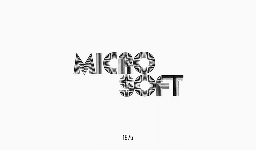
So, what were Microsoft company founders thinking, designing their first logo, the so-called “groovy logo”? Maybe they came across a vinyl plate. And that’s why they’ve chosen disco Microsoft logo font. However, it was alright in 70s. But in 80s a completely new music style became popular. Metallica band was hitting the charts, and its label inspired new version of Microsoft logo.
Microsoft logo evolution
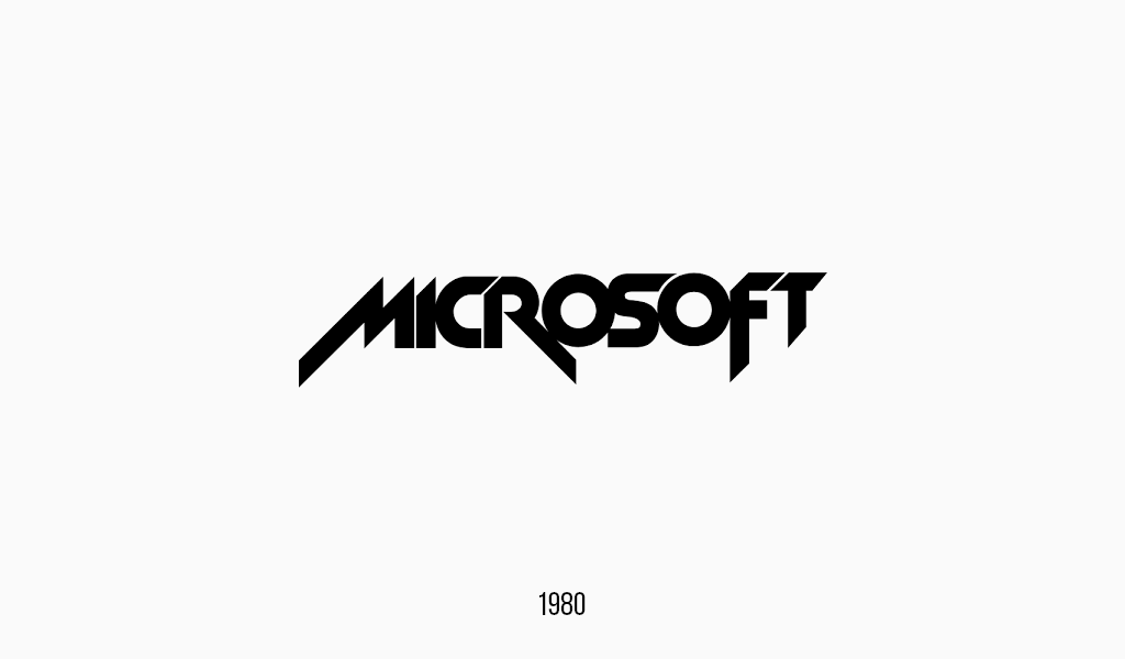
The company wasn’t as popular back then, but sales were good. Maybe this saved it when Metallica charged the company. Nevertheless, this logo bored the company and was removed. The next green variation is remembered by but few.
In general, none of these variations is interesting or remarkable. It simply looks as plagiarism of popular music bands. That’s why none of them is remembered now. But not the next Microsoft logo evolution option!
Microsoft Logo: The Genesis of Success
It is with this logo Microsoft company finally became well-known. The logo was applied to the first hardware output in 1980s. It was Z-80 SoftCard device. It helped to run CP/M OS on a computer. And it was a real breakthrough! That might just be the reason why the has stayed for a long time.
Microsoft logo meaning
Initially, it was planned to use a hyphen in the name. But Micro-Soft was rejected for some reasons. An original “O” letter element, with a dash in it, led to Microsoft logo nicknaming. It was called pac-man in the company and it stayed with the logo for years. After a tremendous success with the development of SoftCard, IBM company asked Microsoft for help. They asked Bill Gates to develop an analog of CP/M OS for their new IBM PC. And, as we know, Microsoft solved the problem brilliantly be creating MS-DOS. It later became a basis for IBM PC and other similar computers of that time.
Talking about Microsoft logo, we simply can’t stay silent regarding their main success. It is Windows, the one we all know and love. If we look at the very first icon we’ll recognize a simple window in it, simple as it is. “Windows” are basis and idea of Windows OS, its ease of operating with small programs fit in windows. Without it we can’t imagine modern smartphones or netbooks. Quite contradictory, but as Windows icon was developing, it was resembling a window less with each new change adopted.
Contemporary Microsoft logo design
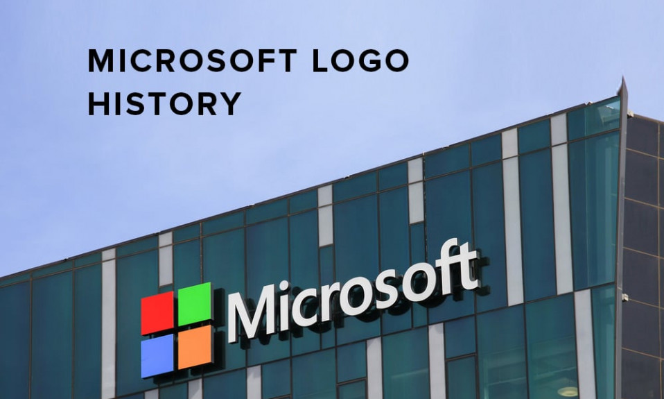
As computers evolved into exquisite household feature, Microsoft decided to alter its firm style in 2013. When the company asked designers for help, they asked a question in return: “Why does your OS called Windows, but its icon looks like a flag?”. And so, they had to rebrand, getting back to the origins, so to say. The label was drawn in a trendy flat-design, and it looks rather up-to-date. Maybe it looks a bit dull, but it’s got to remain recognizable and clear. The renewed Windows icon even had the honor of becoming part of Microsoft logo image, as it is this very OS that has glorified the company!

SEO specialist, link builder, and blog editor at Turbologo. Writing insightful content about marketing, design, and branding. Sharing practical tips on building and promoting brands online.

